Global Warming Science - www.appinsys.com/GlobalWarming
The Late 20th Century Warming Resulted From a 1970s Climate Shift (Not CO2)
[last update: 2011/03/02] – Southern Oscillation Index
|
Many in the media portray the global warming issue as “the global average temperature has increased 0.8 degrees during the 20th century”. But climate scientists do not claim that this was all due to CO2 – only since the 1970s. (I have repeated this point on several pages on this web site – because it is an important one, overlooked by the media in their portrayal of the alarmist position.) In a CRU email between Edward Cook and Michael Mann in May 2001, Cook stated: “most researchers in global change research would agree that the emergence of a clear greenhouse forcing signal has really only occurred since after 1970. I am not debating this point, although I do think that there still exists a significant uncertainty as to the relative contributions of natural and greenhouse forcing to warming during the past 20-30 years at least.” [http://www.eastangliaemails.com/emails.php?eid=228&filename=988831541.txt]
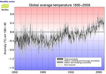
The figure below left shows the global average temperature anomalies (from the Hadley Climatic Research Unit (CRU) which provides the data used by the IPCC [http://hadobs.metoffice.com/hadcrut3/diagnostics/global/nh+sh/]).
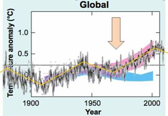
The figure below right superimposes the CRU temperature anomalies on the IPCC graph of model outputs. (IPCC 2007 AR4 Figure SPM-4 [http://www.ipcc.ch/pdf/assessment-report/ar4/syr/ar4_syr_spm.pdf]) In this figure, the blue shaded bands show the result climate model simulations using only natural forcings. Red shaded bands show the result model simulations including anthropogenic CO2.
This clearly shows that prior to about 1973, the global warming is fully explained by climate models using only natural forcings (i.e. no human CO2). The models need input of CO2 only after about the mid-1970s – prior to 1970 all warming was natural, according to the IPCC. (There is no empirical evidence relating CO2 to the post-1970s warming as a causative factor. The only evidence is the fact that the computer models require CO2 to produce warming.)
The IPCC attributes “most” of the warming since 1970 to human-produced (anthropogenic) greenhouse gases – mainly CO2. One must keep in mind that the IPCC was formed in 1988 with the purpose of assessing “the understanding of the risk of human-induced climate change.” -- i.e. it is based on the a priori assumption of “human-induced climate change” – there was never an attempt to evaluate the scientific evidence of the cause. (See: http://www.appinsys.com/GlobalWarming/GW_History.htm for the history).
|
|
Global Average Temperature Regimes
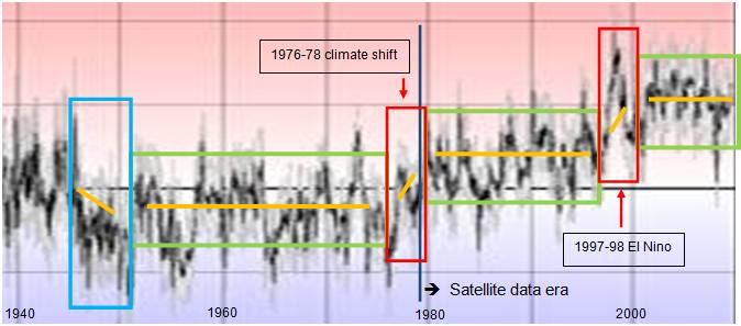
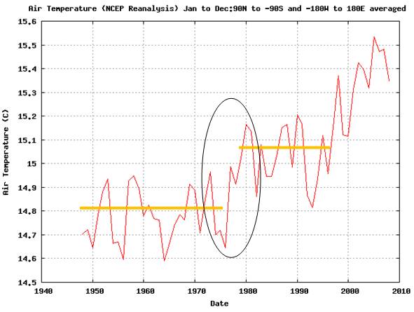
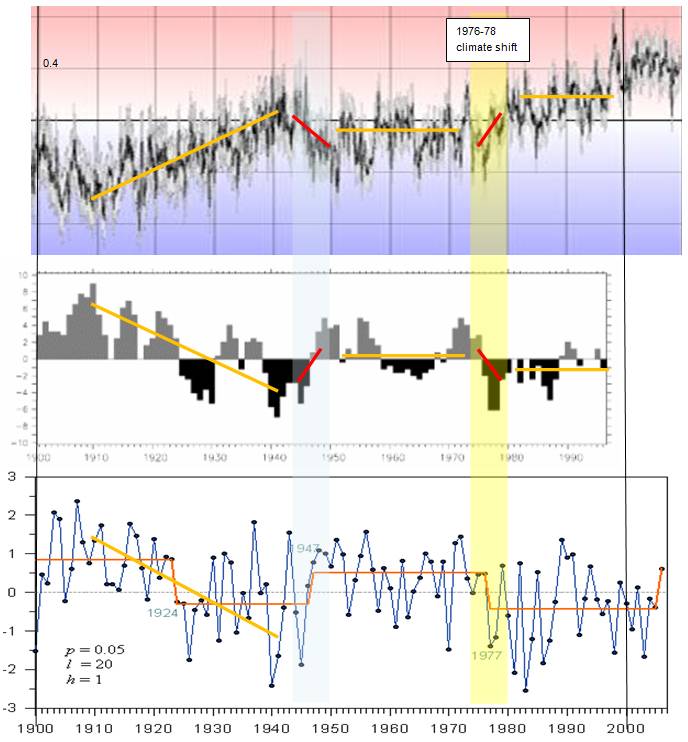
The following figure examines the global temperature regimes over the past 70 years (from the temperature graph shown above). Global average temperatures can vary widely from year to year, generally within a 0.5 degree range (the green bounded rectangles below). Following the 1945 – 1951 cooling event, the temperatures were in a stable regime until the 1976-78 climate shift which resulted in a net warming of about 0.2 – 0.3 degrees. Another stable regime is exhibited for the next almost 20 years until the 1997-98 El Nino, which again resulted in about a 0.3 degree net warming. Since then, there has been no further warming for the last 10 years.
All of the warming in the last 70 years occurred in two extremely short periods – and this is the time frame covering the entire period officially designated as having warming due to CO2.
|
|
Background
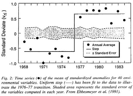
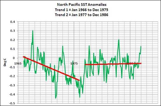
Miller et al, “The 1976-77 Climate Shift of the Pacific Ocean” Oceanography Vol.7, 1994 [http://horizon.ucsd.edu/miller/download/climateshift/climate_shift.pdf] “During the 1976-77 winter season, the atmosphere- ocean climate system over the North Pacific Ocean was observed to shift its basic state abruptly (e.g., Graham, 1994). The Aleutian Low deepened (Fig. la) causing the storm tracks to shift southward and to increase storm intensity. Downstream, over the continent of North America, warmer temperatures occurred in the northwest (Folland and Parker, 1990), decreased storminess was observed in the southeastern U.S. (Trenberth and Hurrell, 1993), and diminished precipitation and streamflow in the western U.S. (Cayan and Peterson, 1989). In the ocean, sea surface temperature (SST) cooled in the central Pacific and warmed off the coast of western North America (Fig. l c). These major changes in the physical climate were accompanied by equally impressive changes in the biota of the Pacific basin (Venrick et al., 1987; Polovina et al., 1994). This remarkable climate transition was illustrated by Ebbesmeyer et al. (1991) in a composite time series of 40 environmental variables (Fig. 2). Each of the 40 time series were normalized by their standard deviation, then averaged together to form a single time series, which suggests that a step-like shift occurred in the winter of 1976-77. ”
A 2001 study at Department of Oceanography, Texas A&M (Giese, Urizar, Fuckar: “Southern Hemisphere Origins of the 1976 Climate Shift”, Geophysical Research Letters, Vol 29, 2001 [http://www.agu.org/pubs/crossref/2002/2001GL013268.shtml]) states: “Observations from the tropical Pacific Ocean identify an abrupt climate shift in 1976 with surface temperatures changing from cooler than normal to warmer than normal in the span of about 1 year.”
|
|
Temperature Trends At Various Atmospheric Heights
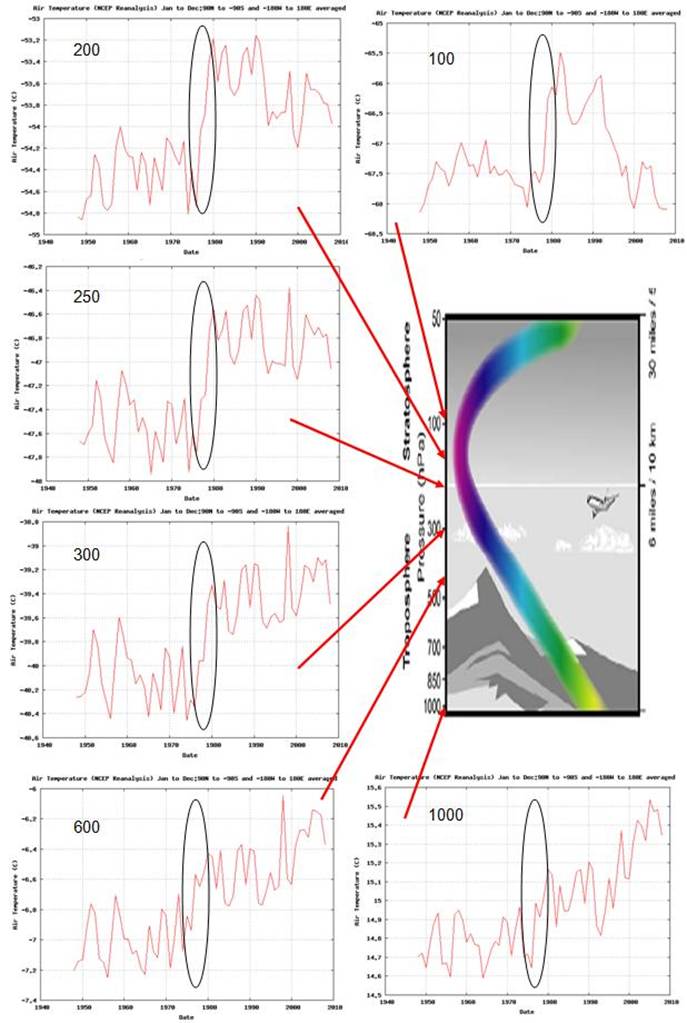
The NOAA Earth System Research Laboratory (ESRL) [http://www.cdc.noaa.gov/cgi-bin/data/timeseries/timeseries1.pl] provides plots of trends of various data items from the NCEP / NCAR reanalysis database for 1948 to 2008. The following figure shows the global air temperature for the 1000 hPa height (near the Earth’s surface). It shows a warming trend since the mid-1970s – the warming officially attributed to CO2 by the IPCC.
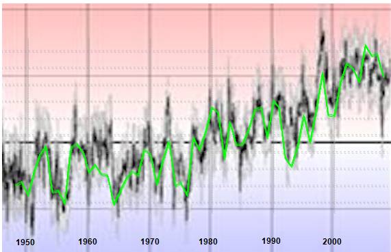
Changing the above plot to green and superimposing on the CRU global temperature plot shown previously gives the following correspondence. The 1997-98 El Nino is not as prominent in the NCEP data, but otherwise tracks the CRU global average closely.
The following figure shows the global average atmospheric temperatures at several atmospheric altitudes for 1948 to 2008, with the 1976-78 climate shift circled. The response to the 1976-78 climate shift was different at different altitudes in the atmosphere – in the stratosphere (100 hPa) the temperatures steadily declined after the event. At the top of the troposphere (250 hPa) the temperatures changed to a relatively steady state after the event. Near the surface (1000 hPa) the temperatures remained steady for about 20 years until 1998 when the major El Nino created another increase.
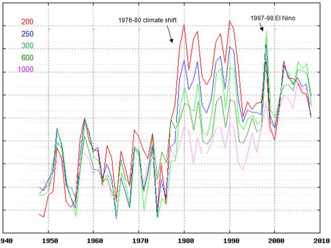
The following figure compares the global average atmospheric temperatures at five atmospheric altitudes (same data as shown above).
Some observations from the above graph:
|
|
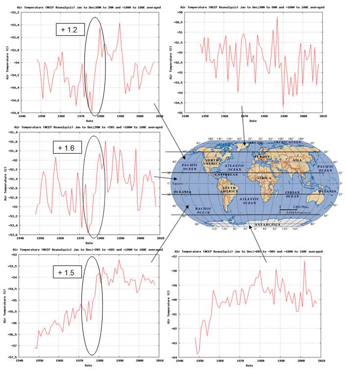
Climate Shift At Various Latitudes
The following figure shows the 200mb air temperature for the indicated latitude bands from the same NCEP data shown previously. Note that the different plots have different scales.
|
|
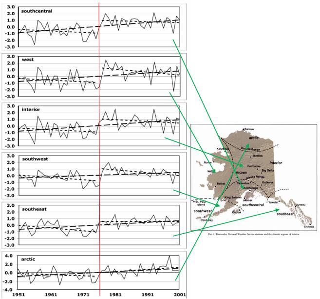
Climate Shift Observed in Alaska
The following figure is from a study published in 2005 (Brian Hartmann and Gerd Wendler: “The Significance of the 1976 Pacific Climate Shift in the Climatology of Alaska”, Journal of Climate, Vol.18, 2005) [http://climate.gi.alaska.edu/ResearchProjects/Hartmann%20and%20Wendler%202005.pdf]. The figure shows temperature trends for each climate region in Alaska, including linear trends for the entire period and for the two periods separated by 1976. Linear trends through the whole period provide a very misleading interpretation. Except for the Arctic region, all of the warming in Alaska occurred in the two-year period of – 1976 - 1978. The temperature trend was decreasing prior to the 1976 climate shift and since then has also not been warming.
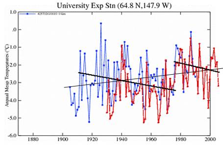
This same effect can be seen for the Fairbanks (red) / University Exp Stn (blue) [also in Fairbanks] from the GISS database – a linear trend through the whole data set (thin black line) provides a very different interpretation than noticing the effect of the shift in 1976-1978 and calculating separate linear trends for the two sub-periods (thicker black lines).
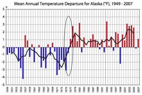
The following figure is from the Alaska Climate Research Center and shows the “stepwise shift appearing in the temperature data in 1976 corresponds to a phase shift of the Pacific Decadal Oscillation from a negative phase to a positive phase” [http://climate.gi.alaska.edu/ClimTrends/Change/TempChange.html].
|
|
Climate Shift Observed in Oceanic Oscillations
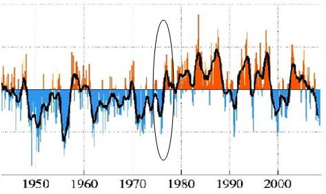
The IPCC states in the AR4: “The 1976–1977 climate shift in the Pacific, associated with a phase change in the PDO from negative to positive, was associated with significant changes in ENSO evolution.“ The Pacific Decadal Oscillation (PDO) index is calculated from sea surface temperatures and sea level pressures. The following figure shows the monthly PDO index from the 1940s to 2008. [http://jisao.washington.edu/pdo/] The PDO shifted from a predominantly cool phase to a predominantly warm phase after 1977. (See www.appinsys.com/GlobalWarming/PDO_AMO.htm for more information on the PDO)
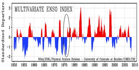
The multivariate ENSO Index (MEI) is based on the six observed variables over the tropical Pacific (sea-level pressure, zonal and meridional components of the surface wind, sea surface temperature, surface air temperature, and total cloudiness fraction of the sky). The following figure shows the MEI since 1950. [http://www.cdc.noaa.gov/people/klaus.wolter/MEI/] The ENSO shifted from predominantly cool phases to predominantly warm (El Nino) phases after 1977. (See www.appinsys.com/GlobalWarming/ENSO.htm for more information on the ENSO)
A 1998 study (Guilderson & Schrag: “Abrupt Shift in Subsurface Temperatures in the Tropical Pacific Associated with Changes in El Nino”, Science Vol 281, 1998 [http://www.sciencemag.org/cgi/content/abstract/281/5374/240]) states: “Radiocarbon (C14) content of surface waters inferred from a coral record from the Galapagos Islands increased abruptly during the upwelling season (July through September) after the El Nino event of 1976. Sea-surface temperatures (SSTs) associated with the upwelling season also shifted after 1976. The synchroneity of the shift in both C14 and SST implies that the vertical thermal structure of the eastern tropical Pacific changed in 1976. This change may be responsible for the increase in frequency and intensity of El Nino events since 1976.”
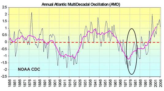
The Atlantic Multidecadal Oscillation (AMO) is shown in the following figure from 1958 to 2006 [http://intellicast.com/Community/Content.aspx?a=127] (See www.appinsys.com/GlobalWarming/PDO_AMO.htm for more information on the AMO). The 1976-78 climate shift corresponds to large change in the AMO, shifting it from the bottom of a cold phase into the start of warm phase.
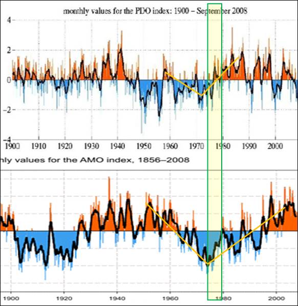
As shown above, all of the major oceanic oscillation indexes shifted at the same time during this climate shift. The following figure compares monthly values of PDO and AMO from 1900 to 2008. Both had a turning point from cooling to warming at the climate shift.
A 2007 paper (Tsonis et al, “A New Dynamical Mechanism for Major Climate Shifts”, Geophysical Research Letters Vol. 34) examined the effects of oceanic oscillations on climate shifts. [http://www.nosams.whoi.edu/PDFs/papers/tsonis-grl_newtheoryforclimateshifts.pdf] “The indices represent the Pacific Decadal Oscillation (PDO), the North Atlantic Oscillation (NAO), the El Niño/Southern Oscillation (ENSO), and the North Pacific Oscillation (NPO). These indices represent regional but dominant modes of climate variability, with time scales ranging from months to decades. NAO and NPO are the leading modes of surface pressure variability in northern Atlantic and Pacific Oceans, the PDO is the leading mode of SST variability in the northern Pacific and ENSO is a major signal in the tropics. Together these four modes capture the essence of climate variability in the northern hemisphere. … We find that in those cases where the synchronous state was followed by a steady increase in the coupling strength between the indices, the synchronous state was destroyed, after which a new climate state emerged. These shifts are associated with significant changes in global temperature trend and in ENSO variability. The latest such event is known as the great climate shift of the 1970s. … While several possible triggers for the shift have been suggested and investigated [Graham, 1994; Miller et al., 1994; Graham et al., 1994], the actual physical mechanism that led to the shift is not known. Understanding the dynamics of the above phenomena is essential for our ability to make useful prediction of climate change.” In the paper conclusion: “It is interesting to speculate on the climate shift after the 1970s event. The standard explanation for the post 1970s warming is that the radiative effect of greenhouse gases overcame shortwave reflection effects due to aerosols [Mann and Emanuel, 2006]. However, comparison of the 2035 event in the 21st 224 century simulation and the 1910s event in the observations with this event, suggests an alternative hypothesis, namely that the climate shifted after the 1970s event to a different state of a warmer climate.”
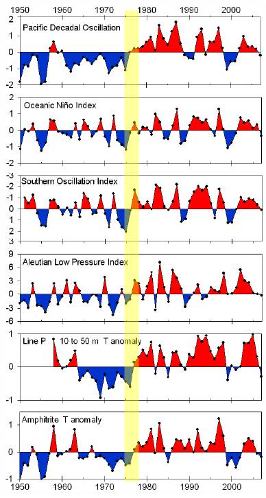
The following figure compares several indices and temperature anomalies (Line P temperature anomaly is 10 to 50 m depths in the eastern Gulf of Alaska while Amphitrite temperature anomaly is on the west coast of Vancouver Island, Canada) [http://www.pices.int/publications/pices_press/volume16/v16_n2/pp_32-33_NEP_f.pdf] The 1976-78 climate shift is highlighted by the yellow bar.
|
|
Climate Shift Observed in Other Ocean Parameters
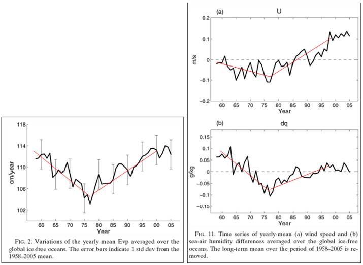
The following figures show the yearly mean global evaporation (left) as well as global wind speed anomalies and global sea-air humidity anomalies. As can be seen from these figures, the 1976-78 climate shift is associated with a reversal of the trends of these climatic parameters. [http://ams.allenpress.com/perlserv/?request=get-abstract&doi=10.1175%2F2007JCLI1714.1]. These trends also indicate that another reversal may be taking place in the 2000s.
Sea Surface Temperatures
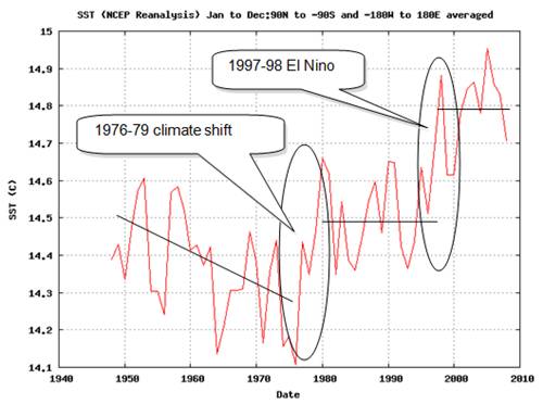
The following figure shows global annual average sea surface temperatures (SST) from the NCEP reanalysis database [http://www.cdc.noaa.gov/cgi-bin/data/timeseries/timeseries1.pl]. It shows that there were generally declining SSTs until the 1976 climate shift, after which the SSTs average 14.5 for almost 20 years until the 1997-98 El Nino, which caused another step change in SSTs – which so far has lasted 10 years until the present (perhaps cooling is now occurring, but it’s hard to tell on a short time scale).
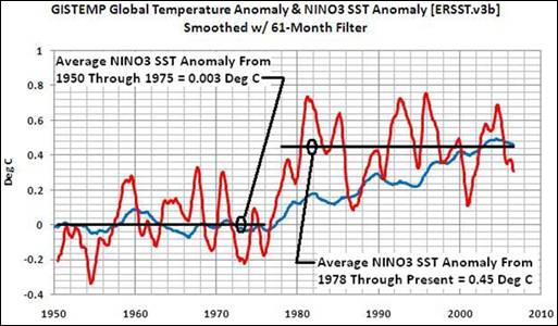
The following figure compares sea surface temperature (SST) anomalies from the ERSST.v3b database for the Pacific Nino region 3 (red line) with global temperature anomalies from the GISTemp database (blue line) [http://bobtisdale.blogspot.com/2009/04/revisiting-bratcher-and-giese-2002.html]. The 1976 climate shift provides the discontinuity in the Nino3 SST. The global surface temperature then ramps up from its flat line prior to the shift more slowly due to thermal inertia.
The following figure is from Bob Tisdale’s examination of regional SSTs resulting from the 1976 climate shift [http://bobtisdale.blogspot.com/2008/10/1976-pacific-climate-shift.html]
Clouds / Wind
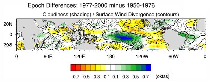
The following figure (from a paper by Deser and Phillips 2006) shows an epoch difference map obtained by subtracting the period 1950-1976 from the period 1977-2000 of observed winter surface marine cloud amount (color shading) and wind divergence (contours) from the ICOADS data set. For surface wind divergence negative contours (indicative of anomalous convergence) are dashed, and the zero contour is darkened. [http://www.cgd.ucar.edu/cas/cdeser/Docs/jclim_7677trans.pdf]
Arctic Sea Ice
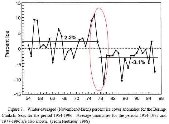
Niebauer, H. J. (1998), “Variability in Bering Sea ice cover as affected by a regime shift in the North Pacific in the period 1947–1996”, J. Geophys. Res., 103 [http://www.agu.org/pubs/crossref/1998/98JC02499.shtml] “In the late 1970s, a “regime shift” or “step” occurred in the climate of the North Pacific, causing, among many other effects, a 5% reduction in the ice cover in the eastern Bering Sea as well as shifts in the position of the Aleutian low. … Since the regime shift, El Niño conditions are about 3 times more prevalent. In recent work [e.g., Mantua et al., 1997; Minobe, 1997] there is evidence that this regime shift is the latest in a series of climate shifts going back to at least the late 1800s and may be due to a 50- to 70-year oscillation in a North Pacific atmospheric-ocean coupled system.”
|
|
Aleutian Low
The Aleutian Low refers to the area of winter low pressure centered near the Aleutian Islands
Overland et al, “Decadal Variability of the Aleutian Low” “The Aleutian low is associated with the large-scale, low frequency mean flow or stationary wave pattern in the general circulation of the Northern Hemisphere. The mean flow becomes unstable and generates transient storm systems that travel downstream along the axis of the westerly jet core … The Aleutian low is connected to the atmosphere-ice-ocean climate system and to the ecology of the North Pacific. The strength of the Aleutian low provides an index of the surface pressure gradient, which represents the intensity of mechanical forcing of the ocean.” [http://www.soest.hawaii.edu/PubServices/1998pdfs/Overland.pdf]
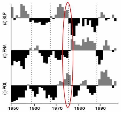
The following figure from the above paper “compares the central pressure of the Aleutian low [SLP] with the standardized amplitudes of the PNA, and the POL. All time series cover the period 1951-1996 and are smoothed with a 3-year running mean. The time series of the PNA (Figure 3b) exhibits variability over long periods and has been in the posi-tive phase since 1977, except for a short period around 1989. The time series of the POL (Figure 3c) and WP (not shown) exhibit greater variability over shorter periods and are visually well-correlated with the Aleutian low central pressure. The PNA, WP, and POL patterns all contributed to the deepening of the Aleutian low in 1977”
The following figure combines:
|
|
Climate Shift Effect on Fisheries
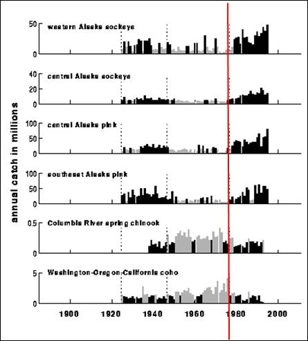
The following figure is from a study of the impacts of the Pacific PDO on salmon production in the Pacific Ocean. The effect of the 1976-78 climate shift on Alaska fisheries is clearly indicated. [http://www.atmos.washington.edu/~mantua/REPORTS/PDO/pdo_paper.html]
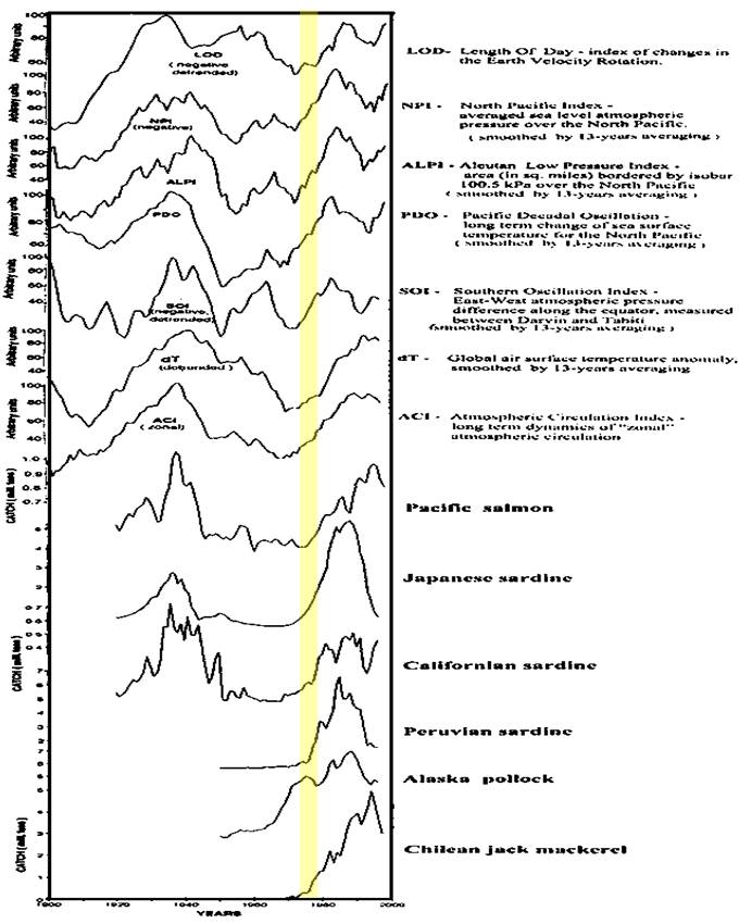
The UN FAO provides the following figure comparing various climatic indices with various Pacific fish catches [http://www.fao.org/docrep/005/Y2787E/y2787e05.htm] The 1976-78 climate shift is indicated by the yellow bar.
|
|
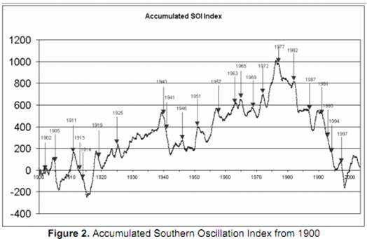
The following figure shows “accumulated Southern Oscillation Index (SOI) since 1900, and indicates that post-1950 there have been two distinct phases separated by the so-called Pacific Climate Shift in 1977. The rising graph 1950-1976 indicates a dominance of positive SOI and La Niña events. The falling graph since 1977 indicates a dominance of negative SOI and El Niño events. … since 1977 there have been much less severe tropical cyclone and tropical hybrid events.” [http://www.cawcr.gov.au/bmrc/pubs/researchreports/RR131.pdf]
|
|
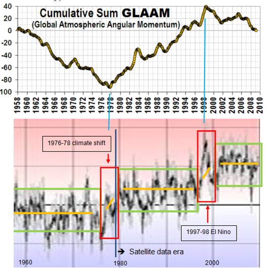
Global Atmospheric Angular Momentum
The following figure shows cumulative global atmospheric angular momentum and its correspondence to the climate regimes. [http://www.sfu.ca/~plv/DRAFT_VaughanPL2009CO_TPM_SSD_LNC.htm] The 1998 peak could portend cooling in the upcoming decades (as well as the last decade).
|
|
|