United Kingdom (Great Britain)
This is part of the Regional Summary series at www.appinsys.com/GlobalWarming

![]()
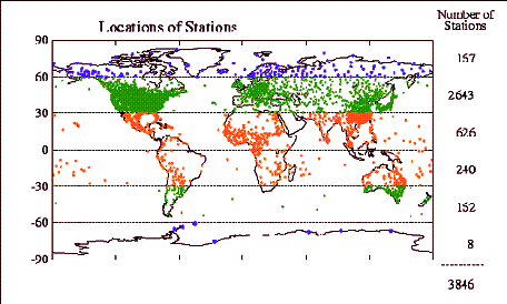
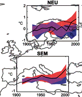
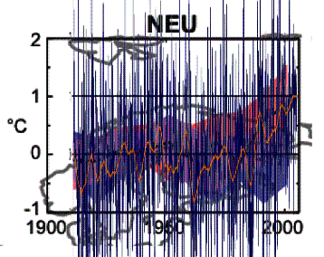
The United Kingdom has a total of 58 temperature stations in the NOAA GHCN database, with only 7 stations having data before 1940 and after 2000. The IPCC AR4 regional graphs (above right) show the climatic models for Northern Europe and Southern Europe Mediterranean. These graphs show that for Northern Europe the need for CO2 in the models only occurs after 1990, whereas for Southern Europe the deviation occurs around 1980.
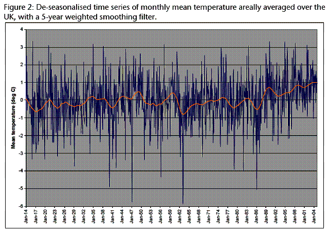
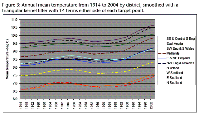
The UK Meteorological Office collects data (in association with the Hadley center) from more stations and provides a summary report of trends. [http://www.metoffice.gov.uk/climate/uk/about/UK_climate_trends.pdf]. The following figure is from that report, and shows temperature trends from 1914 to 2004 for the UK. It is interesting to note that the recent warming trend only began in 1989. This is especially interesting given that the IPCC was started in 1988 with the stated purpose of assessing “the scientific, technical and socioeconomic information relevant for the understanding of the risk of human-induced climate change.” So the IPCC already knew that human-induced climate change was happening in 1988, and their data is provided by the Hadley center in the UK, but warming doesn’t even start in the UK data until 1989.
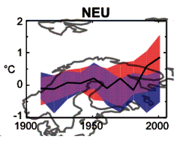
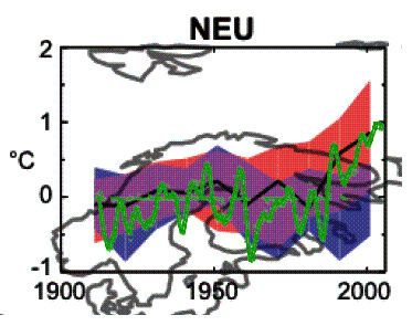
The following figure (left) shows the IPCC models for Northern Europe (red models include anthropogenic CO2, blue models without) as well as with the above UK temperature data superimposed (right). Below these, the next figure shows just the 5-year smoothed temperature from the above UK plot (green) superimposed on the IPCC model plots. The models only need CO2 after 1990. Unfortunately the models do not include solar effects.
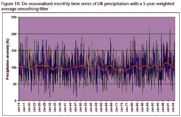
The next figure shows precipitation data from the same Met Office report – exhibiting no trend.
The UK Met Office report states: “Winter and autumn sunshine has increased very significantly for northern, central and south-east England since 1929… Most of the increase has taken place since the late 1960’s.” The following figures show annual smoothed temperatures and sunshine hours by district. Could the sunshine be causing warming?
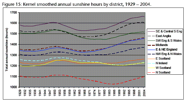
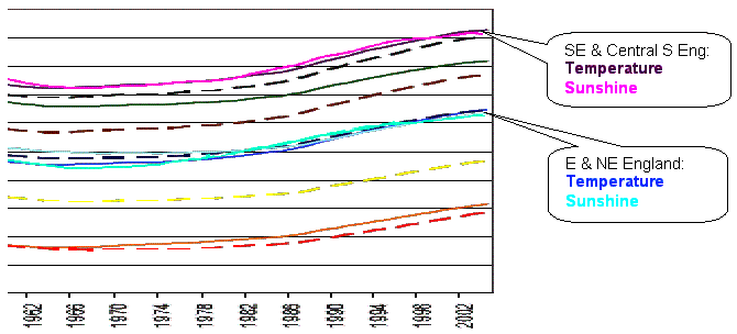
The following figure shows the temperature data from above plus two of the sunshine data lines from above, for 1960 to 2004. The two comparison curves are for “SE & Central S Eng” and “E & NE England”. Most of the temperature curves show similar almost exact correspondence with sunshine. The averaged regional temperature shows a better correlation with solar than with CO2.
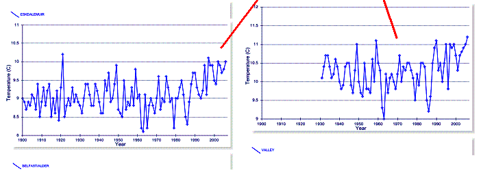
There are only 7 temperature stations in the NOAA GHCN database that have data before 1940 as well as after 200 in the UK. The following figure shows the mean annual temperature data from six of these stations (the seventh – Stornoway – is very similar to Lerwick). Lerwick and Stornoway are the two northern-most stations – on islands off the coast of northern Scotland.
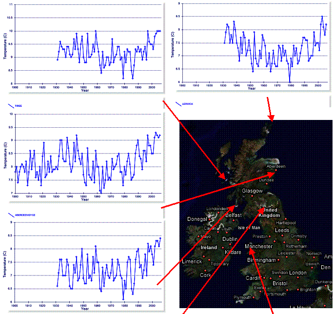
One thing that is noticeable from the individual stations is that the recent warming has only just begun to exceed the warming of the 1930s and 1940s. For example, Aberdeen (an urban station) shown above and in the figure below shows recent warming starting in the early 1960s. But in the historical perspective of the warming and cooling cycles, warming is barely out of the “normal” range only in the last 5 years. This is not significant when climate is defined as average weather over 30 years.
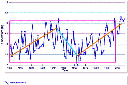
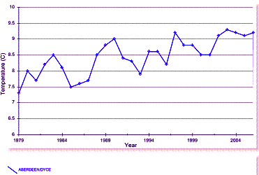
Aberdeen is also a good case study of choosing a year range. The IPCC (AR4) uses a starting point of 1979 for climate summaries (even though 1979 – 2005 is shorter than the standard definition of climate). The figure below left is from the AR4 Figure 9.6 showing significant warming in the UK region. The figure below right shows the Aberdeen mean annual temperature for 1979 – 2006 (same GHCN data as shown above).

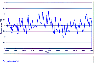
However looking at the same Aberdeen data using a different year range gives a very different picture. The following figure shows Aberdeen mean annual temperature for 1896 to 1996 – there is no observed long-term trend.
So is “global warming” beneficial for the UK? The Met Office
study states: “this study has indicated that there may be increasing
possibilities for agriculture further north in the UK, with an extension of the
growing season of 39 days in North and East Scotland since 1961, and a 20%
increase in growing degree days.”