Global Warming Science - www.appinsys.com/GlobalWarming
New Zealand
[last update: 2010/05/15]
|
[update: 2010/05/15]
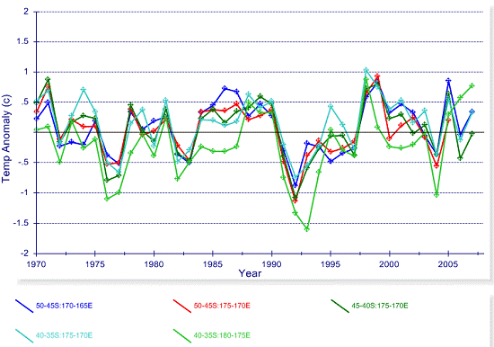
Two years have passed since the original document, so here is an update on the HadCRU temperature data for New Zealand. The following graphs show average annual temperature anomalies for 1970-2009, for the 5x5-degree grids from the Hadley/CRU CRUTEM3 database (plotted using the map interface at http://www.appinsys.com/GlobalWarming/climate.aspx)
The most recent 40 years of data – no warming.
|
|
|
|
[rest of document: 2008/03/22]
In September 2007, New Zealand decided to proceed with an emissions trading scheme that is expected to add an annual cost of $100 to $330 for each household’s energy costs (“New Zealand emissions trading scheme Q & A” [http://www.scoop.co.nz/stories/PA0709/S00350.htm]: “New Zealand’s greenhouse gas emissions are small from a global perspective (around 0.2 to 0.3 per cent of global emissions).” New Zealand also has no warming, and the glaciers there have been advancing for the last two decades.
|
|
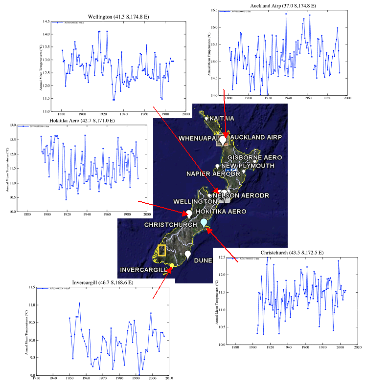
GISS Station Data
The following figure shows all stations in the GISS database with 50 years of data continuing to at least the 1980’s.
|
|
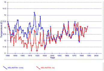
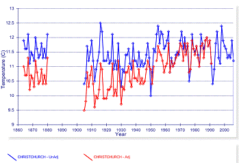
NOAA GHCN Temperature Data and Adjustments
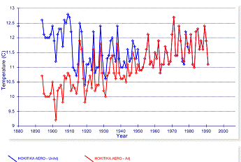
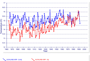
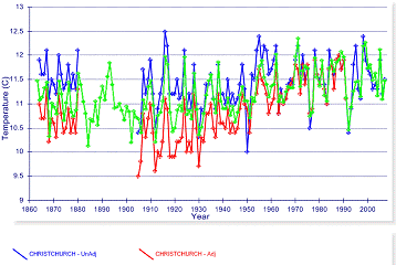
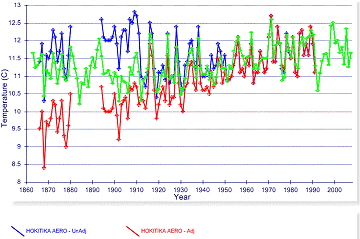
The following figures illustrate how warming is achieved at GHCN database stations: The figures for each of four stations show a comparison of the raw data (blue), the adjusted data (red).
Wellington (left) and Christchurch (right).
Hokitika (left) and Aukland (right).
|
|
HadCRU Temperature Data
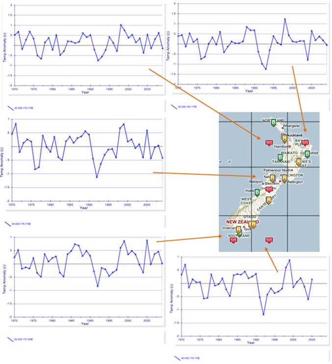
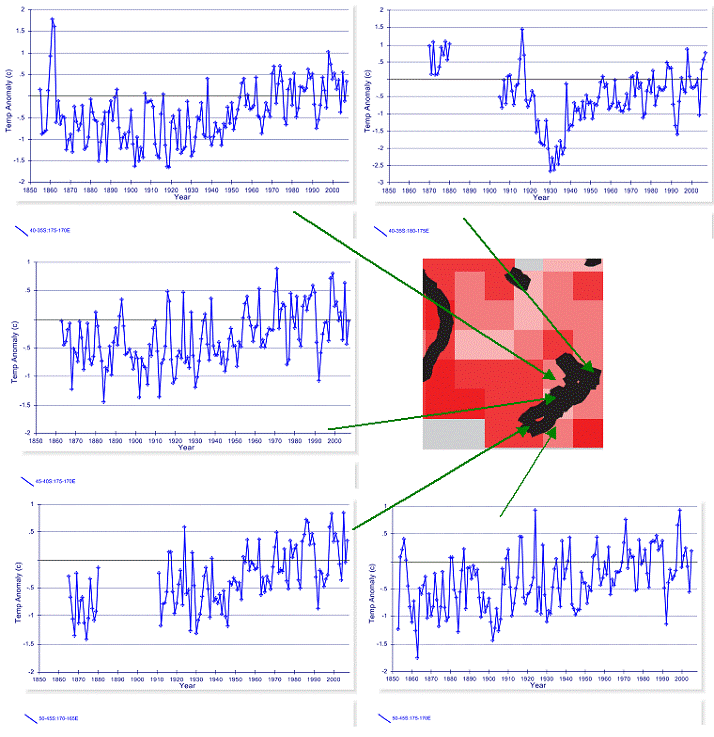
The following figure shows the Hadley Climatic Research Unit (HadCRU) temperature anomaly data for each of the 5x5 degree grids encompassing temperature stations in New Zealand. HadCRU calculates temperature anomaly data and averages the data for each 5x5 degree grid “box” in the world. The HadCRU data is used by the IPCC in their reports. Unfortunately, HadCRU does not make public their data, except for the gridded data – i.e. after all included stations are adjusted and averaged – therefore individual HadCRU station data and adjustments cannot be examined.
In the above figure, the temperature plots are created from HadCRU CRUTEM3 data at www.appinsys.com/GlobalWarming/Climate.aspx and the “map” of New Zealand is from the IPCC AR4, Figure 9.6 indicating warming from 1901 to 2005.
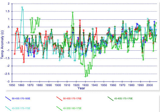
The following figure combines the HadCRU temperature anomaly graphs shown in the above figure.
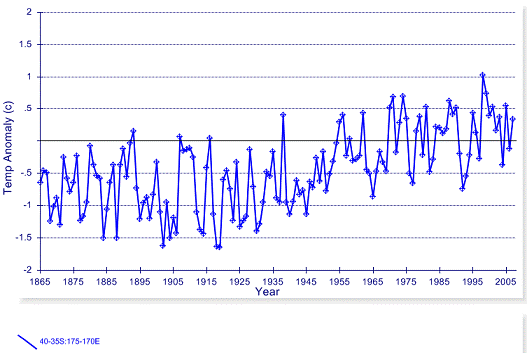
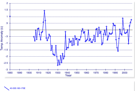
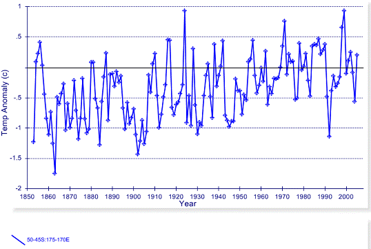
Grid: 35-40 S / 170-175 E
The following figure shows the HadCRU temperature anomaly graph for the 35-40 S / 170-175 E grid.
According to the HadCRU website [http://www.cru.uea.ac.uk/cru/data/landstations/crustnsused.txt], the following stations are in this grid:
930120 -35.0 -173.3 80 KAITAIA A NEW ZEALAND 931120 -36.7 -174.6 26 WHENUAPAI A NEW ZEALAND 931150 -36.9 -174.8 -999 AUCKLAND NEW ZEALAND ** 931190 -36.8 -174.8 5 AUCKLAND NEW ZEALAND 932920 -38.7 -178.0 8 GISBORNE AERODROME NEW ZEALAND 933090 -39.0 -174.1 27 NEW PLYMOUTH A NEW ZEALAND
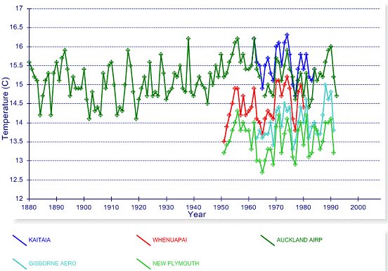
The HadCRU includes stations that have data for the period 1961 – 1990, since this is the base period for calculating the average value from which the anomalies are derived. Five of the above stations are in the NOAA GHCN database (all except 931150 indicated above with asterisks). The following figure shows the mean annual temperature from the GGHCN database.
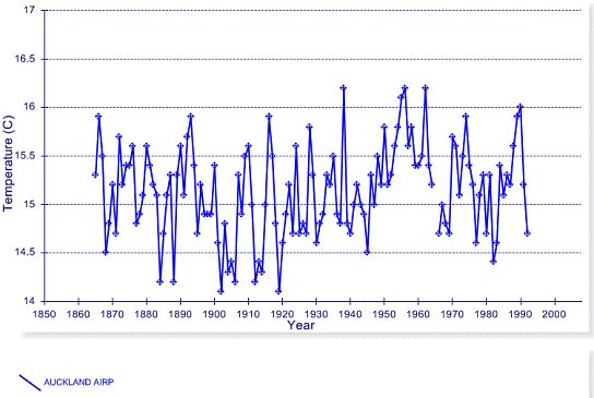
There is only one long-term station in this 5x5 degree grid: Auckland 931190 – the GHCN data for this station is shown in the next figure. There is no warming evident, and although the GHCN data ends in 1992, the station still reports data.
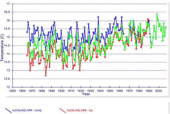
Comparing the GHCN Auckland data with the HadCRU grid shown previously – why does the HadCRU grid show warming when the only long-term station in the grid does not? -- adjustments.
The following figure superimposes the HadCRU grid on the GHCN Auckland data – the raw Auckland data is in blue, the NOAA adjusted Auckland data is in red and the HadCRU grid is in green. This gives an indication of the adjustments made by HadCRU – not as extreme as NOAA, but still inducing warming.
The temperature station was moved around the airport a couple of times in the 1960s and 1980s – so this may be the justification for the adjustments.
Grid: 35-40 S / 175-180 E
The following figure shows the HadCRU temperature anomaly graph for the 35-40 S / 175-180 E grid.
HadCRU has only one station listed in this grid:
933710 -39.5 -176.8 2 NAPIER NELSON PK NEW ZEALAND
The NOAA GHCN has data for this station only from 1950 to 1980.
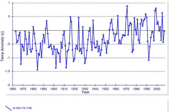
Grid: 40-45 S / 170-175 E
The following figure shows the HadCRU temperature anomaly graph for the 40-45 S / 170-175 E grid.
HadCRU lists the following stations in this grid:
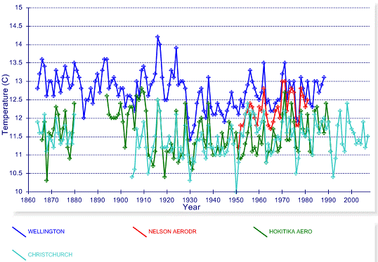
934340 -41.2 -174.8 125 WELLINGTON, KELBURN NEW ZEALAND 935450 -41.2 -173.1 2 NELSON A NEW ZEALAND 936150 -42.7 -170.1 39 HOKITIKA A NEW ZEALAND 937800 -43.5 -172.5 37 CHRISTCHURCH A NEW ZEALAND 937820 -43.5 -172.6 8 CHRISTCHURCH NEW ZEALAND **
Four of the above stations are in the NOAA GHCN database (all except 937820 indicated above with asterisks). The following figure shows the mean annual temperature from the GGHCN database.
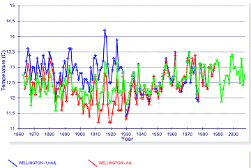
The following figures superimpose the HadCRU grid on the GHCN data for three locations – the raw NOAA data is in blue, the NOAA adjusted data is in red and the HadCRU grid is in green. This gives an indication of the adjustments made by HadCRU – not as extreme as NOAA, but still inducing warming that is not displayed in the raw data.
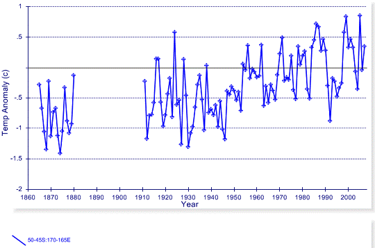
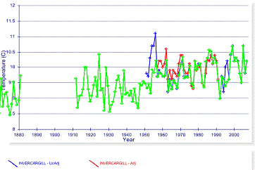
Grid: 45-50 S / 165-170 E
The following figure shows the HadCRU temperature anomaly graph for the 45-50 S / 165-170 E grid.
HadCRU has only one station listed in this grid:
938440 -46.4 -168.3 0 INVERCARGILL A NEW ZEALAND
The NOAA GHCN has data for this station only from 1950 to 2007. The following figure superimposes the HadCRU grid on the GHCN data for this location – the raw NOAA data is in blue, the NOAA adjusted data is in red and the HadCRU grid is in green.
Grid: 45-50 S / 170-175 E
The following figure shows the HadCRU temperature anomaly graph for the 45-50 S / 170-175 E grid.
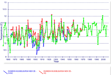
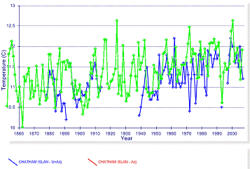
HadCRU lists the following stations in this grid:
938900 -45.9 -170.1 1 DUNEDIN A NEW ZEALAND 938940 -45.9 -170.5 2 DUNEDIN NEW ZEALAND 939870 -43.0 176.6 44 CHATHAM I WAITANGI NEW ZEALAND
Two of the above stations in the NOAA GHCN database have data going back to the 1800s. The following figures superimpose the HadCRU grid on the GHCN data for three locations – the raw NOAA data is in blue, the NOAA adjusted data is in red and the HadCRU grid is in green.
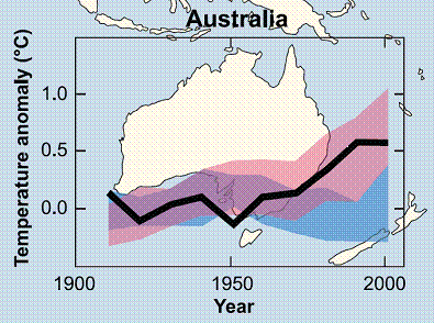
The following figure is from the IPCC AR4 (FAQ 9.2 Fig.1) and is the closest to New Zealand. The blue band shows the range of temperature outputs from the climate models including only natural forcings, while the pink band shows the range of temperatures from the models including anthropogenic CO2. It shows that the models deviate in the 1970s – prior to that there is significant overlap between the two sets. In other words, according to the IPCC, anthropogenic CO2 is only a factor in explaining temperatures after 1970.
The next figure shows the five 5x5 degree HadCRU grids in New Zealand showing the temperature anomalies from 1970 to 2007 – no warming in the last 37 years. All of the warming in the adjusted station data occurred prior to 1970. Perhaps there is a problem with the models.
The “New Zealand emissions trading scheme Q & A” article referred to previously stated: “In its chapter on the New Zealand and Australia region, the IPCC Fourth Assessment Report on Climate Change Impacts, Adaptation and Vulnerability confirmed that the effects of climate change are already being felt in New Zealand. Since 1950 there has been a 0.3–0.7˚C warming across the region as a whole, with more heat waves, fewer frosts, more rain in southwest New Zealand, less rain in northeastern New Zealand, a rise in sea level of about 70 mm, reduced seasonal snow cover, and ongoing glacial shrinkage.”
The “0.3–0.7˚C warming” since 1950 is based on carefully “adjusted” data and ignores the pre-1950 data.
|
|
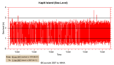
Sea Level
The IPCC also refers to “a rise in sea level of about 70 mm” (almost 3 inches). This matches the available studies of sea level in New Zealand, which find a long-term increase of 1.6 mm per year. However, that rate has been unchanging for more than 100 years. A study of New Zealand sea level change: “An updated analysis of long-term sea level change in New Zealand”, J. Hannah, University of Otago, New Zealand, Geophysical Research Letters, Vol. 31, L03307, 2004. [http://www.agu.org/pubs/crossref/2004/2003GL019166.shtml] states: “The original analysis of long-term sea level change in New Zealand is updated with a new and extended analysis … new data covering the period 1989–2000 has been added, and the sea level record for Wellington extended by the inclusion of recently discovered data covering the years 1891–1893... There continues to be no evidence of any acceleration in relative sea levels over the record period.”
The available sea level record at the NIWA climate explorer [http://edenz.niwa.co.nz/map/sealevel] provides the following figure for the station near Wellington for the last 30 years.
|
|
Glaciers
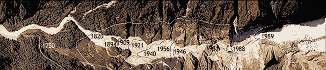
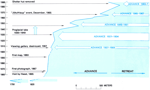
New Zealand’s main glaciers – the Franz Josef and Fox glaciers have been advancing since the mid-1980s. The following two figures show the retreat of the Franz Josef glacier – the first showing the glacier front in various years and the second showing the rates of advance and retreat over the years. [http://pubs.usgs.gov/pp/p1386h/nzealand/nzfig13.html]
A 1999 study of NZ’s glaciers (“New Zealand glacier response to climate change of the past 2 decades”, T.J. Chinn) [http://www.sciencedirect.com/science?_ob=ArticleURL&_udi=B6VF0-3YHWS3C&_user=10&_rdoc=1&_fmt= &_orig=search&_sort=d&view=c&_acct=C000050221&_version=1&_urlVersion=0&_userid=10 &md5=bbbe432f07a9aad52520ede80089f16c] states: “Oblique aerial photography of 111 glaciers during the past 2 decades has recorded a reversal of the past century glacier-recession trend. Cirque glaciers show little response to the recent mass balance increase; mountain glaciers show visible advances. Some valley glaciers have advanced, some have thickened in the upper trunk, and the larger ones and those with proglacial lakes continue to recede. The shift to advance is driven by an average lowering of snowlines of 67 m, equivalent to a cooling of 0.47°C if other factors are held constant.”
|
|
Taxes and CO2
The New Zealand government published a lengthy summary of the upcoming taxes: “New Zealand’s climate change solutions: An overview” Sept 2007 [http://www.climatechange.govt.nz/files/NZ-Climate-Change-Solutions.pdf] This document states: “Globally, about 20 per cent of carbon dioxide equivalent emissions into the atmosphere come from deforestation. In New Zealand, deforestation of plantation forests has increased rapidly in recent years and this is expected to continue unless measures are introduced to actively manage the process.”
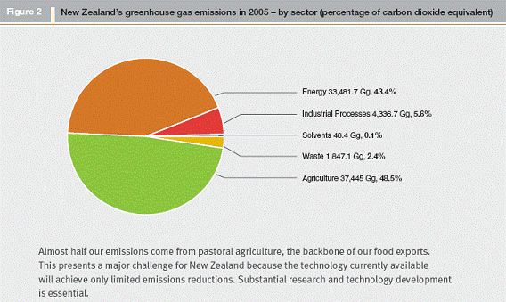
The following figure is from the same report showing that agriculture is the largest area of CO2 emissions in New Zealand. The report also states that there are currently insufficient technological solutions to be able to significantly reduce the agriculture emissions.
The NZ government report on the new emissions trading scheme provides further insight on the above [http://www.climatechange.govt.nz/files/emissions-trading-scheme-complete.pdf]: “Nearly 49 per cent of New Zealand’s greenhouse gas emissions result from agriculture (excluding agricultural energy use), contrasting with an average of 12 per cent in other developed countries. New Zealand also has significant emissions from the deforestation of forests planted before 1990, while emissions from the future harvesting of land afforested since that date are forecast to rise sharply during the decade from 2020 to 2030. On the other hand, New Zealand’s energy sector contributes 43 per cent of total emissions, which is low relative to other developed countries. This is because approximately 69 per cent of our electricity is generated from renewable sources, such as hydro, geothermal, wind, solar, biogas and wood. However, energy emissions from transport, which currently account for 19 per cent of total emissions and 45 per cent of energy emissions, are forecast to increase steadily.”
Forestry (included in agriculture in the graph above) is important for New Zealand, as indicated in the following parliamentary exchange [http://theyworkforyou.co.nz/portfolios/forestry/2007/sep/18/o01]:
Hon Dr Nick Smith (Nelson): Is the Minister aware that of New Zealand’s 40 million tonnes of projected Kyoto carbon liability, 34,000 tonnes—or 85 percent of that—is from deforestation [emphasis added]; and does he agree with John Key that the No. 1 priority of any climate change policy should be reversing that deforestation?
Hon Jim Anderton (Minister of Forestry): I certainly recognise the issue of deforestation and the Kyoto regime, and its impact there… [Answer to another question] … Forestry is our third-largest export earner and directly employs more than 22,000 people, so it plays an important role in New Zealand’s economy.
The New Zealand forestry companies should be pleased with the CO2 emissions trading scheme in being paid to plant trees and achieve carbon credits they can sell to emitters, since after years of disagreement with the government over who receives the credits (resulting in increased deforestation), the new emissions trading scheme allocates units to forestry. Although it may not reduce deforestation in some areas since [http://www.nzherald.co.nz/section/1/story.cfm?c_id=1&objectid=10429169]: “with returns for dairying far more attractive in the past decade than those for logs, conversion into pasture has been accelerating.”
In summary: a country that emits a very small amount of greenhouse gases from a global perspective and is so far experiencing no climate change, will increase its own energy costs because: “Just about everything we need to do in the name of climate change we want to do anyway.” -- according to Hon. David Parker, Minister Responsible for Climate Change Issues.
|
|
|