Global Warming Science - www.appinsys.com/GlobalWarming
California
[last update: 2010/09/22]
|
Temperatures
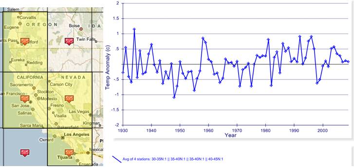
The following figure shows the average annual temperature anomalies for the average of the four 5x5 degree grids covering California for 1930 – 2009 (indicated in yellow on the map).
This 5x5 degree gridded data is from the Hadley/Climatic Research Unit (CRU) CRUTEM3 database (IPCC uses CRU data), plotted at: [http://www.appinsys.com/GlobalWarming/climate.aspx]
The warmest year was 1934. There has been no statistically significant warming over the last 80 years.
|
|
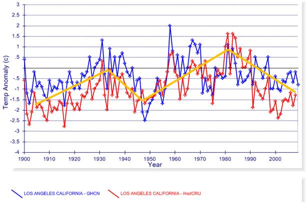
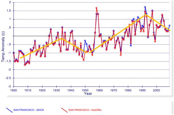
Los Angeles and San Francisco
The following figures compare the NOAA GHCN (blue) and HadCRU (red) average annual temperature anomalies for Los Angeles and San Francisco for 1900 to 2009.
Los Angeles: There has been net cooling for the last 30 years.
San Francisco: There has been net cooling for the last 20 years.
|
|
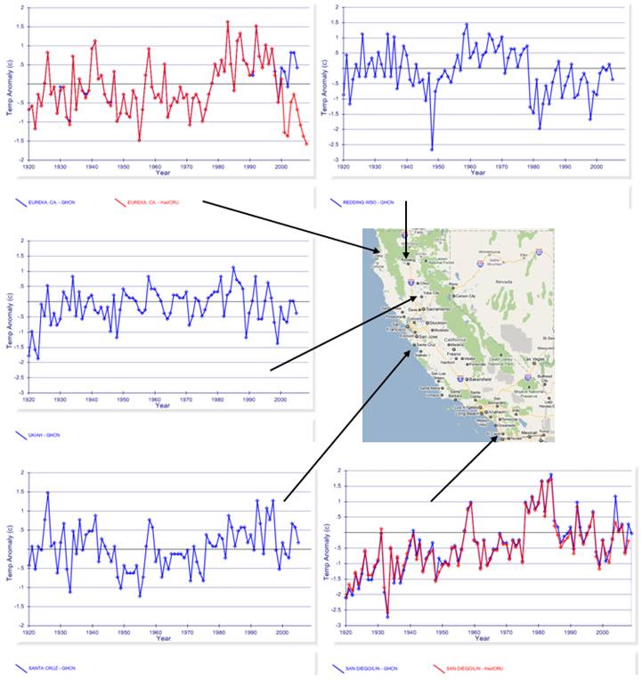
Various Cities
The following figure shows the NOAA GHCN (blue) (and HadCRU when available for the same location - red) average annual temperature anomalies for various cities in California for 1920 to 2009.
Some warming occurred in San Diego earlier in the 20th century prior to the era attributed to CO2, but it has been cooling for the last 30 years. Other cities shown above have no net warming trend over the last 80 years.
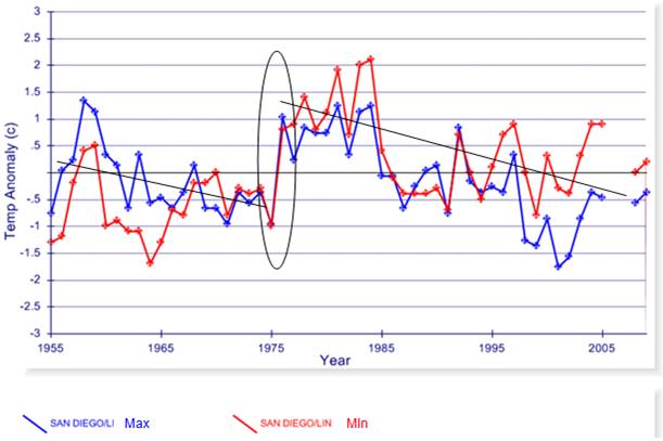
San Diego has had a cooling summer trend for the last 50 years. The following figure shows the annual average maximum and minimum temperature for San Diego from the NOAA GHCN database for 1955 - 2009. The effect of the 1976 Pacific climate shift is clearly observable - there are cooling trends before and after. The maximum temperature (blue) has been cooling more rapidly than the minimum temperature (red).
(See: http://www.appinsys.com/GlobalWarming/SanDiego.htm for more info on the cooling summer trend in San Diego)
|
|
Urban Heat
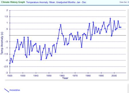
The urban heat island effect happens in cities due to increased paved areas over time, which retains heat and cause an increase in the average temperature by increasing the nighttime and winter temperatures. Pasadena is one location that exhibits a strong urban heat island trend. The following figure shows the average annual temperature anomalies for Pasadena from the GHCN database.
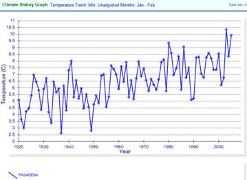
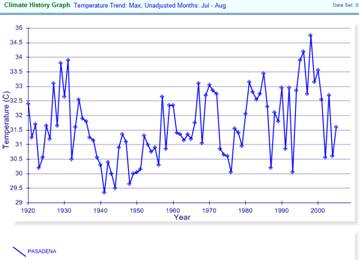
The following figures compare the average minimum temperature for January – February (left) and the average maximum temperature for July – August (right) for Pasadena. The winter minimum temperatures have increased, whereas there is no significant trend in the summer maximum temperatures. This is an indication of urban heat.
A 2008 study reported by NASA’s JPL of summer temperatures in Los Angeles [http://climate.jpl.nasa.gov/news/index.cfm?FuseAction=ShowNews&NewsID=24] states: “One hundred years of daily temperature data in Los Angeles were analyzed by scientists at NASA's Jet Propulsion Laboratory, Pasadena, Calif.; the University of California, Berkeley; and California State University, Los Angeles. They found that the number of extreme heat days (above 90 degrees Fahrenheit or 32.2 degrees Celsius in downtown Los Angeles) has increased sharply over the past century. … Most of the increase in heat days and length of heat waves, however, is due to a phenomenon called the "urban heat island effect."
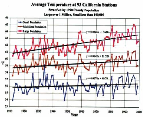
The following figure shows the annual average temperature for 93 stations in California, grouped by population [http://wwa.colorado.edu/colorado_river/docs/Colorado_River_Basin_Climate.pdf] The cited report states: “Counties with large populations show more warming than rural counties due to the urban heat island influence.”
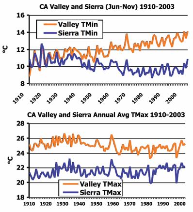
In 2006 John Christy (Professor of Atmospheric Science, University of Alabama in Huntsville) published a study of California Central Valley temperatures: “the nighttime temperatures in the 18 Valley stations were warming rapidly, about 6°F in summer and fall, while the same daytime temperatures fell about 3°F. This is consistent with the effects of urbanization and the massive growth in irrigation in the Valley. The real surprise was the composite temperature record of the 23 stations in the central Sierra foothills and mountains. Here, there was no change in temperature. These results did not match the results given by climate models specifically downscaled for California where the Sierra’s were expected to have warmed more than the Valley over this period” [http://www.nsstc.uah.edu/atmos/christy/ChristyJR_07EC_subEAQ_written.pdf]
The following figure is from John Christy’s 2009 testimony to congress [http://www.nsstc.uah.edu/atmos/christy/ChristyJR_WM_Written_090225.pdf], in which he stated: “Temperature change in Central California for the nighttime (TMin) temperatures in the developed Valley (orange) and the adjacent undeveloped Sierra (blue). Note the rapid rise in nighttime temperatures in the Valley as agriculture and urbanization occurred. Bottom: Daytime (TMax) temperatures in the Valley (orange) and Sierra (blue) showing almost identical trends near zero change. This study shows that using nighttime temperatures from stations where development has occurred leads to a spurious warming signal. The popular surface datasets today use the average of the day and night temperatures, thus are influenced by this warming that is unrelated to CO2. If daytime temperatures, which are much more representative of the atmosphere as a whole, are used then there has been no warming in Central California since 1910 according to these results (nor in Alabama nor East Africa).”
|
|
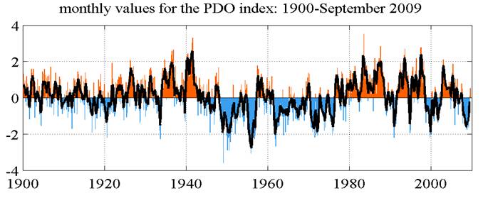
Pacific Decadal Oscillation
The west coast of the United States is highly influenced by the Pacific Decadal Oscillation (PDO). The following figure shows the PDO through September 2009 [http://jisao.washington.edu/pdo/]
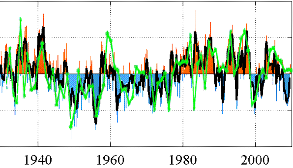
The following figure superimposes the Hadley CRUTEM3 average California temperature data (shown at the start of this document) changed to green, on the PDO shown above. While CO2 continues to simply increase, the California temperature follows the trend in PDO.
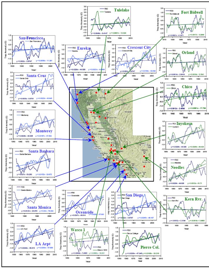
The following figure plots coastal and rural California stations showing the temperature (light blue or green) compared to the PDO (dark blue). [http://scienceandpublicpolicy.org/images/stories/papers/originals/pacific_decadal.pdf]
For more info on the PDO and the effects on California fisheries see: http://www.appinsys.com/GlobalWarming/PDO.htm
|
|
Precipitation
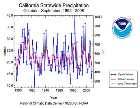
The following figure shows California statewide precipitation through 2008 [http://www.ncdc.noaa.gov/img/climate/research/2008/ann/Reg004Dv00Elem01_10092008_pg.gif]
Recent drought is similar to the 1930s.
Current info sites: California reservoir water levels: http://cdec.water.ca.gov/cgi-progs/products/rescond.pdf California mountain snowpack: http://cdec.water.ca.gov/cdecapp/snowapp/sweq.action
|
|
Sea Level
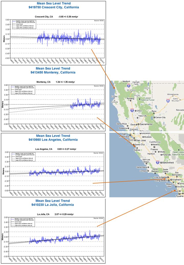
The following figure shows sea level trends at various locations in California [http://tidesandcurrents.noaa.gov/sltrends/index.shtml] The trends vary widely from a decreasing trend (-0.65 mm / year) in the north to 2 mm / year increase in the south. The rate of increase has slowed in recent years at locations that have an increasing trend.
|
|
See also: http://www.appinsys.com/GlobalWarming/CaliFog.htm examining the California fog alarm.
See also: http://www.appinsys.com/GlobalWarming/SanDiego.htm examining the cooling trend in San Diego and correspondence to the PDO
|
|
|