New York City
The following figure shows the annual mean temperature for New York City – Central Park from the NOAA Global Historical Climate Network database. Over the long term it exhibits warming – due to the increased urbanization of NYC over the last 150 years. This graph includes only years with data in all 12 months of the year – thus 1991 is not plotted since February is missing from the database.
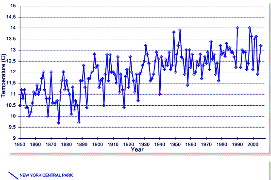
The above figure indicates two general temporal climatic regimes – increasing temperature from the 1800s to 1953, followed by a greatly reduced trend of increase.
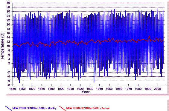
The following figure compares the annual mean temperature (in red – same data as shown above) with the monthly data (blue). This shows that most of the variation occurs in the winter months.
The following figure shows the same data as the previous figure but zoomed in to show only 1970 to the present. The warmest year in the annual average (1991) was warmer mainly because February is missing from the data.
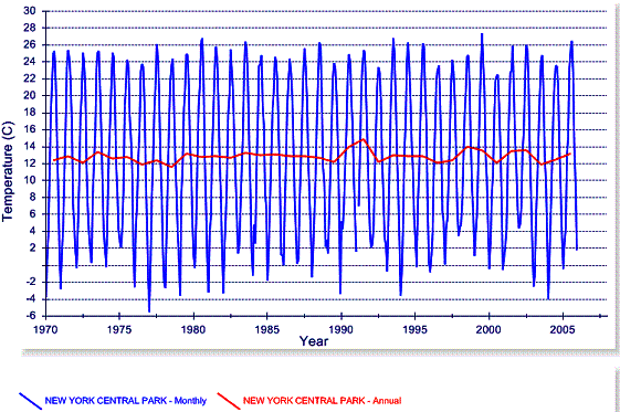
The above figure indicates that while the average annual temperature since 1970 has been fluctuating within the 12 – 14 degree C band, there is no warming trend for this period. The monthly data shows that any slight warming trend is due to reduced winter temperatures rather than increased summer temperatures – indicative of urban warming. The fact that the warming trend observed from the 1800s to the 1950s then flattened out is significant –according to the IPCC’s climate models, the effect of anthropogenic CO2 based warming is only observable after 1970. Warming prior to that is explained by natural factors (see www.appinsys.com/GlobalWarming/GW_Nutshell.htm).
The following figure shows the annual mean temperatures for the four closest rural stations to New York City that have long-term data in the NOAA GHCN database. No warming trend is evident at rural locations.
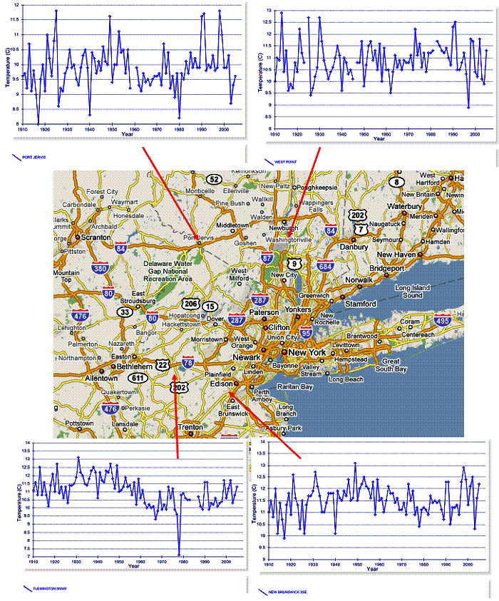
The above NOAA GHCN temperatures for New York City and nearby rural stations indicate that no warming trend is evident in the data for the area.
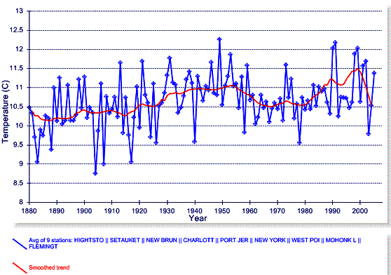
The following figure shows the average of 9 stations including New York Central Park plus the 8 nearest long-term stations designated as rural in the NOAA GHCN database (the red line is a smoothed trend line).
