Global Warming Science - www.appinsys.com/GlobalWarming
Global Warming is Not Global
[last update: 2010/03/20]
The IPCC portrays the warming as global – but it is not.
Many reports quote the IPCC global trend as if it applies locally – but it does not.
[last update: 2010/03/20] – February 2010 satellite data
|
Global Satellite Data
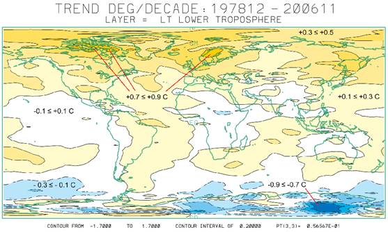
The following figure shows the global temperature change from 1978 to 2006 for the lower troposphere from satellite data [http://climate.uah.edu/25yearbig.jpg].
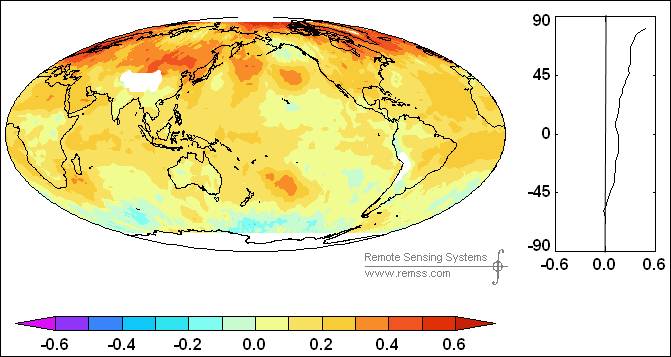
The following figure shows a more recent satellite data trend from the RSS analysis 1979 - 2008 [http://www.ssmi.com/msu/msu_data_description.html]. The left-hand figure shows regional warming around the world, the right-hand figure shows the average warming by latitude – zero warming at 60 degrees S with increasing warming into the Arctic. This illustrates that recent warming is a northern hemisphere phenomenon.
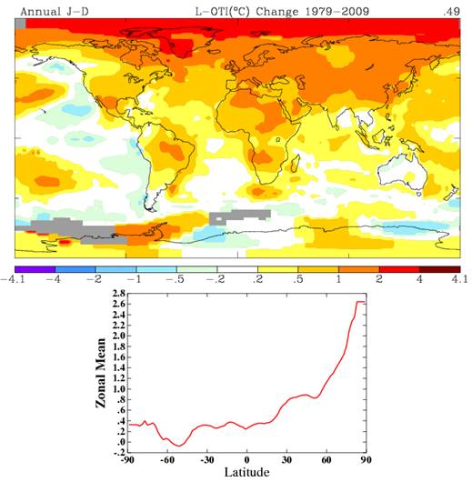
The following figure shows the temperature change from 1979 – 2009 from the GISS temperature data (including all the adjustments) [http://data.giss.nasa.gov/cgi-bin/gistemp/do_nmap.py?year_last=2010&month_last=2&sat=4&sst=1&type=trends&mean_gen=0112 &year1=1979&year2=2009&base1=1951&base2=1980&radius=1200&pol=reg]
The graph of “Zonal Mean” above, shows the variation by latitude showing that it is a northern hemisphere and mainly Arctic phenomenon.
|
|
IPCC AR4 Report
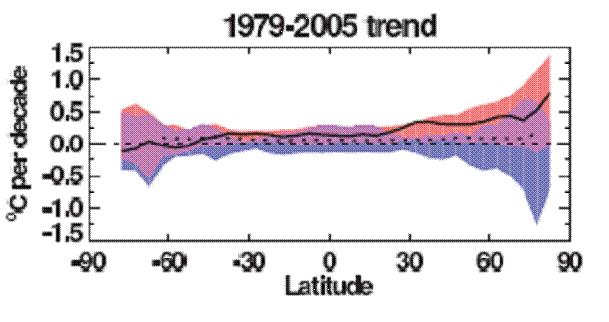
The following figure is from the IPCC Fourth Assessment Report (AR4) Figure 9.6 (2007). It shows the change in temperature (C per decade) by latitude. The black line shows the observed temperature, the blue band shows the output of the computer models including only natural factors, whereas the pink band shows the output of computer models including anthropogenic CO2. Notice that the models without CO2 (blue shaded area) can explain all of the warming for most of the world up to 30 degrees north latitude. This figure also shows cooling in Antarctica with warming increasing in the Arctic.
|
|
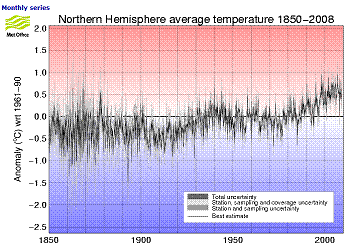
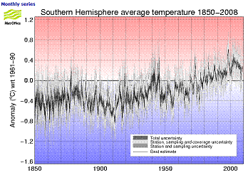
Hadley Center Data
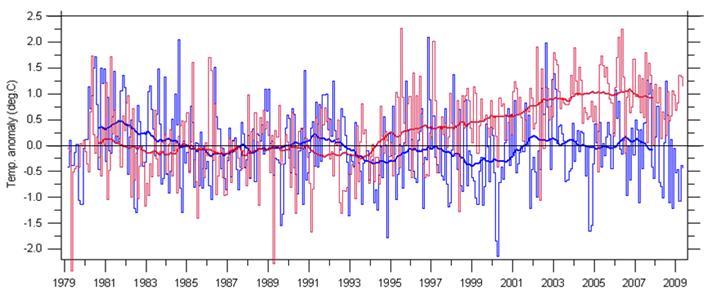
The following figures show the average temperature anomalies for the northern (left) and southern (right) hemispheres from the UK Met Office Hadley Center HadCRUT3 data used by the IPCC (note that the temperature y-axis scales are different). [http://hadobs.metoffice.com/hadcrut3/diagnostics/index.html]
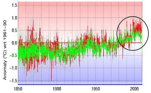
The following figure compares the northern (red) and southern (green) hemispheres from the above figures put to a common scale.
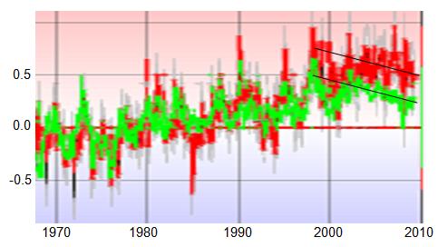
The following figure shows a close up of the above figure for temperatures since 1970 (1970 was chosen since the IPCC states that the warming prior to then was from natural causes). Both hemispheres have exhibited slight cooling for the last decade although the cooling trend is more distinct for the southern hemisphere, which never had as much warming. Since 1970 when the IPCC attributes the start of warming due to CO2, the northern hemisphere has warmed about 0.5 degrees C, while the southern hemisphere has warmed only half as much.
|
|
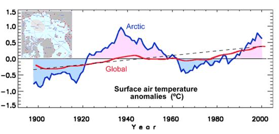
An Arctic Phenomenon
The following figure compares the Arctic temperature trends with global temperature trends. [http://research.iarc.uaf.edu/multidecadal_variability/ocean.php] Two observations are evident from this graph: the recent Arctic warming is not unprecedented, and the Arctic warming is much greater than the global warming.
|
|
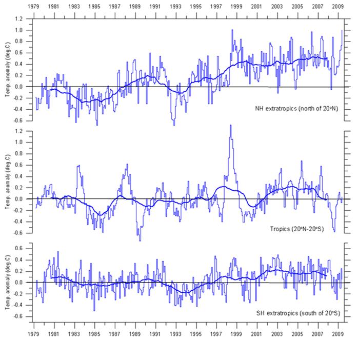
Comparison of Northern Hemisphere / Southern Hemisphere / Tropics
The following figure shows the global average lower troposphere temperature (near the Earth’s surface) from satellite data, for the northern hemisphere (north of 20N), the tropics (20N – 20S) and the southern hemisphere (south of 20S) (figure from http://climate4you.com/). [Satellite data is more reliable than averages of surface stations, but is only available since 1979 - which covers most of the period that the IPCC says exhibits warming due to CO2.]
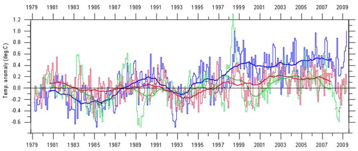
The following figure combines the above three graphs, showing the northern hemisphere, tropics and southern hemisphere. The northern hemisphere has warmed about 0.5 degrees C, while the southern hemisphere has warmed about 0.1 C and the tropics show no net warming over the 30 years of available satellite data.
|
|
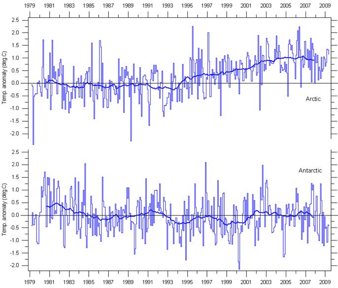
Comparison of Arctic / Antarctic
The following figure shows the global average lower troposphere temperature (near the Earth’s surface) from satellite data, for the northern and southern polar regions (figure from http://climate4you.com/).
The following figure combines the above two graphs, showing the northern polar (Arctic) and southern polar (Antarctic) regions. The northern polar region has warmed about 1.0 degrees C, while the southern polar region has not warmed at all over the 30 years of available satellite data.
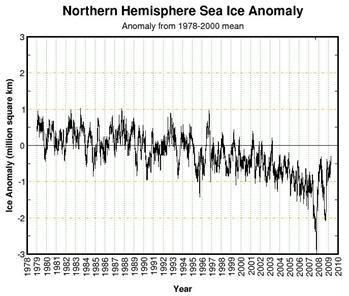
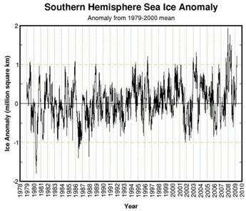
The ice extent in the Polar Regions has been measured since 1979 – the start of the satellite era for earth measurements. The following figures show sea ice extent anomalies for the Arctic (left) and Antarctic (right) to March 2009 [http://arctic.atmos.uiuc.edu/cryosphere/]
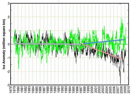
The following figure overlays the Antarctic ice anomalies (green) from above, on the Arctic ice anomalies (black) from above. A polar divergence began around 1998 (when the major El Nino of 1997-98 occurred). The divergence is due to divergence in sea surface temperature trends as shown in the next section.
|
|
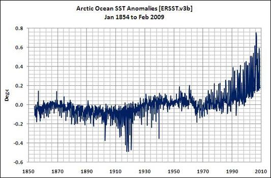
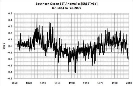
Polar Sea Surface Temperatures
The following figures show sea surface temperature anomalies for the Arctic (65N-90N, top) and Antarctic (60S-90S, bottom) to Feb 2009 [http://bobtisdale.blogspot.com/2009/03/knmi-added-ersstv3b-data-to-climate.html]
|
|
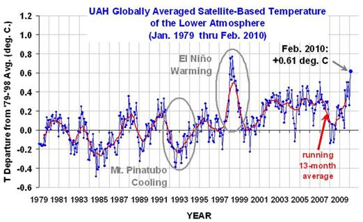
February 2010 Satellite Data – Global Warming is Not Global
This example is based on a Roger Pielke posting: http://pielkeclimatesci.wordpress.com/2010/03/19/an-example-of-why-a-global-average-temperature-anomaly-is-not-an-effective-metric-of-climate/
February 2010 was reported to have the warmest global average February anomaly since satellite data began in 1979, as shown in the following figure from http://www.drroyspencer.com/latest-global-temperatures/
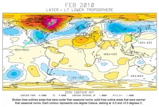
As shown in the following figure, most of the world had normal (white, light yellow) or below normal (blue shades) temperatures. The global average is affected by one small area of the Arctic having much higher than normal temperatures.
|
|
Conclusion
Conclusion: The empirical data show that warming in recent decades is a northern hemisphere phenomenon – in particular an Arctic phenomenon –with no significant warming in the tropics or southern hemisphere.
It is not a global phenomenon.
|
|
Medieval Warm Period
The IPCC / CRU has gone to considerable effort to eradicate the Medieval Warm Period (MWP), as well as to deny that it was global. CRU’s Phil Jones stated: “if the MWP was shown to be global in extent and as warm or warmer than today … then obviously the late 20th century warmth would not be unprecedented.” This is a red herring since the late 20th century is also clearly not global.
See: http://www.appinsys.com/GlobalWarming/MWP_Globality.htm for details related to this.
|