Tennessee, USA
Tennessee is in a region of the United States that exhibits no substantial long-term warming. Recent warming is less than in the 1920s – 1930s. But the alarm has sounded! The National Conference of State Legislatures is preparing an alarmist report on each state in terms of “Climate Change and the Economy”. The report on Tennessee states: “Since 1955, the average temperature in the southeastern United States has risen almost 1.8 F. Models predict that, if global greenhouse gas emissions continue at the current rate, the temperature in Tennessee could increase by 6.3 degrees F. Scientists predict that temperatures in Tennessee, like those in most mid-latitude regions, will increase more than the global average. … Higher temperatures and altered precipitation patterns could lead to an increase in drought, flooding and extreme weather events.” [http://www.ncsl.org/print/environ/ClimateChangeTN.pdf]
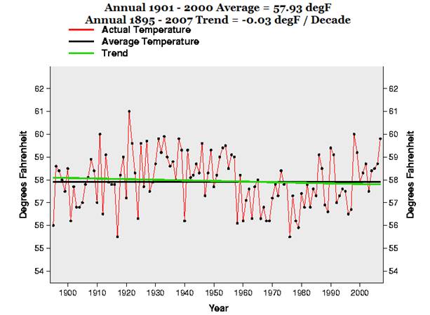
The following figure shows the Tennessee average annual temperatures from 1895 to 2007 from the National Climatic Data Center (NCDC) [http://climvis.ncdc.noaa.gov/cgi-bin/cag3/hr-display3.pl]. So the National Conference of State Legislatures report is correct that temperatures have risen since 1955 – but what a way to exaggerate – ignore the previous 60 years of data, which altogether tells a very different story. If the warming since 1955 is due to anthropogenic CO2, Tennesseans better be grateful that Al Gore spews so much of it – the cooling trend for the previous 30 years was more than 1 degree per decade.
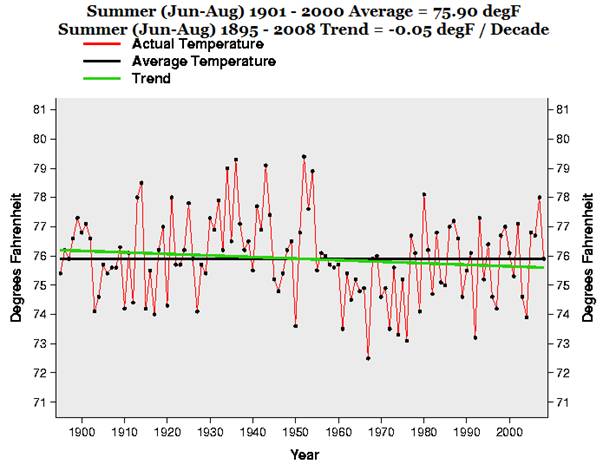
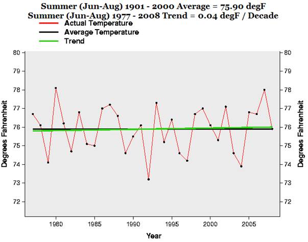
The National Conference of State Legislatures (NCSL) report also states: “Tennessee could experience a range of health effects due to climate change, since higher temperatures increase the production of pollutants such as ozone and smog, which worsen asthma and other respiratory conditions.” These types of issues are more common in the summer. The following figure shows the Tennessee average summer temperatures (June to August) from 1895 to 2007 from the NCDC. Well, I wonder what the NCSL is talking about? The second figure below shows the summer temperatures for the last 30 years – showing that the warming is close to zero!
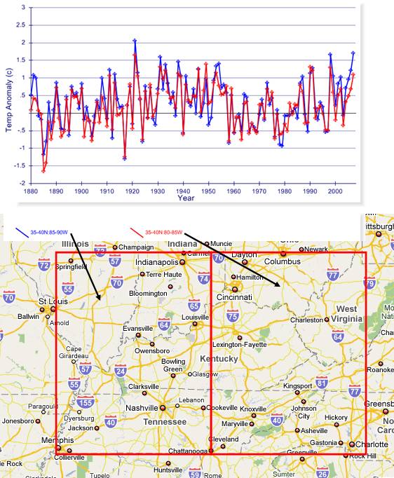
The following figure shows the temperature anomalies for 1880 to 2007 for the two 5x5 degree grids covering Tennessee (35-40 N latitude x 80-85 W longitude and 35-40 N x 85-90 W) from the HadCRU data used by the IPCC. Similar to the NCDC data, the recent period is not as warm as the 1930s-1940s.
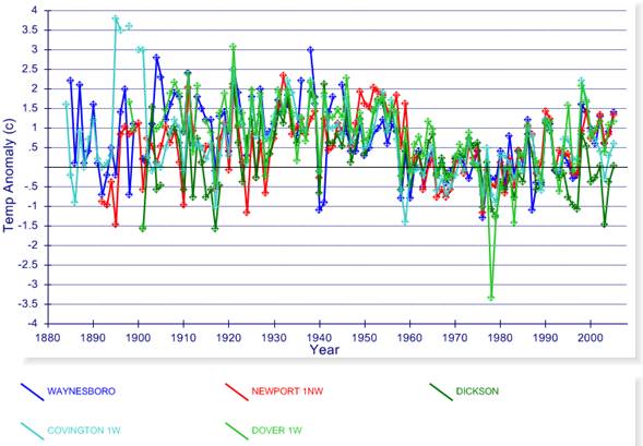
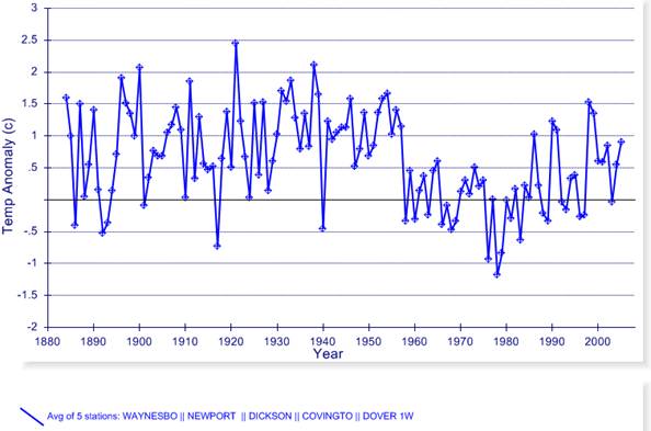
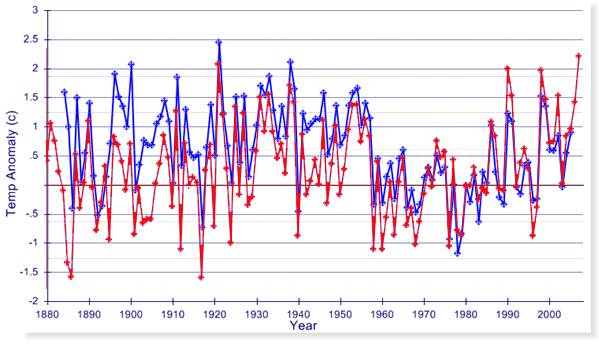
The following figure shows the annual mean temperature anomalies from 1880 to 2007 for the long-term rural temperature stations in Tennessee from the NOAA Global Historical Climate Network. Tennessee is not exhibiting unprecedented warming. The second figure below shows the average of the five stations.
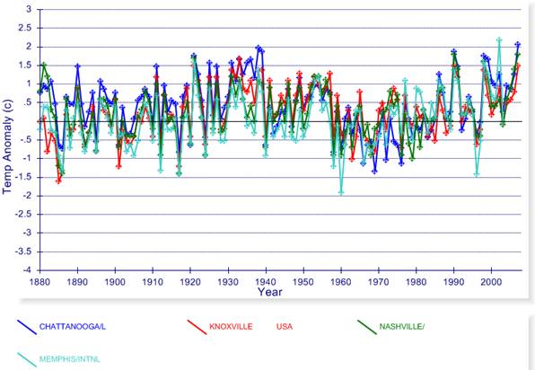
The following figure shows the annual mean temperature anomalies from 1880 to 2007 for the long-term urban temperature stations in Tennessee from the NOAA Global Historical Climate Network. The second figure below shows the average of the four stations.
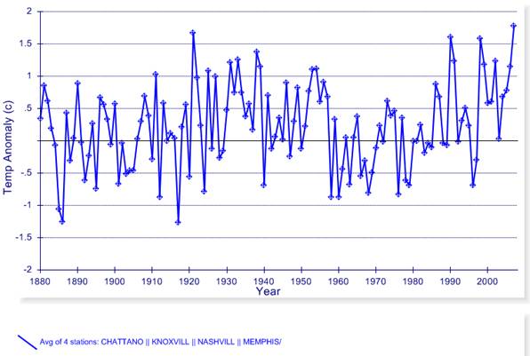
The following figure compares the rural station average from above (blue) with the urban station average from above (red). This clearly shows the clear effect of UHI (Urban Heat Island) – warming occurring in urban areas.
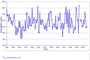
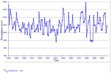
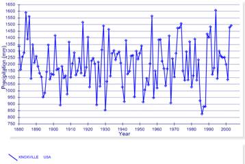
The following figures show total annual precipitation from 1880 to 2007 for a few locations in Tennessee from the NOAA GHCN database. No significant trends are exhibited in the data.
Chattanooga: Nashville:
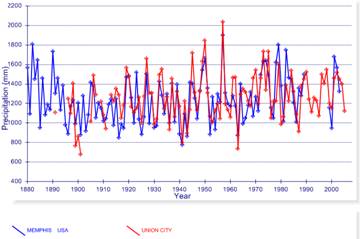
Knoxville: Memphis & Union City:
The following figure shows the Tennessee total annual precipitation from 1895 to 2007 from the National Climatic Data Center.
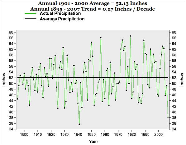
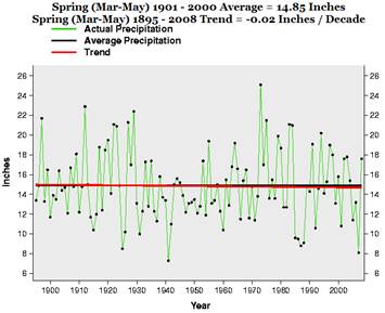
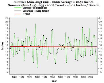
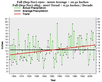
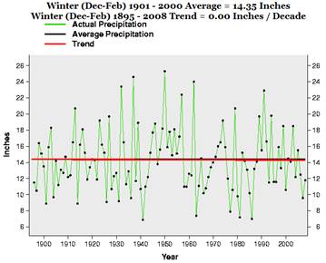
The National Conference of State Legislatures (NCSL) report states in the conclusion: “Since the likelihood of flooding is predicted to increase, policymakers can promote additional state-specific research on potential precipitation changes. ... Revisiting and modifying zoning and development in susceptible areas could be helpful in avoiding flood-related disasters and their associated costs.” The following figures show precipitation by season (NCDC database) – the only increasing trend is in the fall – the least rainy season.
Given the actual data for Tennessee, the NCSL report is ridiculous. It contains many statements about what “might” happen – but the empirical data shows no need for alarm.