New England Area, USA
The following figure shows several long-term temperature stations from the NOAA Global Historical Climate Network (GHCN). The graphs show annual mean temperature from 1880 to the present. The red rectangle indicates the 40-45 N / 70-75 W 5x5 degree grid encompassing the area.
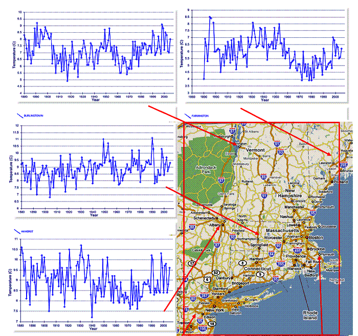
See also www.appinsys.com/GlobalWarming/NewYorkCity.htm for a look at stations within the New York City area.
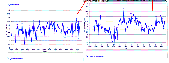
Although the rural stations in the area generally show no long-term or unprecedented warming trend, there is commonly a significant difference between rural and urban stations. The following figures provide two examples comparing urban and nearby rural stations.
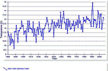
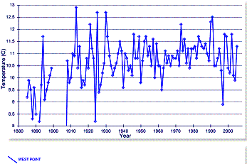
Urban: New York Central Park, NY (left) / Rural: West Point, NY (right)
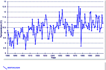
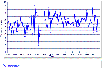
Urban: Boston Logan, MA (left) / Rural: Cooperstown, MA (right)
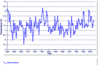
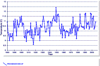
Some urban stations exhibit no long-term or unprecedented warming. The following graphs show Portland ME (left) and Providence, RI (right).
It is important to keep in mind that according to the IPCC’s climate models, the effect of anthropogenic CO2 based warming is only observable after 1970. Any observed warming prior to that is explained by natural factors (see www.appinsys.com/GlobalWarming/GW_Nutshell.htm).
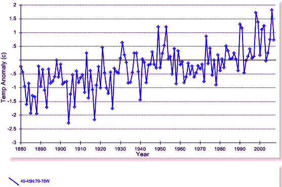
The following figure shows the historical temperature anomaly data for the 5x5 degree grid that encompasses the New England area, from the Hadley Climatic Research Unit (HadCRU) data. HadCRU provides temperature data to the IPCC. They collect data from the NOAA database and other data and then make adjustments to the individual stations before calculating the temperature anomalies and averaging them by 5x5 degree lat-long grids. (Unfortunately, as an anomaly to the scientific process, they do not make the individual station data available so that the station adjustments can be examined, they only publish the averaged 5x5 degree gridded data.) This is the 5x5 grid data that goes into the global average calculations.
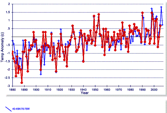
Although HadCRU includes about 79 stations in the 40-45 N / 70-75 W grid data shown in the above figure, it looks remarkably like the New York City – Central Park station. The following figure superimposes the New York City – Central Park station (red) on the 40-45 N / 70-75 W grid shown above (blue). It is hard to believe that the average of all the stations including the rural stations shown previously end up with virtually the same trend as New York City.
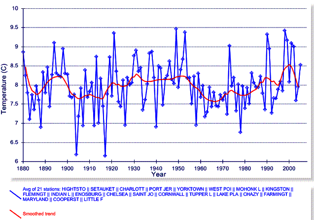
The following figure shows the average of all 21 long-term stations designated as rural in the NOAA GHCN database in the 40-45 N / 70-75 W grid (the red line is a smoothed trend line). This tells a very different story than the HadCRU data. There seems to be a problem with HadCRU misrepresenting the data going into the global average – they are not removing the urban heat effect.
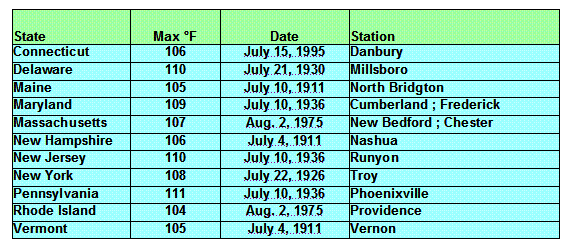
The following table shows the maximum temperatures recorded for each of the New England states, as well as a few nearby states [http://ggweather.com/climate/extremes_us.htm].