Colorado State Warming
How is global warming affecting the state of Colorado?
The following figure shows IPCC AR4 Fig. 9.6: Observed Temperature Trend 1901 – 2005 with the approximate position of Colorado outlined by the blue box.
![]()
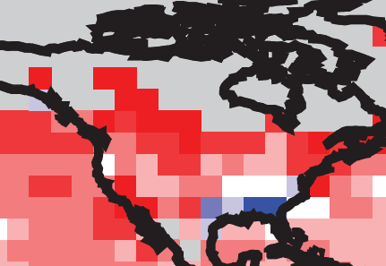
IPCC AR4 Fig. 9.6: Observed Temperature Trend 1901 - 2005
IPCC shows significant warming. Here are a few temperature stations in the NOAA GHCN database.
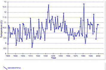
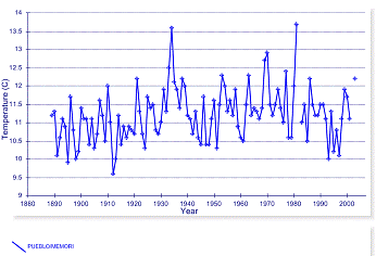
A couple of urban stations - Denver and Pueblo:
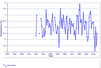
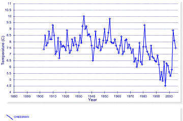
A couple of rural stations – Del Norte and Cheesman:
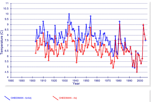
But wait! Is that warming I see?
In an attempt to create warming, the “homogeneity” adjustments for Cheesman drop the older temperatures by about 1 degree. NOAA! Up to your old tricks again.
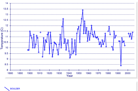
Of course, boulder is unique: The City of Boulder web site: “Boulder voters pass first energy tax in the nation: … City of Boulder voters approved Initiative 202, the Climate Action Plan Tax, on Tuesday, making this the first time in the nation that a municipal government will impose an energy tax on its residents to directly combat global warming. The tax will be collected by the local electric utility company based on the amount of electricity used…This energy tax is also referred to as a carbon tax... The average household will pay $1.33 per month and an average business will pay $3.80 per month. The tax will generate about $1 million annually through 2012 when the tax is set to expire.“ [http://www.ci.boulder.co.us/index.php?option=com_content&task=view&id=6136&Itemid=169].
The following figure shows the NOAA GHCN temperature data for Boulder (years with less than 10 months of data in the database are left out). Taxing energy for efficiency / renewable incentives is one thing, but being honest about the reason should be part of the integrity of the process.
The 2008 Democratic National Convention took place in Denver August 25-28. This is an historical event from the perspective that it is the first time that a national presidential candidate convention has had an “Official Carbon Advisor”. In fact the DNCC is planning the “Most Sustainably-Produced Democratic Convention in American History” [http://www.camcoglobal.com/cmsAdmin/uploads/DNCC-Camco_-_Press_Release_3_6_08_(5)-FINAL.pdf], and have hired the first ever Director of Greening for a Democratic Convention. As the Official Carbon Advisor, Camco Global will “work with the DNCC to estimate the Convention's carbon footprint.” Who is Camco Global? One of Al Gore’s investments, of course.
The following figure shows the historical temperature anomaly data for the Denver area from the Hadley Climatic Research Unit (HadCRU) data. HadCRU provides temperature data to the IPCC. They collect data from the NOAA database and other data and then make adjustments to the individual stations before calculating the anomalies and averaging them by 5x5 degree lat-long grids. (Unfortunately, as an anomaly to the scientific procedure, they do not make the station data available so that the adjustments can be examined, they only publish the averaged 5x5 degree gridded data.)
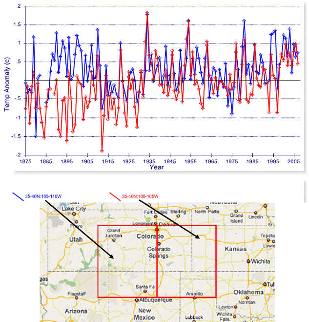
Denver is at 105 degrees W longitude, so the following figure includes both 5x5 degree grids bordering 105W. One grid shows that current temperatures are similar to the late 1800’s. Both grids show that the warmest temperatures occurred in the 1930s-1940s.
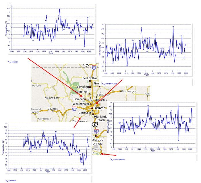
The following figure shows several temperature stations in the Denver area from the NOAA Global Historical Climate Network database. No consistent trends – and no global warming.
The National Conference of State Legislatures is preparing a report on each state in terms of “Climate Change and the Economy”. Reports on several states have been produced, with Colorado being one of the initial reports. [http://www.ncsl.org/print/environ/ClimatechangeCO.pdf]
>>“During the last 50 years, Colorado has experienced rising temperatures, increased precipitation, and altered surface water flow as a result of climate change. The state on the whole has warmed faster than the U.S. average, with more dramatic temperature increases seen at higher altitudes.”<<
Global warming alarmists typically use short-term based statements such as “during the last 50 years” in order to try to get a more dramatic trend. However, this analysis will use the context of the available long-term data since climatic parameters fluctuate on a multi-decadal timeframe.
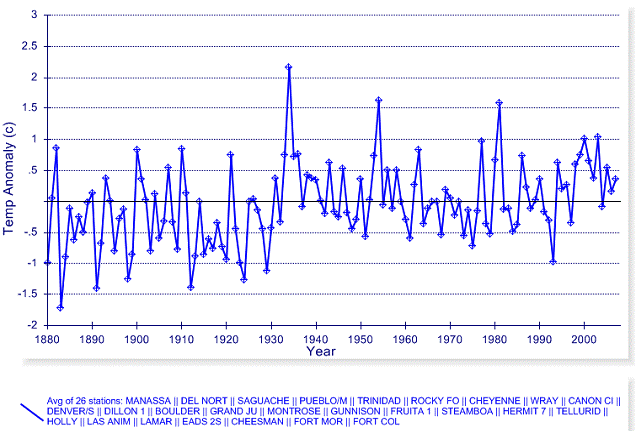
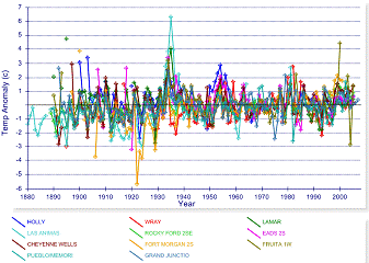
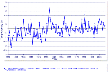
There are 26 temperature stations in the NOAA Global Historical Climatic Network (GHCN) within the state of Colorado that have data from prior to 1930 continuing past 2000. The following figure shows the average of the annual mean temperature anomalies for all 26 stations.
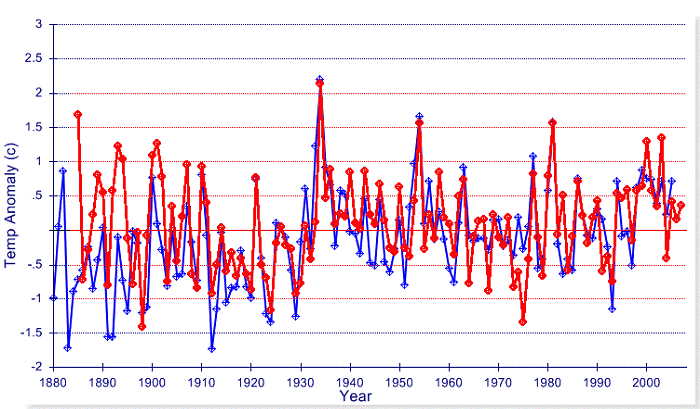
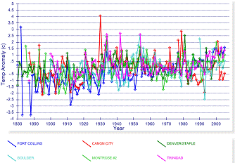
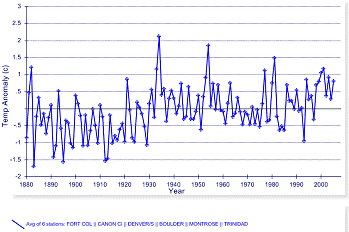
Of the 26 temperature long-term GHCN stations in Colorado, 14 are east of the
mountains and 12 are in the western half. The following figure compares the
temperature anomalies for these two subgroups (average of 14 eastern in blue, average of 12 western in red)
Since the report states there is “more dramatic temperature increases seen at higher altitudes”, the following figures show the 26 stations combined into elevation ranges. For each elevation range, the left-hand plot shows the individual station temperature anomalies, while the right-hand graph shows the average temperature anomalies for that group of stations. The dramatic increases based on the last 50 years are not so dramatic when examining long-term historical temperatures.
Elevation up to 5000 ft
Elevation 5000 to 6000 ft
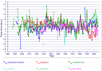
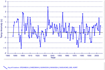
Elevation 6500 to 8000 ft
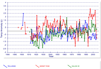
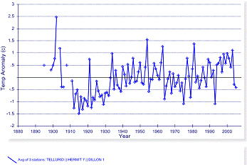
Elevation > 8500 ft
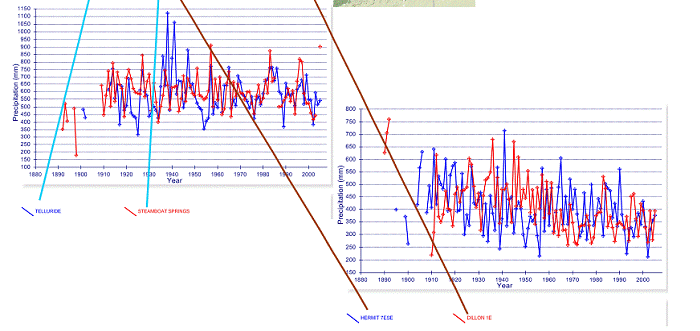
There are 25 precipitation stations in the NOAA GHCN within the state of Colorado that have data from prior to 1930 continuing past 2000. Precipitation varies widely based on geographic area and elevation. The following figure shows the total annual precipitation at groups of stations that have similar precipitation levels. The “increased precipitation” is only evident for the recent decades at the stations east of the mountains (center-right graph below). It is not evident when long-term data are examined, or in other areas of the state. The only two stations that show any real trend are the two highest elevation stations (Hermit and Dillon – lower-right graph below), which show decreasing precipitation.
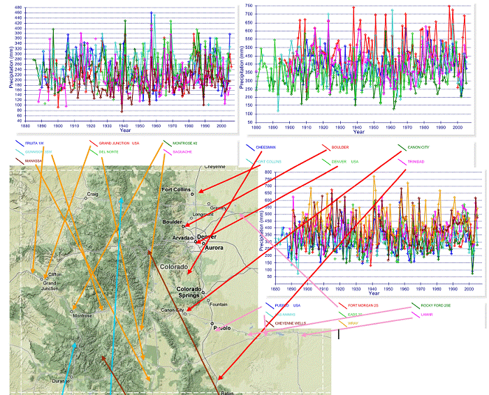
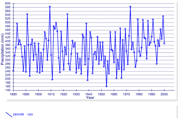
The following figure shows precipitation for the Denver area, from the NOAA GHCN database. No drought.