New Zealand – Temperature Trends
This document provides an examination of Hadley Climatic Research Unit (HadCRU) gridded data for New Zealand. HadCRU calculates temperature anomaly data and averages the data for each 5x5 degree grid “box” in the world. The HadCRU data is used by the IPCC in their reports. Unfortunately, HadCRU does not make public their data, except for the gridded data – i.e. after all included stations are adjusted and averaged – therefore individual HadCRU station data and adjustments cannot be examined.
The following figure shows the HadCRU temperature anomaly data for each of the 5x5 degree grids encompassing temperature stations in New Zealand.
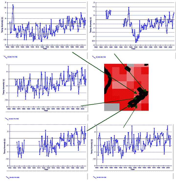
In the above figure, the temperature plots are created from HadCRU CRUTEM3 data at www.appinsys.com/GlobalWarming/Climate.aspx and the “map” of New Zealand is from the IPCC AR4, Figure 9.6 indicating warming from 1901 to 2005.
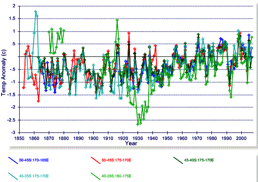
The following figure combines the HadCRU temperature anomaly graphs shown in the above figure.
Grid: 35-40 S / 170-175 E
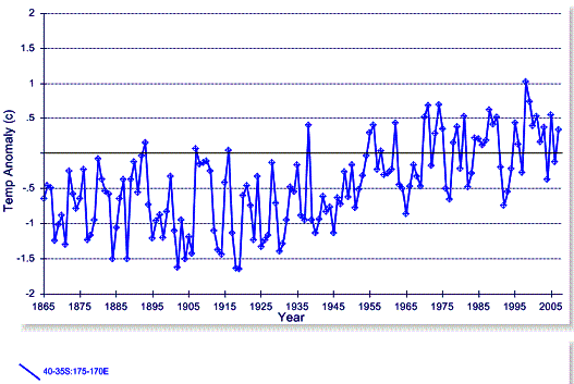
The following figure shows the HadCRU temperature anomaly graph for the 35-40 S / 170-175 E grid.
According to the HadCRU website [http://www.cru.uea.ac.uk/cru/data/landstations/crustnsused.txt], the following stations are in this grid:
930120 -35.0
-173.3 80 KAITAIA A NEW
ZEALAND
931120 -36.7
-174.6 26 WHENUAPAI A NEW
ZEALAND
931150 -36.9
-174.8 -999 AUCKLAND NEW
ZEALAND **
931190 -36.8
-174.8 5 AUCKLAND NEW
ZEALAND
932920 -38.7
-178.0 8 GISBORNE AERODROME NEW ZEALAND
933090 -39.0
-174.1 27 NEW PLYMOUTH A NEW
ZEALAND
The HadCRU includes stations that have data for the period 1961 – 1990, since this is the base period for calculating the average value from which the anomalies are derived. Five of the above stations are in the NOAA GHCN database (all except 931150 indicated above with asterisks). The following figure shows the mean annual temperature from the GGHCN database.
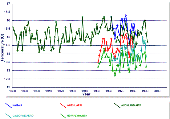
There is only one long-term station in this 5x5 degree grid: Auckland 931190 – the GHCN data for this station is shown in the next figure. There is no warming evident, and although the GHCN data ends in 1992, the station still reports data.
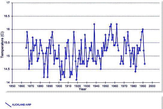
Comparing the GHCN Auckland data with the HadCRU grid shown previously – why does the HadCRU grid show warming when the only long-term station in the grid does not? -- adjustments.
The following figure superimposes the HadCRU grid on the GHCN Auckland data – the raw Auckland data is in blue, the NOAA adjusted Auckland data is in red and the HadCRU grid is in green. This gives an indication of the adjustments made by HadCRU – not as extreme as NOAA, but still inducing warming.
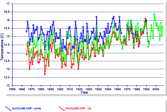
The temperature station was moved around the airport a couple of times in the 1960s and 1980s – so this may be the justification for the adjustments.
Grid: 35-40 S / 175-180 E
The following figure shows the HadCRU temperature anomaly graph for the 35-40 S / 175-180 E grid.
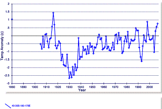
HadCRU has only one station listed in this grid:
933710 -39.5
-176.8 2 NAPIER NELSON PK NEW
ZEALAND
The NOAA GHCN has data for this station only from 1950 to 1980.
Grid: 40-45 S / 170-175 E
The following figure shows the HadCRU temperature anomaly graph for the 40-45 S / 170-175 E grid.
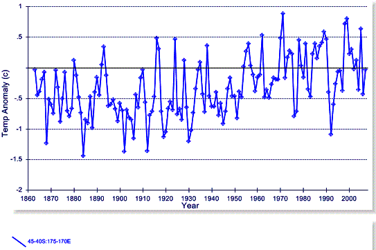
HadCRU lists the following stations in this grid:
934340 -41.2
-174.8 125 WELLINGTON, KELBURN NEW
ZEALAND
935450 -41.2
-173.1 2 NELSON A NEW
ZEALAND
936150 -42.7
-170.1 39 HOKITIKA A NEW
ZEALAND
937800 -43.5
-172.5 37 CHRISTCHURCH A NEW
ZEALAND
937820 -43.5 -172.6 8 CHRISTCHURCH NEW ZEALAND **
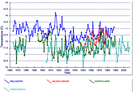
Four of the above stations are in the NOAA GHCN database (all except 937820 indicated above with asterisks). The following figure shows the mean annual temperature from the GGHCN database.
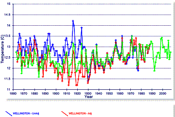
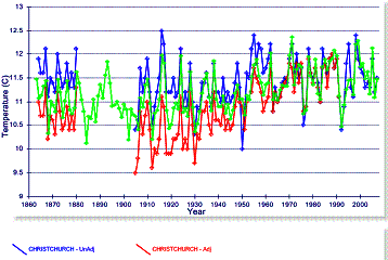
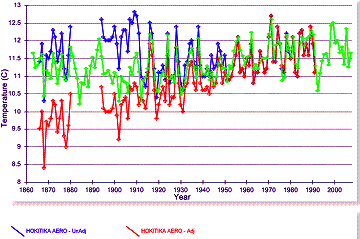
The following figures superimpose the HadCRU grid on the GHCN data for three locations – the raw NOAA data is in blue, the NOAA adjusted data is in red and the HadCRU grid is in green. This gives an indication of the adjustments made by HadCRU – not as extreme as NOAA, but still inducing warming that is not displayed in the raw data.
Grid: 45-50 S / 165-170 E
The following figure shows the HadCRU temperature anomaly graph for the 45-50 S / 165-170 E grid.
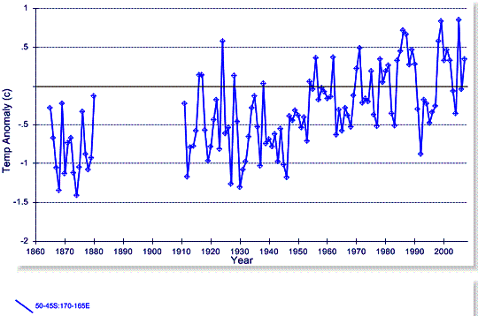
HadCRU has only one station listed in this grid:
938440 -46.4
-168.3 0 INVERCARGILL A NEW
ZEALAND
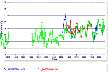
The NOAA GHCN has data for this station only from 1950 to 2007. The following figure superimposes the HadCRU grid on the GHCN data for this location – the raw NOAA data is in blue, the NOAA adjusted data is in red and the HadCRU grid is in green.
Grid: 45-50 S / 170-175 E
The following figure shows the HadCRU temperature anomaly graph for the 45-50 S / 170-175 E grid.
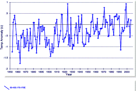
HadCRU lists the following stations in this grid:
938900 -45.9
-170.1 1 DUNEDIN A NEW
ZEALAND
938940 -45.9
-170.5 2 DUNEDIN NEW ZEALAND
939870 -43.0 176.6
44 CHATHAM I WAITANGI NEW ZEALAND
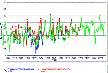
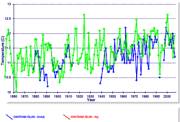
Two of the above stations in the NOAA GHCN database have data going back to the 1800s. The following figures superimpose the HadCRU grid on the GHCN data for three locations – the raw NOAA data is in blue, the NOAA adjusted data is in red and the HadCRU grid is in green.
Recent New Zealand Warming
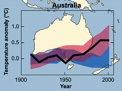
The following figure is from the IPCC AR4 (FAQ 9.2 Fig.1) and is the closest to New Zealand. The blue band shows the range of temperature outputs from the climate models including only natural forcings, while the pink band shows the range of temperatures from the models including anthropogenic CO2. It shows that the models deviate in the 1970s – prior to that there is significant overlap between the two sets. In other words, according to the IPCC, anthropogenic CO2 is only a factor in explaining temperatures after 1970.
![]()
The next figure shows the five 5x5 degree HadCRU grids in New Zealand showing the temperature anomalies from 1970 to 2007 – no warming in the last 37 years. All of the warming in the adjusted station data occurred prior to 1970. Perhaps there is a problem with the models.
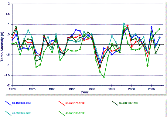
None of the stations in New Zealand exhibit warming in the raw data – only in the adjusted data. None of the stations show warming in the last 4 decades even in the adjusted data. Global warming? – not in this part of the globe.
See www.appinsys.com/GlobalWarming for more regional studies exploring actual climate data.