Global Warming Science -
www.appinsys.com/GlobalWarming
NOAA Jan-Jun 2010 Warmest Ever: False Impressions
[last update: 2010/07/18]
“NOAA: June, April to June, and Year-to-Date Global Temperatures are Warmest on Record”
The following figure from NOAA shows the temperature anomaly
of January – June 2010 compared to the 1971-2000 base
period for 5x5 degree grids
[http://www.noaanews.noaa.gov/stories2010/20100715_globalstats.html]
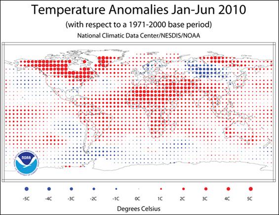
The problem with the above map: data quality and data manipulation.
The following sections provide some spot checks on the areas of the
world exhibiting the most warming according to NOAA. The gridded
historical data graphs shown in these sections are from the Hadley
CRUTEM3 database for January – June. (CRUTEM3 uses a 1961-1990 base
period whereas the NOAA data above is for a 1971-2000 base period. This
simply shifts the anomalies on the vertical scale, but does not affect
the relative trends.)
It is clear from the following sections that NOAA performs manipulations
to create false impressions from the data, including assigning
temperature increases were there is zero data.
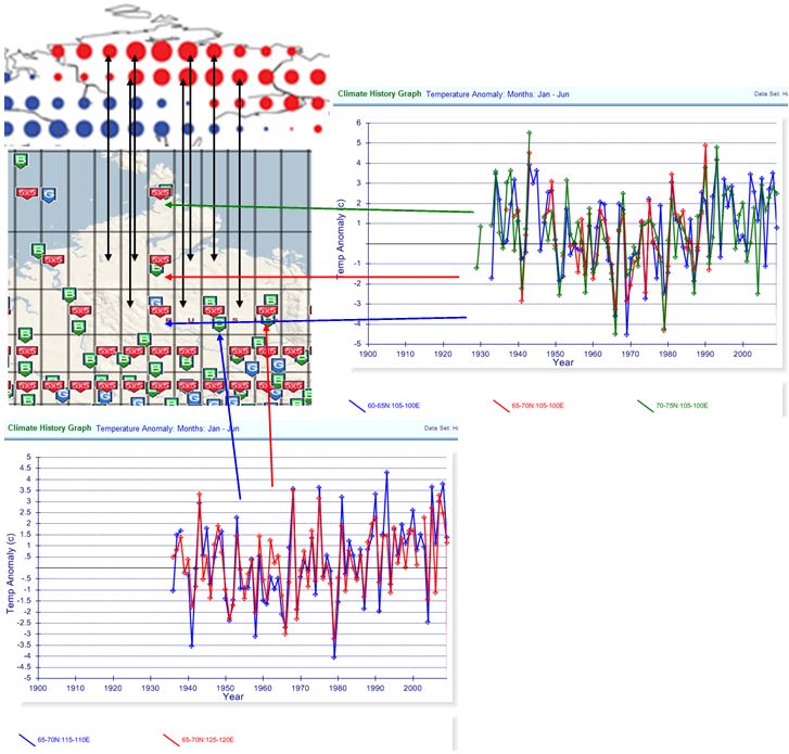
Spot Check - Northern Africa
It is apparently much hotter than usual in the Sahara. But where is
the data? Several of the 5x5 degree grids have zero stations
(indicated by the black arrows). Many of the others have one station
with very limited historical data. There seems to be an inverse
correlation between the number of stations and warming – more stations
in a 5x5 degree grid and less warming is observed.
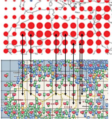
The map figure above shows the location of stations in the
NOAA GHCN database (blue G or green B icons) and the red 5x5
icon indicates whether data exists in the Hadley CRUTEM3
database – a 5x5 degree gridded database used by IPCC
(plotted at http://www.appinsys.com/GlobalWarming/climate.aspx).
The grid lines are 5x5 degree grids.
In many of the 5x5 degree grids showing 4 degrees warming
according to the NOAA map, there are only one or two stations.
The figure below shows some of the “hot-spots” in the NOAA map
displaying January – June average temperature anomaly from the
Hadley CRUTEM3 database for 1900 - 2009.
In no cases is the warming close to what NOAA indicates.
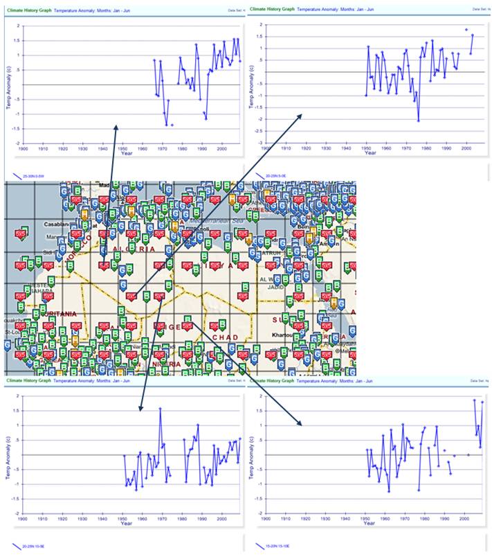
There is a severe problem with lack of historical data in Africa as
well as lack of coverage and gaps in the data. NOAA’s algorithms spread
the low quality data across areas that have no data as well as showing
warming that isn’t really there.
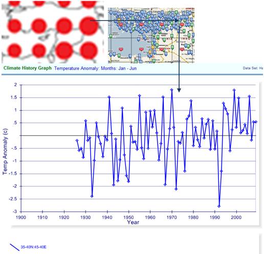
One must really question the NOAA data when even the areas with many
stations seem to be misrepresented. The following figure shows the area of
eastern Turkey (35-40Nx40-45E) which has many stations and shows no warming in Jan-Jun
through 2009, but suddenly according to NOAA has 4 degrees in 2010.
Historical Context
Many parts of the world do not have data for the first half of the 20th century.
Without this historical context it is easy to create misleading
impressions. Much of Africa has this problem of a lack of historical
context. The warming of 1 - 2 degrees since the base period is without historical
perspective. This lack of history gives the false impression that the warming is significant.
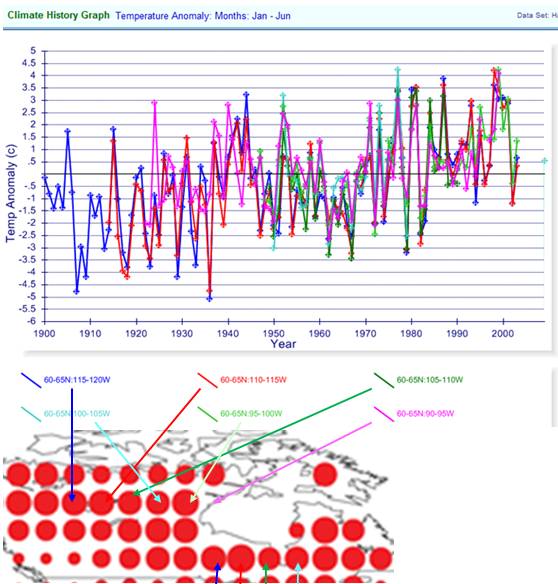
Spot Check - Greenland
It is apparently much hotter than usual in Greenland.
But where is the data? Most of the 5x5 degree grids have zero stations
(as indicated by the black arrows). Most of the grids with data have one station.
The two hottest spots on the NOAA Greenland area show 5 degrees warming and have no data.
How could such an interpolation occur?
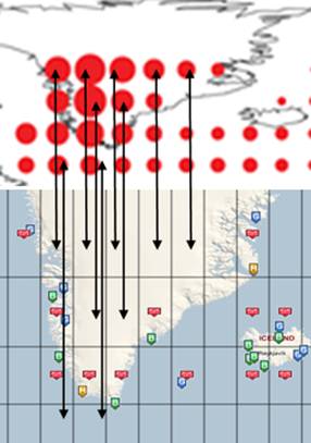
Some of the Greenland stations have long-term data (including the longest-term stations in the Arctic).
The figure below shows some of the “hot-spots” (that actually have data)
in the NOAA map displaying January – June average
temperature anomaly from the Hadley CRUTEM3 database for 1900 - 2009.
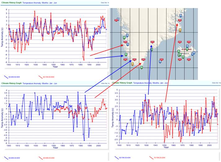
See this for larger graphs of the above:
http://www.appinsys.com/GlobalWarming/greenlandfigs/greenlandfigs.htm
Historical Context
The historical context shows that warming and cooling by several
degrees is not without precedent in Greenland. Recent warming is less than the 1930s.
The statement of warming since the 1980s gives the false impression that
this is unprecedented.
For more info see the Greenland summary:
http://www.appinsys.com/GlobalWarming/RS_Greenland.htm
The following figure shows the average of the six 5x5 degree grids
from the CRUTEM3 data in Greenland for Jan-Jun temperature anomalies.
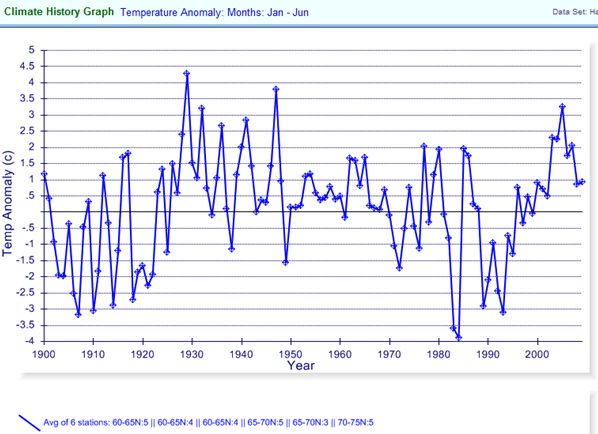
The following figure shows the average Greenland Jan-Jun from above,
changed to green and plotted on the Atlantic Multidecadal Oscillation (AMO)
(from
http://en.wikipedia.org/wiki/File:Amo_timeseries_1856-present.svg).
The correlation is clear.
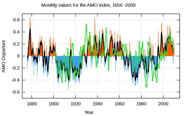
For more info on the AMO see:
http://www.appinsys.com/GlobalWarming/AMO.htm
Spot Check - Siberia
Siberia has some hot and cold areas. But the hot areas include many
grids with no data (indicated by the black arrows on the map).
The graphs show Jan-Jun temperature anomalies for several of the "hot" grids that actually have data.
Historical Context
The historical context shows that warming and cooling by several
degrees is not unprecedented. The northern Siberia areas have had
similar warming in the 1940s. The historical data only go back as far as
the 1940s, so an appropriate long-term context is unknown for much of
the area.
Spot Check - Canada
It is apparently
hot in Canada. Almost all the grids in the NOAA map actually have at
least one station (although again they have one grid showing 5 degrees
warming where there is no data).
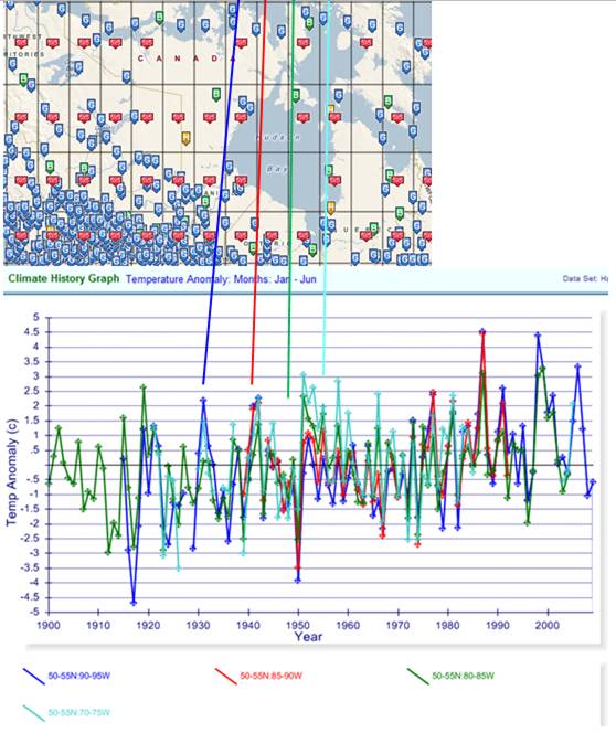
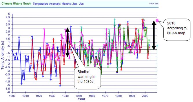
Historical Context
Many stations in northern Canada are no longer maintained in the GHCN
or CRUTEM3 databases. Warming has been 4 degrees over the last 40 years
according to NOAA. The historical context shows similar warming in the
1930s as shown below.
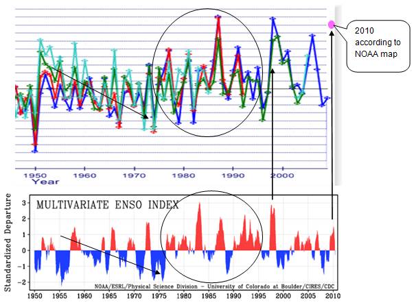
Recent warming in Canada correlates to the El Nino Southern Oscillation (ENSO).
The following figure compares the Jan-June temperature graph shown previously
for northern Canada with the multivariate ENSO index
(from http://www.esrl.noaa.gov/psd/people/klaus.wolter/MEI/).
(2010071601)