Global Warming Science: www.appinsys.com/GlobalWarming
Temperature Projections – IPCC / Hansen v Non-CO2
[last update: 2012/10/23]
|
The IPCC provides temperature “projections” as part of their assessment reports. They say they are not “predictions” since they are based on various scenarios involving different amounts of CO2 and other gases in the future.
[Update 2012/10/23: Roger the Tallbloke section added] [Update 2012/01/09: Nicola Scafetta section added]
|
|
This document looks at the IPCC projections as well as others. It contains the following sections (year of projection in parentheses):
The CO2 based models appear to be overestimating the amount of warming.
Theodore Landscheidt predicted in 2003 that the current cooling would continue until 2030 [http://www.ingentaconnect.com/content/mscp/ene/2003/00000014/F0020002/art00010]: “Analysis of the sun's varying activity in the last two millennia indicates that contrary to the IPCC's speculation about man-made global warming as high as 5.8°C within the next hundred years, a long period of cool climate with its coldest phase around 2030 is to be expected. It is shown that minima in the secular Gleissberg cycle of solar activity, coinciding with periods of cool climate on Earth, are consistently linked to an 83-year cycle in the change of the rotary force driving the sun's oscillatory motion about the centre of mass of the solar system. As the future course of this cycle and its amplitudes can be computed, it can be seen that the Gleissberg minimum around 2030 and another one around 2200 will be of the Maunder minimum type accompanied by severe cooling on Earth. This forecast should prove 'skilful' as other long-range forecasts of climate phenomena, based on cycles in the sun's orbital motion, have turned out correct, as for instance the prediction of the last three El Niños years before the respective event.”
|
|
|
|
The IPCC provides temperature “projections” as part of their assessment reports. These projections are based on various “storyline” scenarios using various amounts of CO2 to drive the global circulation models.
|
||||||
|
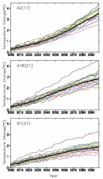
Comparison of IPCC Third Assessment Report (TAR) 2001 and Assessment Report (AR4) 2007
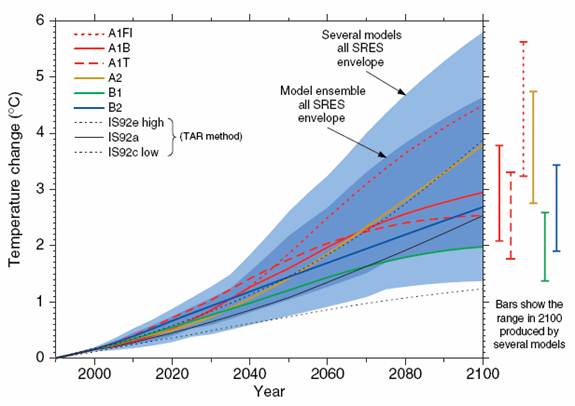
The following figure shows Figure 9.14 from the TAR. It shows temperature projections to 2100: “results are relative to 1990 and shown for 1990 to 2100. future changes for the six illustrative SRES scenarios using a simple climate model tuned to seven AOGCMs. Also for comparison, following the same method, results are shown for IS92a. The dark blue shading represents the envelope of the full set of thirty-five SRES scenarios using the simple model ensemble mean results. The light blue envelope is based on the GFDL_R15_a and DOE PCM parameter settings. The bars show the range of simple model results in 2100 for the seven AOGCM model tunings.”
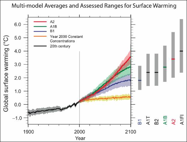
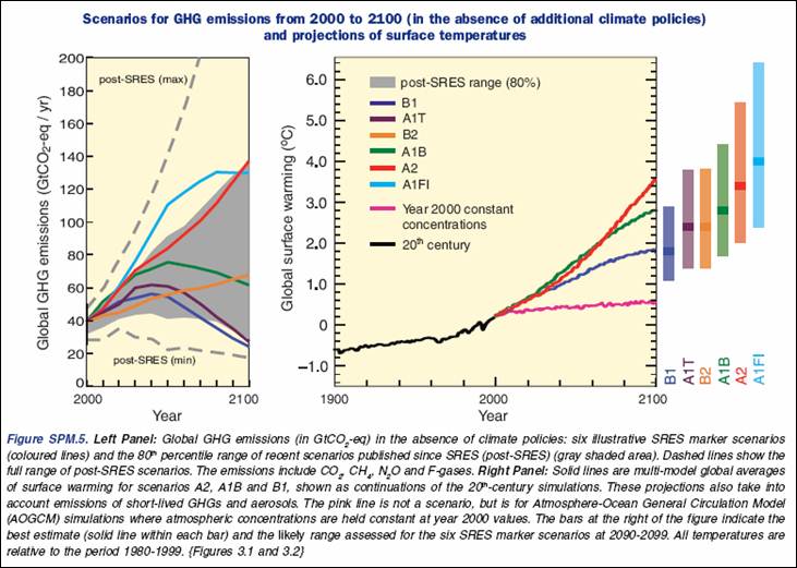
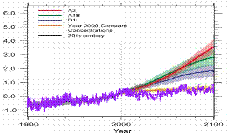
The following figure shows Figure SPM-5 from the AR4. It shows temperature projections to 2100: “Solid lines are multi-model global averages of surface warming (relative to 1980-99) for the scenarios A2, A1B and B1, shown as continuations of the 20th century simulations. Shading denotes the plus/minus one standard deviation range of individual model annual averages. The orange line is for the experiment where concentrations were held constant at year 2000 values. The gray bars at right indicate the best estimate (solid line within each bar) and the likely range assessed for the six SRES marker scenarios. The assessment of the best estimate and likely ranges in the gray bars includes the AOGCMs in the left part of the figure, as well as results from a hierarchy of independent models and observational constraints.”
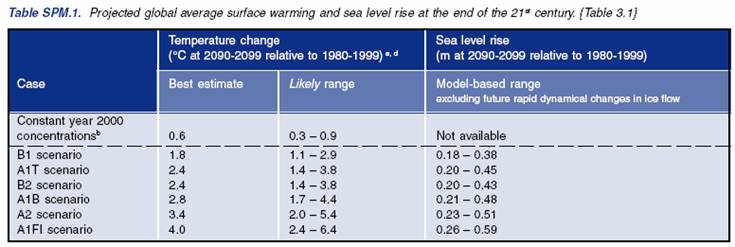
In a revision of the AR4 Summary for Policymakers (2008) the following figure became the Figure SPM.5. The left-hand side of the figure shows the scenarios in terms of the GHG emissions. The warming and seal level rise estimates for the scenarios are summarized in the following table.
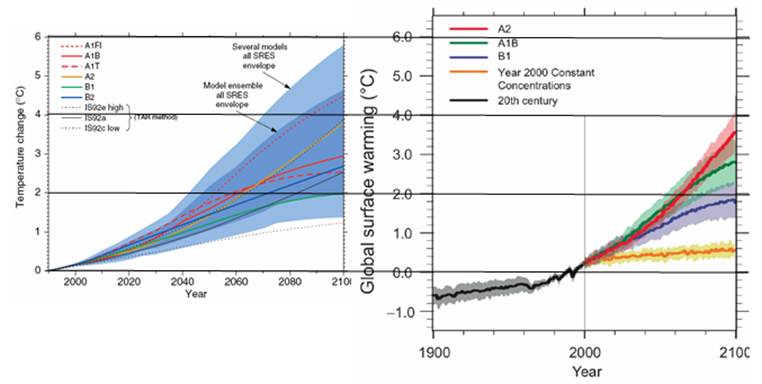
The following figure compares the TAR (left) and AR4 (right) projections from the above figures. The main difference is that they don’t display the blue “envelope of the full set of thirty-five SRES scenarios” in the AR4 and the A1F1 scenario is no longer displayed as a plot on the graph.
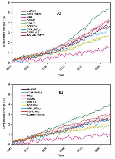
The following table compares the TAR with the AR4 in terms of temperature plots for various models for a couple of the scenarios.
From the IPCC AR4 (Chapter 8 [http://ipcc-wg1.ucar.edu/wg1/Report/AR4WG1_Print_Ch08.pdf]):
|
|
|
|
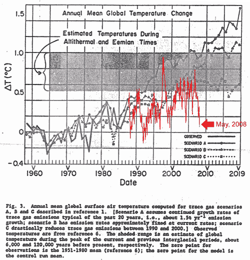
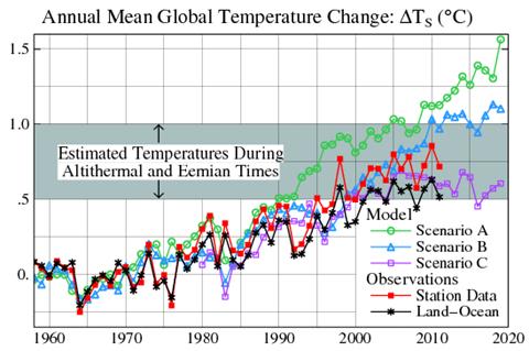
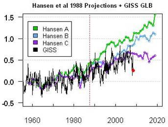
In 1988 NASA’s climate alarmist James Hansen provided temperature predictions based on climate models (results of which he presented to the US congress). He modeled three scenarios: A had an increasing rate of CO2 emissions, B had constant rate of CO2 of CO2 emissions, whereas scenario C had reduced CO2 emissions rate from 1988 levels into the future. (Hansen’s 1988 paper can be found at: http://pubs.giss.nasa.gov/abstracts/1988/Hansen_etal.html)
The following figure shows Hansen’s Figure 3 with satellite temperature data superimposed (from: http://www.climate-skeptic.com/2008/06/gret-moments-in.html). The Figure 3 caption also provides a brief explanation of the scenarios.
The following figure compares the observed global temperature with James Hansen’s climate model predictions used to start the global warming scare in 1988. The observations still most closely match scenario C (which had reduced CO2 emissions rate from 1988 levels into the future “such that the greenhouse gas climate forcing ceases to increase after 2000” – see http://www.appinsys.com/GlobalWarming/HansenModel.htm for more info on Hansen’s models). Scenario A is the only scenario with an increasing rate of CO2 in the graph below.
Figure from: [http://www.columbia.edu/~mhs119/Temperature/T_moreFigs/]
|
|
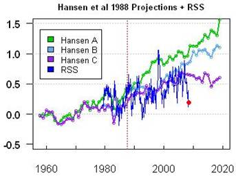
The following figures compare Hansen’s 1988 predictions with actual temperature data since then. The left-hand figure compares the NASA GISS global data (as compiled by Hansen), while the right-hand figure compares the satellite-based temperature data as processed by RSS. (Figures from Steve McIntyre [http://www.climateaudit.org/?p=3354] ). While actual atmospheric CO2 levels have increased since 1988, the fact that actual temperatures are similar to the reduced CO2 models implies a problem with the models
|
|
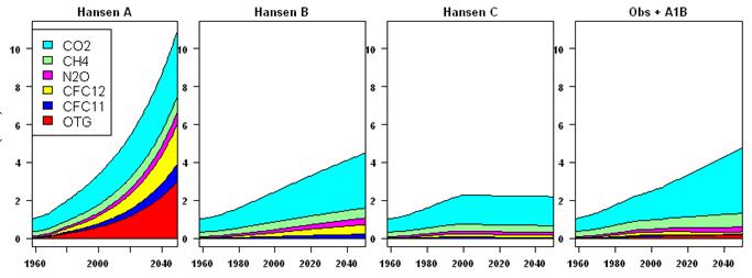
The next figure shows the greenhouse gas emissions scenarios used in the plots, as well the observed (1988 – 2008) plus future based on scenario B. The observed CO2 emissions is closest to the scenario B input, but the observed temperature is closer to scenario C output – indicating a problem with the models. (Figures from Steve McIntyre [http://www.climateaudit.org/?p=3354] ).
|
|
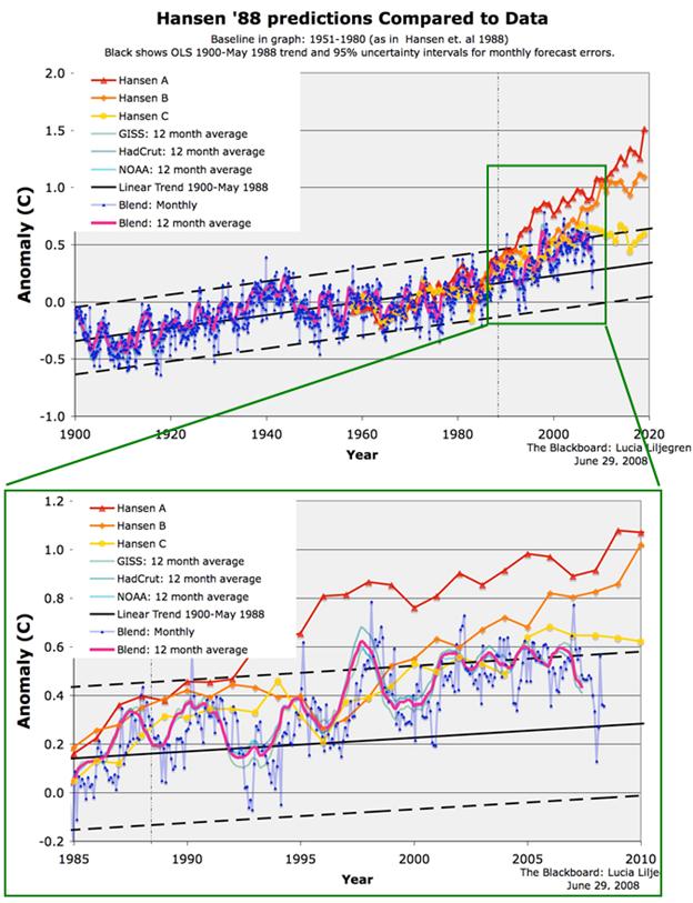
The next figure shows a plot of Hansen’s predictions along with actual temperature data from various sources – GISS, HadCRU and NOAA (from: http://rankexploits.com/musings/2008/ordinary-eyeball-how-did-hansens-predictions-do/ ).
|
|
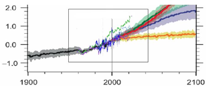
The following figure compares Hansen’s 1988 projections (green) to the 2007 IPCC. Twenty years has produced a reduction in the projections from Hansen’s to the IPPC’s.
|
|
|
|
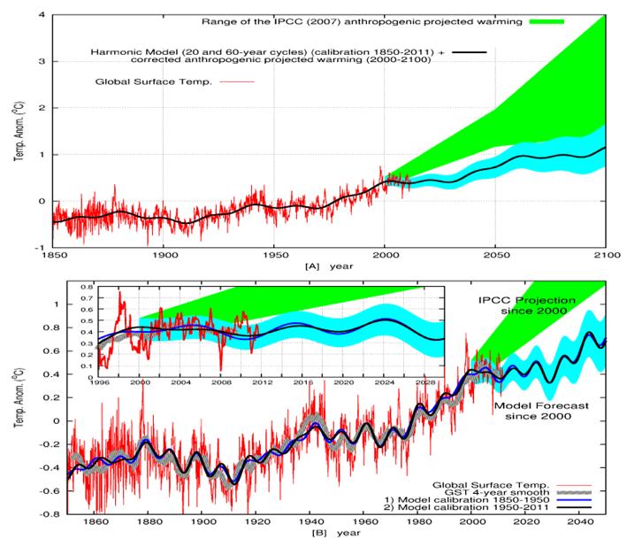
Nicola Scafetta (with ACRIM lab at Duke University) made predictions in 2011 as to the future global (temperatures to the year 2100. January 2012: Nicola Scafetta published “Testing an astronomically based decadal-scale empirical harmonic climate model versus the IPCC (2007) general circulation climate models” [http://scienceandpublicpolicy.org/images/stories/papers/reprint/astronomical_harmonics.pdf]
“At this point it is possible to attempt a full forecast of the climate since 2000 that is made of the four detected decadal and multidecadal cycles plus the corrected anthropogenic warming effect trending. The results are depicted in the figures below. The figure shows a full climate forecast of my proposed empirical model, against the IPCC projections since 2000. It is evident that my proposed model agrees with the data much better than the IPCC projections, as also other tests present in the paper show.”
“In conclusion the empirical model proposed in the current paper is surely a simplified model that probably can be improved, but it already appears to greatly outperform all current GCMs adopted by the IPCC, such as the GISS ModelE. All of them fail in reconstructing the decadal and multidecadal cycles observed in the temperature records and have failed to properly forecast the steady global surface temperature observed since 2001.”
See also Scafetta’s web page documenting his astronomical model: http://people.duke.edu/~ns2002/#astronomical_model_1
|
|
|
|
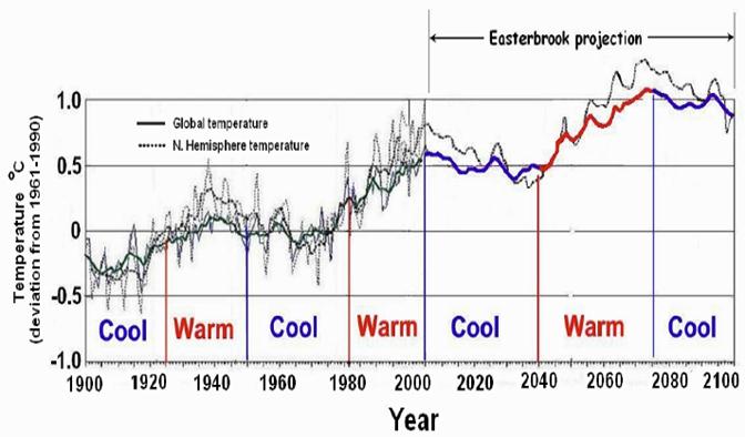
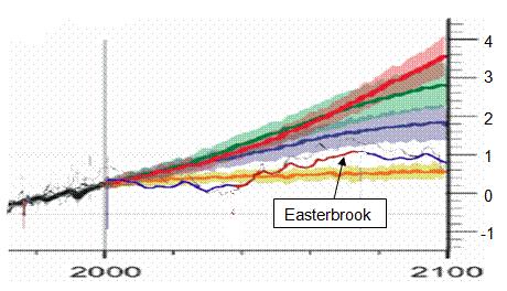
Don Easterbrook (geologist at Western Washington University) made predictions in 2001 as to the future global (and northern hemisphere) temperatures to the year 2100.
“In 2001, I put my reputation on the line and published my predictions for entering a global cooling cycle about 2007 (plus or minus 3-5 years), based on past glacial, ice core, and other data. As right now, my prediction seems to be right on target and what we would expect from the past climatic record, but the IPCC prediction is getting farther and farther off the mark. With the apparent solar cooling cycle upon us, we have a ready explanation for global warming and cooling. If the present cooling trend continues, the IPCC reports will have been the biggest farce in the history of science.” [http://myweb.wwu.edu/dbunny/research/global/glocool_summary.pdf]
The following figure shows his predictions
The following figure compares Easterbrook’s projections with the IPCC AR4.
|
|
|
|
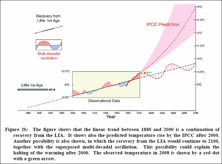
Syun-Ichi Akasofu (Founding Director and Professor of Physics, International Arctic Research Center, University of Alaska) states: “There seems to be a roughly linear increase of the temperature of about 0.5°C/100 years (~1°F/100 years) from about 1800, or even much earlier, to the present. This value may be compared with what the IPCC scientists consider the manmade effect of 0.6 - 0.7°C/100 years. This linear warming trend is likely to be a natural change. One possible cause of the linear increase may be that the Earth is still recovering from the Little Ice Age. This trend should be subtracted from the temperature data during the last 100 years in estimating the manmade effect. Thus, there is a possibility that only a fraction of the present warming trend may be attributed to the greenhouse effect resulting from human activities. This conclusion is contrary to the IPCC (2007) Report (p. 10), which states that “most” of the present warming is due to the greenhouse effect. It is urgent that natural changes be correctly identified and removed accurately from the presently on-going changes in order to find the contribution of the greenhouse effect.” [http://www.iarc.uaf.edu/highlights/2007/akasofu_3_07/earth_recovering_from_lia_r.pdf]
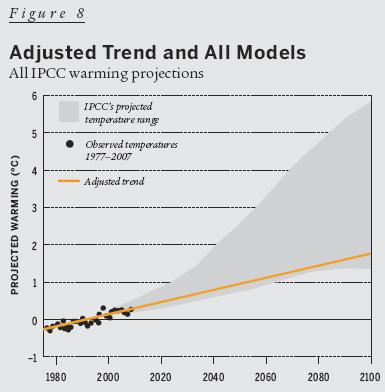
The following temperature projection contradicts IPCC’s assessment of future scenarios (from https://selectra.co.uk/sites/selectra.co.uk/files/pdf/two_natural_components_recent_climate_change%20(1)%20(1).pdf).
|
|
|
|
Patrick Michaels (former Virginia State Climatologist, UN IPCC reviewer, Professor of Environmental Sciences at University of Virginia) made projections in 2008 as to the future global temperatures to the year 2100 (http://www.cato.org/pubs/regulation/regv31n3/v31n3-2.pdf). This linked paper also provides a good overview of urban warming and other biases that influence surface station measurements.
“Contrary to the assertions of the United Nations’ Intergovernmental Panel on Climate Change, there is a significant nonclimatic warming in global land-surface temperature records. That warming results from previously unaccounted-for influences of non-climatic factors that are largely socioeconomic in origin. The result is that as much as half of the land-surface warming that has been detected in recent decades may be spurious.”
“One of the most interesting results of our research concerns the global distribution of the IPCC’s surface temperatures after we adjust them for the non-climatic biases. Obviously the biases are different between nations. Very high biases of 0.5°C (0.9°F) per decade appear in Southeast Asia, Africa, and South America, and a moderately high bias (of about 0.2°C (0.4°F)) is prevalent over Western Europe. Data from the United States, most of the former Soviet Union, and the southern cone of South America show very little bias at all.”
“In the model without the satellite temperature data, almost all — 85 percent — of the explanatory power is from the socioeconomic predictors. Given that the model explains only 34 percent of the total variation of the IPCC temperature trends, this means that non-climatic factors could be responsible for about 29 percent of the difference in warming trends around the world’s land masses. That is hardly the inconsequential effect asserted by the IPCC.”
The following figure shows his predictions (orange line):
Patrick Michaels has done considerable collaborative work with Ross McKitrick (economist, University of Guelph, Canada [http://ross.mckitrick.googlepages.com/#new]) including the following:
“Quantifying the Influence of Anthropogenic Surface Processes and Inhomogeneities on Gridded Global Climate Data”, Journal of Geophysical Research, Vol. 112, 2007 [http://www.agu.org/pubs/crossref/2007/2007JD008465.shtml] “Local land surface modification and variations in data quality affect temperature trends in surface-measured data. Such effects are considered extraneous for the purpose of measuring climate change, and providers of climate data must develop adjustments to filter them out. If done correctly, temperature trends in climate data should be uncorrelated with socioeconomic variables that determine these extraneous factors. … We conclude that the data contamination likely leads to an overstatement of actual trends over land. Using the regression model to filter the extraneous, nonclimatic effects reduces the estimated 1980–2002 global average temperature trend over land by about half.”
|
|
|
|
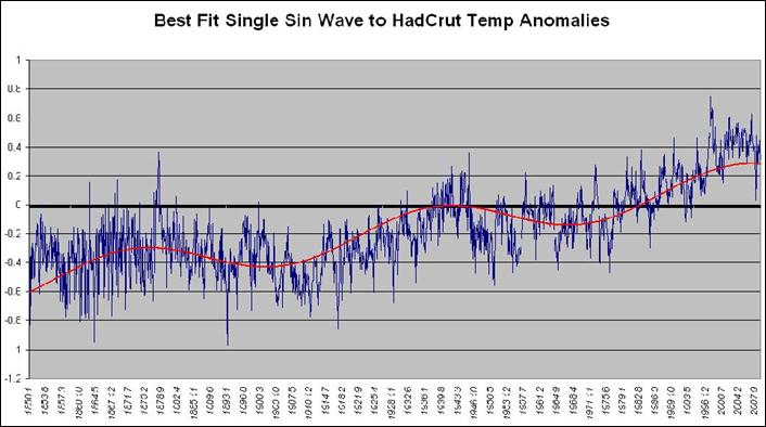
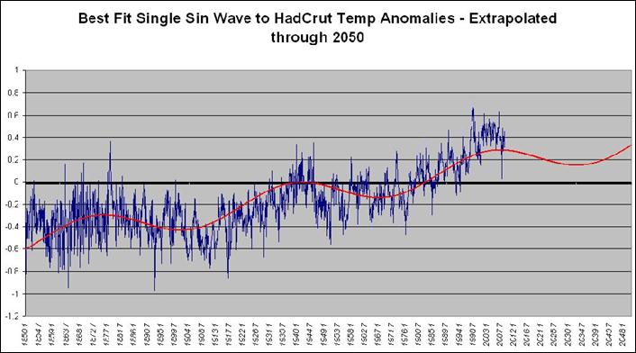
Joe the actuary [http://digitaldiatribes.wordpress.com/2009/02/10/deconstructing-the-hadcrut-data/] made some calculations fitting a single sine wave to the HadCRUT temperature anomaly data. The following two figures show (top) the curve fit to the data, and (bottom) the curve extrapolated to 2050. The 2050 projection is lower than the other estimates. Only time will tell.
|
|
|
|
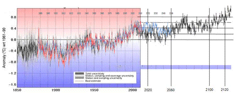
Based on the HadCRUT global temperature anomaly data, I made the following prediction for the global average temperature over the next 100 years. From the early 2000s anomaly of 0.4, I predict there will be an additional 0.2 degree increase by 2100. See: www.appinsys.com/GlobalWarming/PredictionFromCycles.htm for more details on this prediction method.
Of course this method is simply based on recurrent 60-year cycles. The underlying increase may be due to CO2 – or there is just as likely a longer cycle which will result in a larger cooling trend at some point.
Comparison with the IPCC
The following figure compares my prediction (in purple) with the IPCC AR4 projections under various scenarios. My prediction matches fairly closely to the “year 2000 constant concentrations” scenario. The warming in my projection could actually be a result of CO2 – but without the positive feedback due to water vapor assumed by the IPCC climate models.
|
|
|
|
|
|
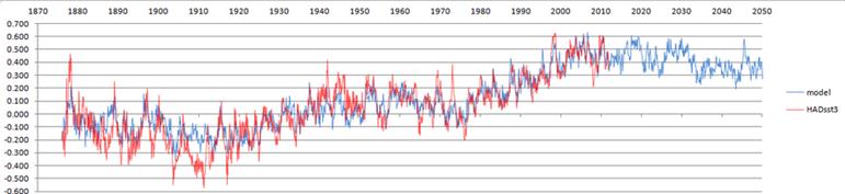
Roger, who runs Tallbloke’s Talkshop (http://tallbloke.wordpress.com/) developed a global temperature prediction model. (See: http://tallbloke.wordpress.com/2012/10/23/the-carbon-flame-war-final-comment/) He says “I have put together a simple model which replicates sea surface temperature (which drives global lower troposphere temperature and surface temperatures a few months later). The correlation between my model and the SST is R^2=0.874 from 1876 FOR MONTHLY DATA.” The model is shown below with predictions to 2050 (blue) along with the HADsst3 (red).
Comparison with My Graphical Prediction
The following figure compares my projection (from the previous section of this document) with the Tallbloke Projection overlaid on it. Mine has more cooling in the later 20-teens with close agreement in the 2040’s.
|