Global Warming
[This is part 3 of the Global Warming Summary series at www.appinsys.com/GlobalWarming]
Part
3: The Measurement of Global Temperatures
The term “global warming” is based on an increasing trend in global average temperature over time. The IPCC reported in 2007 that “Global mean surface temperatures have risen by 0.74°C ± 0.18°C when estimated by a linear trend over the last 100 years (1906–2005).” [4AR, Chapter 3, 2007]. However, the measurement of a “global” temperature is not as simple as it may seem. Historical instrumentally recorded temperatures exist only for 100 to 150 years in small areas of the world. During the 1950s to 1980s temperatures were measured in many more locations, but many stations are no longer active in the database.
Average temperatures are calculated at a given location based on the following procedure: record the minimum and maximum temperature for each day; calculate the average of the minimum and maximum. Calculate the averages for the month from the daily data. Calculate the annual averages by averaging the monthly data.
The main global temperature data set is managed by the US National Oceanic and Atmoshpheric Administration (NOAA) at the National Climatic Data Center (NCDC). This is the Global Historical Climate Network (GHCN) [http://www.ncdc.noaa.gov/oa/climate/ghcn-monthly/index.php]: “The period of record varies from station to station, with several thousand extending back to 1950 and several hundred being updated monthly”. This is the main source of data for global studies, including the data reported by the IPCC. However, the IPCC uses data processed and adjusted by the UK-based Climatic Research Unit of the University of East Anglia (HadCRU), although much of the HadCRU raw data comes from the GHCN.
The UK-based HadCRU provides the following description [http://www.cru.uea.ac.uk/cru/data/temperature/] (emphasis added):
“Over land regions of the world over 3000 monthly station temperature time series are used. Coverage is denser over the more populated parts of the world, particularly, the United States, southern Canada, Europe and Japan. Coverage is sparsest over the interior of the South American and African continents and over the Antarctic. The number of available stations was small during the 1850s, but increases to over 3000 stations during the 1951-90 period. For marine regions sea surface temperature (SST) measurements taken on board merchant and some naval vessels are used. As the majority come from the voluntary observing fleet, coverage is reduced away from the main shipping lanes and is minimal over the Southern Oceans.”
“Stations on land are at different elevations, and different countries estimate average monthly temperatures using different methods and formulae. To avoid biases that could result from these problems, monthly average temperatures are reduced to anomalies from the period with best coverage (1961-90). For stations to be used, an estimate of the base period average must be calculated. Because many stations do not have complete records for the 1961-90 period several methods have been developed to estimate 1961-90 averages from neighbouring records or using other sources of data. Over the oceans, where observations are generally made from mobile platforms, it is impossible to assemble long series of actual temperatures for fixed points. However it is possible to interpolate historical data to create spatially complete reference climatologies (averages for 1961-90) so that individual observations can be compared with a local normal for the given day of the year.”
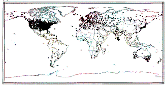
The
NASA Goddard Institute for Space Studies (GISS) is a major provider of climatic
data in the US. Figure 3-7 shows the distribution of temperature stations used
by the GISS. As can be seen in the Figure, the 30 to 60 degree North latitude
band contains 69 percent of the stations used and almost half of those are
located in the United States. This implies that if these stations are valid,
the calculations for the US should be more reliable than for any other area or
for the globe as a whole.
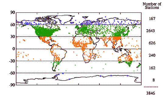
Figure
3-1: Distribution of Temperature Stations Around the World
In addition to the extensive problem of sparseness, the network has also been historically constantly changing - the number of available temperature reporting stations changes with time. The so-called "global" measurements are not really global at all. The coverage by land surface thermometers slowly increased from less than 10% of the globe in the 1880s to about 40% in the 1960's, but has decreased rapidly in recent years. The GISS web site shows how the number of stations has changed, as shown below in Figure 3-2 [http://data.giss.nasa.gov/gistemp/station_data/]. Note that in Figure 3-2 c) the definition of percent coverage is based on “percent of hemispheric area located within 1200 km (720 miles) of a reporting station”! Yet 720 miles is about twice the width or height of the largest 5x5 degree grid box.
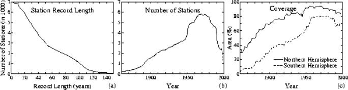
Figure
3-2: Number of Stations Over Time (c shows the percent of hemispheric area located
within 1200km of a reporting station)
There was a major disappearance of recording stations in the late 1980’s – early 1990’s. Figure 3-3 compares the number of global stations in 1900, 1970s and 1997 showing the increase and then decrease. [Peterson and Vose: http://www.ncdc.noaa.gov/oa/climate/ghcn-monthly/images/ghcn_temp_overview.pdf ]. The University of Delaware has an animated movie of station locations over time [http://climate.geog.udel.edu/~climate/html_pages/air_ts2.html ].
a) 1900
b) 1976
c)
1997
Figure
3-3: Comparison of Available GHCN Temperature Stations Over Time
The following figure shows the number of stations in the GHCN database with data for selected years, showing the number of stations in the United States (blue) and in the rest of the world (ROW – green). The percents indicate the percent of the total number of stations that are in the U.S.
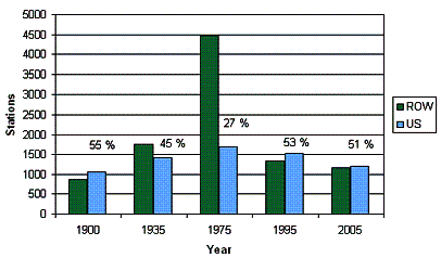
Figure
3-4: Comparison of Number of GHCN Temperature Stations in the U.S. vs Rest of
the World
The following figure shows a calculation of straight temperature averages for all of the reporting stations for 1950 to 2000 [http://www.uoguelph.ca/~rmckitri/research/nvst.html]. While a straight average is not meaningful for global temperature calculation (since areas with more stations would have higher weighting), it illustrates that the disappearance of so many stations may have introduced an upward temperature bias. As can be seen in the figure, the straight average of all global stations does not fluctuate much until 1990, at which point the average temperature jumps up. This observational bias can influence the calculation of area-weighted averages to some extent. A study by Willmott, Robeson and Feddema ("Influence of Spatially Variable Instrument Networks on Climatic Averages, Geophysical Research Letters vol 18 No. 12, pp2249-2251, Dec 1991) calculated a +0.2C bias in the global average due to pre-1990 station closures.
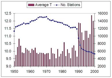
Figure
3-5: Calculation of Average Temperatures From Reporting Stations for 1950 to
2000
Temperature measurement stations must be continually reevaluated for suitability for inclusion due to changes in the local environment, such as increased urbanization, which causes locally increased temperatures regardless of the external environmental influences. Thus only rural stations can be validly used in calculating temperature trends. As a result, adjustments are made to temperature data at urban stations (this will be discussed below).
There is substantial debate in the scientific community regarding the use of various specific stations as well as regarding the factors that can affect the uncertainty involved in the measurements. For example, the Pielke et al paper available at http://climatesci.colorado.edu/publications/R-321.pdf is a recent (Feb 2007) publication by 12 authors describing the temperature measurement uncertainties that have not been taken into sufficient consideration.
The Climate Audit web site [http://www.climateaudit.org] provides some analysis of specific station data usage, as does Warwick Hughes [ http://www.warwickhughes.com/climate ]. The Surface Stations web site [http://www.surfacestations.org/] is accumulating physical site data for the temperature measurement stations (including photographs) and identifying problem stations -- there are a significant number of stations with improper siting. The Regional Summary series at www.appinsys.com/GLobalWarming focuses on specific stations within various global regions. Some specific locations are also examined later in this document.
Different agencies use different methods for calculating a global average. The first step is that temperatures at each station are converted into anomalies – the difference from an average temperature. In the HadCRU method (used by the IPCC) anomalies are calculated based on the average observed in the 1961 – 1990 period (thus stations without data for that period cannot be included). For the calculation of global averages, the HadCRU method divides the world into a series of 5 x 5-degree grids and the temperature is calculated for each grid cell by averaging the stations in it. The number of stations varies all over the world and in many grid cells there are no stations. Both the component parts (land and marine) are separately interpolated to the same 5º x 5º latitude/longitude grid boxes. Land temperature anomalies are in-filled where more than four of the surrounding eight 5º x 5º grid boxes are present. Weighting methods can vary but a common one is to average the grid-box temperature anomalies, with weighting according to the area of each 5° x 5° grid cell, into hemispheric values; the hemispheric averages are then averaged to create the global-average temperature anomaly. [http://www.cru.uea.ac.uk/cru/data/temperature/]. The IPCC deviates from the HadCRU method at this point – instead the IPCC uses “optimal averaging. This technique uses information on how temperatures at each location co-vary, to weight the data to take best account of areas where there are no observations at a given time.” Thus empty grid cells are interpolated from surrounding cells. [http://www.cru.uea.ac.uk/cru/data/temperature/#faq] Other methods calculate averages by averaging the cells within latitude bands and then average the latitude bands.
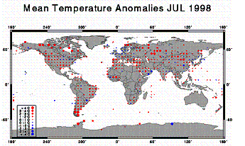
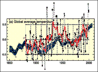
The NOAA National Climatic Data Center (NCDC) has an animated series showing the temperature anomalies for July of each year from 1880 to 1998 (no interpolation into empty grids). [http://www.ncdc.noaa.gov/img/climate/research/ghcn/movie_meant_latestmonth.gif]. The images in the following figure are from that series. These give an indication of the global coverage of the grid temperatures and how the coverage has changed over the years, as well as highlighting 2 warm and 2 cool years. The 1930’s were a very warm period (compare 1936 in Fig 3-6-b with 1998 in Fig 3-6-d).
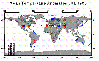
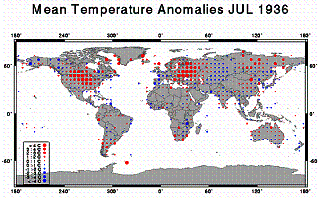
a) b)
![]()
![]()
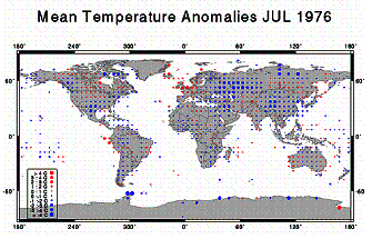
c) d)
Figure 3-6: Temperature Anomalies for 5x5-Degree Grids For
Selected Years
The temperature data recorded from the stations is not simply used in the averaging calculations: it is first adjusted. Different agencies use different adjustment methods. The station data is adjusted for homogeneity (i.e. nearby stations are compared and adjusted if trends are different). The U.S. based GHCN data set is feely available including both raw and adjusted data so that anyone can see what the station data show. However, the HadCRU data used by the IPCC is not publicly available – neither the raw data nor the adjusted data. They publish only a list of stations and the calculated 5x5 degree grid anomaly results.
As an illustration of the sometimes questionable effects of temperature adjustments, consider the United States data (almost 30 percent of the world’s total historical climate stations are in the US; rising to 50 % of the world’s stations for the post-1990 period). The following graphs show the historical US data from the GISS database as published in 1999 and 2001. The graph on the left was produced in 1999 (Hansen et al 1999 [http://pubs.giss.nasa.gov/docs/1999/1999_Hansen_etal.pdf ]); the graph on the right was produced in 2001 (Hansen et al 2001 [http://pubs.giss.nasa.gov/docs/2001/2001_Hansen_etal.pdf]). They are from the same raw data – the only difference is that the adjustment method was changed by NASA in 2001. The next figure compares the graphs, showing how an increase in temperature trend was achieved simply by changing the method of adjusting the data. Some of the major changes are highlighted in this figure – the decreases in the 1930s and the increases in the 1980s and 1990s. (See the regional summaries at www.appinsys.com/GlobalWarming to see what is actually happening in the U.S.).
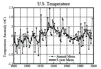
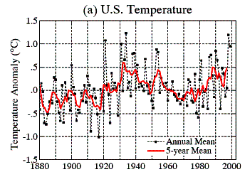
Figure 3-7: U.S. Temperature Changes Due to Change in
Adjustment Methods (Left: 1999, Right 2001)
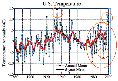
Figure 3-8: Comparison of U.S. Temperature Changes Due to
Change in Adjustment Methods
Temperature station adjustments are theoretically supposed to make the data more realistic for identifying temperature trends. In some cases the adjustments make sense, in other cases – not.
Here is an example where the adjustment makes sense. In Australia the raw data for Melbourne show warming, while the nearest rural station does not. The following figure compares the raw data (blue) and adjusted data for Melbourne. However, this seems to be a rare instance.
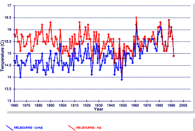
Figure 3-9: Comparison of Adjusted and Unadjusted
Temperature Data for Melbourne, Australia
The following graph is more typical of the standard adjustments made to the temperature data – this is for Darwin, Australia (blue – unadjusted, red – adjusted). Warming is invoked in the data through the adjustments.
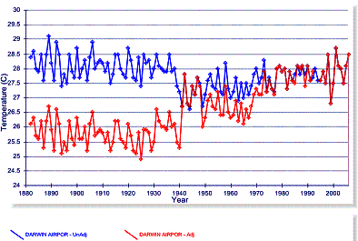
Figure 3-10: Comparison of Adjusted and Unadjusted
Temperature Data for Darwin, Australia
In New Zealand the temperature adjustments do not make sense (and this is not an isolated incident). The following two graphs show the available long-term (raw) data for the urban areas of Wellington (left) and Christchurch (right). No warming is observed in these urban areas. To the right of the New Zealand map is the nearest and only long-term rural station, Hokitika Aero (all graphs show 1860 to 2006, although both Wellington and Kokitika end around 1990).


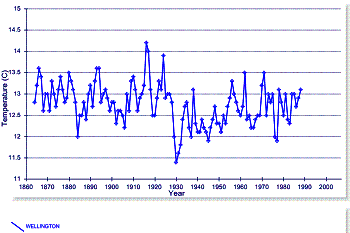
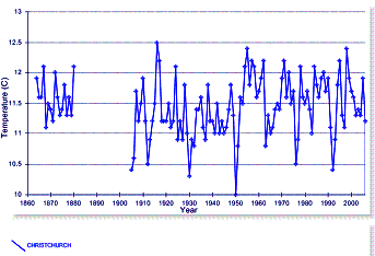

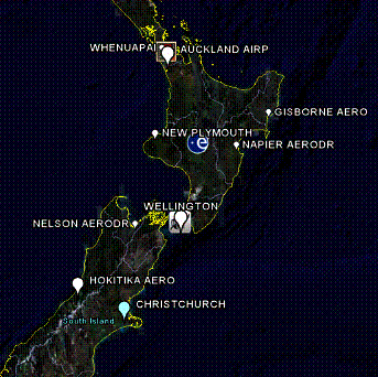
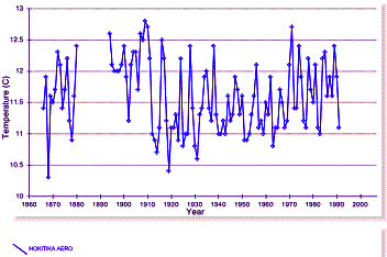
Figure 3-11: Long-Term Temperature Stations in New Zealand
Show No Long-Term Warming
After adjustments, the urban stations exhibit warming. The following figures compare the adjusted (red) with the unadjusted data (blue) for Wellington (left) and Christchurch (right). These adjustments introduce a spurious warming trend into urban data that show no warming.
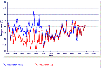
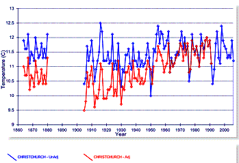
Figure 3-12: Comparison of Adjusted and Unadjusted
Temperature Data for Wellington and Christchurch
Even the Hokitika station (below, right), listed as rural, ends up with a very significant warming trend.
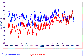
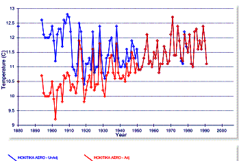
Figure 3-13: Comparison of Adjusted and Unadjusted
Temperature Data for Auckland and Hokitika
Adjustments to the data – this is how all of New Zealand (which exhibits no warming) ends up contributing to “global warming” – the graphs below show unadjusted (left) and adjusted (right) for Auckland, Wellington, Hokitika and Christchurch.
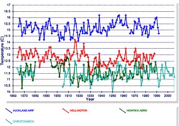
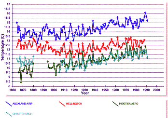
Figure 3-14: Comparison of Adjusted and Unadjusted
Temperature Data
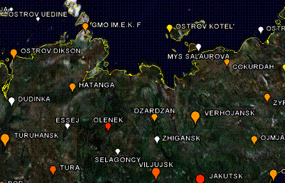
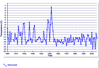
Siberia provides an example of the IPCC flaws. The following figure shows 5 x 5 degree grids with interpolated data as used by the IPCC, showing the temperature change from 1976 to 1999. They selected 1976 as a starting point since that was a relatively cool year (see Figure 3-6-c) and would thus show greater warming towards 1999. But most starting points do not exhibit such warming trends. If they selected 1936 (Fig 3-6-b) to 1998 (Fig 3-6-d) as the time period, the following figure would not be so dramatic. The selective use of data is one of the primary problems in representing actual phenomena. Some Siberian 5x5 grids are highlighted in the upper-right green box in Figure 3-15. These are the area of 65 – 80 latitude x 100 -135 longitude (notice in Figure 3-6 the grids that do not actually have data, but are represented by strong warming dots in the IPCC version in Figure 3-15). Figure 3-16 illustrates the effect of selecting a particular start year and why the IPCC selected 1976.
![]()
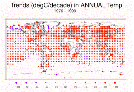
Figure
3-15: IPCC Warming from 1976 to 1999 in 5x5 degree grid cells [from Figure
2.9 in the IPCC Third Annual Report (TAR)]
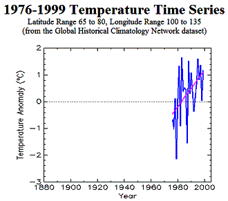
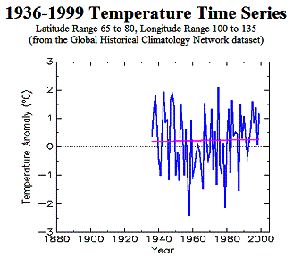
Figure 3-16: Trends from 1976 to 1999 (left) and 1936 to 1999 (right) Showing IPCC’s Selectivity
Another issue with the IPCC method shown in Figure 3-15 above is the effect of interpolation to empty 5x5 degree grid boxes. In the GHCN data shown in Figure 3-6, grid boxes with no data are left empty. In the IPCC method, many empty grid boxes are filled in with interpolations, with the net effect of increasing the warming trend.
Figure 3-17 shows temperature trends for the Siberian area highlighted in Figure 3-15 (Lat 65 to 80 - Long 100 to 135). Of the eight main temperature dots on the IPCC map, three are interpolated (no data). Of the five with data, the number of stations is indicated in the lower left corner of each grid-based temperature graph. The only grid with more than two stations shows no warming over the available data. The average for the entire 15 x 35 degree area is shown in the upper right of the figure. Of the eight individual stations, only two exhibit any warming since the 1930’s (the one in long 130-135 and only one of the two in long 110-115).
An important issue is to keep in mind is that in the calculation of global average temperatures, the interpolated grid boxes are averaged in with the ones that actually have data. This example shows how sparse and varying data can contribute to an average that is not necessarily representative.
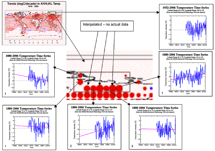
Figure
3-17: Temperatures for 5x5 Grids in Lat 65 to 80 - Long 100 to 135
The following figure shows the four Siberian temperature
stations with the longest-term data. The IPCC has misrepresented the warming
trend in Siberia.

![]()
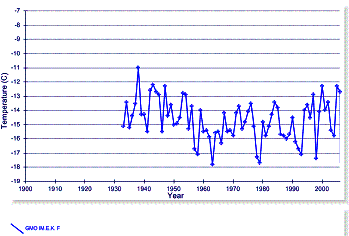
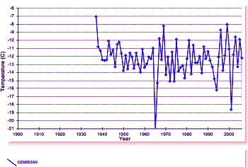


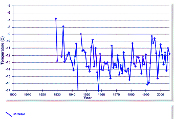
Figure
3-18: Four Long-term Temperature Stations in Siberia
This brings up another problem with the calculation of
global averages – the fact that the warming occurring in the world is not uniform
and has major regional differences. A recent paper by Syun-Ichi Akasofu at the International Arctic Research Center
(University of Alaska Fairbanks) provides an analysis of warming trends in the
Arctic. [http://www.iarc.uaf.edu/highlights/2007/akasofu_3_07/index.php ] “It
is interesting to note from the original paper from Jones (1987, 1994) that the
first temperature change from 1910 to 1975 occurred only in the Northern Hemisphere.
Further, it occurred in high latitudes above 50° in latitude (Serreze and
Francis, 2006). The present rise after 1975 is also confined to the Northern
Hemisphere, and is not apparent in the Southern Hemisphere; there may be a
problem due to the lack of stations in the Southern Hemisphere, but the
Antarctic shows a cooling trend during 1986-2005 (Hansen, 2006). Thus, it is
not accurate to claim that the two changes are a truly global phenomenon”. In
fact, the changes are very inconsistent throughout the Northern Hemisphere.
The regional
variation in trends is so great that it brings into question the validity of
calculating global averages as representative of any actual physical phenomena.
See the Regional Summaries on www.appinsys.com/GlobalWarming/RS_Summary.htm
for information on individual world regions and comparison to IPCC models.
The following figure shows the monthly sea surface temperature (SST) anomalies for the Nino 3 region (Pacific Ocean around the equator off the coast of South America – Galapagos Islands area). No warming trend observed – but the IPCC (See Figure 3-15) shows red dots in these grid cells indicating warming of 0.2 – 0.4 degrees.
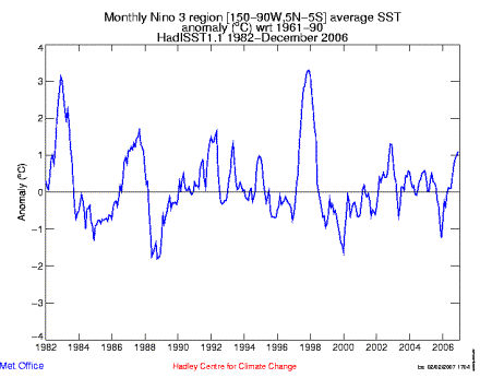
Figure
3-19: Monthly Sea Surface Temperature Anomalies in the Equatorial Pacific West
of South America
The following figure shows the temperature trend for the United States. The left-hand figure shows the annual average temperatures (black) along with the 5-year average (red) and the 5-year average of the global average temperature (blue). The right-hand figure compares the same US data with the IPCC global average. As can be seen, the United States (which has the highest density of temperature measurement stations in the world) exhibits significantly more variation than the global average. The temperature increase in the US is similar to the 1930’s.
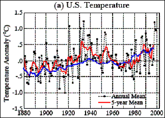
Figure
3-20: Comparison of US and Global Temperature Anomalies (left, after Hansen et
al 2001, right comparing IPCC 2007 with Hansen US 2001)
The following figure shows the temperature trend for the United States (including Northern Mexico, since it is based on a latitude – longitude grid). The left-hand figure shows the “global warming” since 1976; the right-hand figure puts in perspective since 1920.
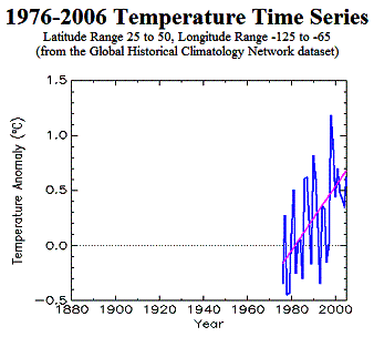
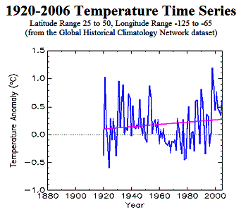
Figure 3-21: U.S. Trends from 1976 to 1999 (left) and 1936 to 1999 (right) Showing Effect of Selecting a Start Date
Temperature adjustments are often made to U.S. stations that do not make sense, but invariably increase the apparent warming. The following figure shows the closest rural station to San Francisco (Davis - left) and closest rural station to Seattle (Snoqualmie – right). In both cases warming is artificially introduced to rural stations.
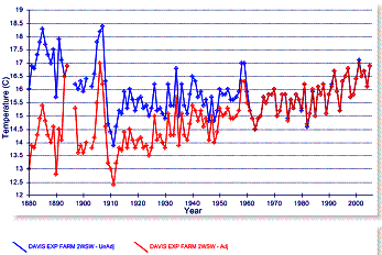
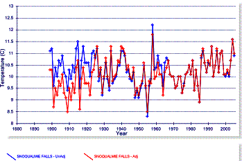
Figure 3-22: Artificial Warming Trends in Adjustments to U.S. Rural Stations
The IPCC Physical Basis report [http://ipcc-wg1.ucar.edu/wg1/wg1-report.html] makes the following statements:
- “Urban heat islands result partly from the physical properties of the urban landscape and partly from the release of heat into the environment by the use of energy for human activities such as heating buildings and powering appliances and vehicles (‘human energy production’). The global total heat flux from this is estimated as 0.03 W m–2 (Nakicenovic, 1998). If this energy release were concentrated in cities, which are estimated to cover 0.046% of the Earth’s surface (Loveland et al., 2000) the mean local heat flux in a city would be 65 W m–2. Daytime values in central Tokyo typically exceed 400 W m–2 with a maximum of 1,590 W m–2 in winter (Ichinose et al., 1999). Although human energy production is a small influence at the global scale, it may be very important for climate changes in cities” [emphasis added] [Since most of the temperature stations are in cities, this is more significant than implied by the IPCC, because that’s where the data is recorded.]
- “Over the conterminous USA, after adjustment for time-of-observation bias and other changes, rural station trends were almost indistinguishable from series including urban sites” [emphasis added] [The problem is that the data don’t support these statements, as shown below using examples from around the world.]
The following sets of figures compare urban and rural stations in several parts of the world. Keep in mind while observing the differences, that the IPCC states (4AR, Chapter 3, 2007): “Urbanisation impacts on global and hemispheric temperature trends have been found to be small. Furthermore, once the landscape around a station becomes urbanized, long-term trends for that station are consistent with nearby rural stations”.
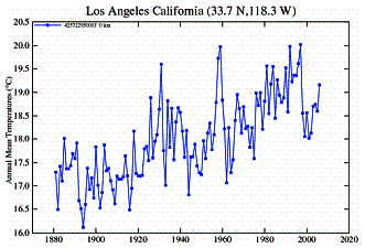
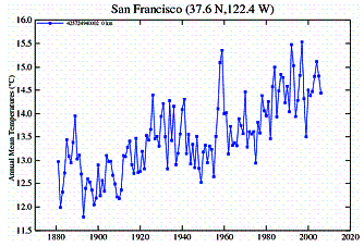
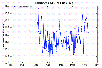
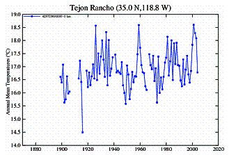
In California an examination of temperature stations within most of the state shows that most are highly urbanized - very few are land-based rural and of those many stopped reporting in the 1970’s – 1990’s. A comparison of urban and rural stations shows a very distinct difference in temperature trends. The urban stations exhibit distinct warming trends, while the rural stations either show no warming or cyclical warming that is not as warm as it was during the 1930’s.
Urban Stations:
Rural Stations:
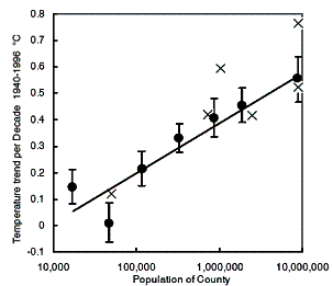
A
study showing the effects of urban heat islands on temperatures in California
(“Environmental Effects of Increased Carbon Dioxide”, A.B. Robinson, S.L. Baliunas, W. Soon, Z.W. Robinson, 1998)
shows the following showing surface temperature trends for the period of 1940 to
1996 from 107 measuring stations in 49 California counties. After averaging the
means of the trends in each county, counties of similar population were
combined and plotted as closed circles along with the standard errors of their
means.
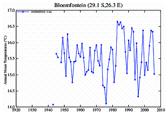
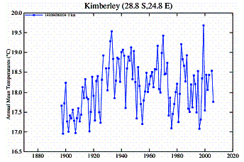
In Southern Africa an examination of temperature stations shows a similar discrepancy between urban and rural stations.
Urban Stations:
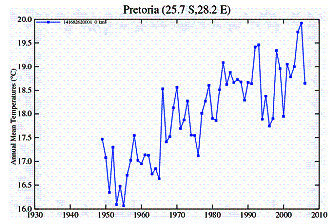
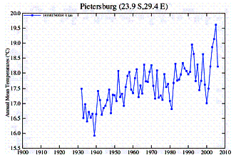
Rural Stations:
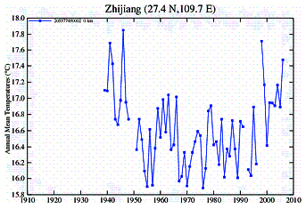
In China an examination of temperature stations shows a similar discrepancy between urban and rural stations. However, the Chinese data show another problem: most rural stations started collecting data in the mid-1950’s and stopped in 1990.
Urban Stations:
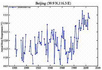
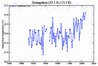
Rural Stations:
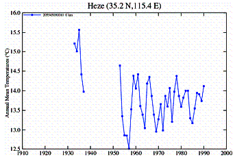
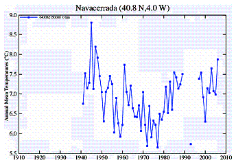
In Europe an examination of temperature stations shows a different problem: a lack of data. There are very few rural stations and close to zero rural stations with a long-term record. Although there are many urban stations, there are very few with long-term data. Many of those have a gap for 1930 – 1945 (World War II) or from 1915 – 1945 (a gap covering both World Wars). Very few stations have continued into the 2000’s. I couldn’t find any rural stations that started earlier than 1940 and continued to 2000 except for a couple of towns at high elevations in the Alps (Sonnblick, Saentis) which show warming but are in an extreme environment -- i.e. elevations > 10,000 feet, mean annual temperature below zero (in fact Sonnblick is the highest weather station in the world) and are thus in their own microclimate.
Urban Stations:
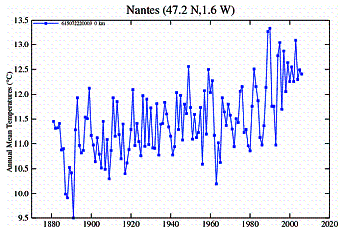
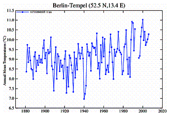
Rural Stations:
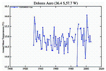
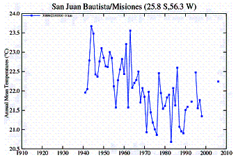
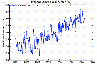
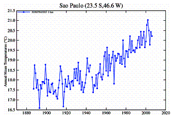
In Southern South America an examination of temperature stations shows the common discrepancy between urban and rural stations. There are very few rural area stations, but several small town stations. Very few stations have data earlier than 1950.
Urban Stations:
Rural Stations: