Global Warming Science - www.appinsys.com/GlobalWarming
Climatic Events – No Evidence Supporting the AGW Theory
[last update: 2009/08/16]
While the global warming scare got rolling, other climatic events such as receding glaciers, etc. have also garnered much alarmist attention.
This document provides an overview of the documents in the Climatic Events summary series.
Documents in Climatic Events summary series include:
- Hurricanes
- Precipitation (including Tornadoes)
- Polar Ice Caps
- Glaciers
- Sea Level
- Animals
- Human Disease / Death (including Malaria and Extreme Weather)
- North Atlantic Thermohaline Circulation / Gulf Stream
|
|
|
Seasonal Change
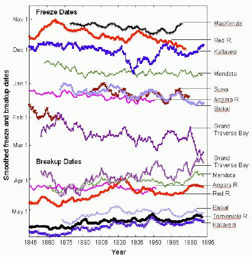
Alarmists claim that global warming is causing winters to get shorter – with winter freeze onset happening later and spring break-ups occurring sooner. The following figure shows the trend in winter freeze dates and spring thaw dates for various lakes and rivers in the Northern Hemisphere. (Figure from [http://www.dartmouth.edu/~mpayres/hhs/EarthDay_Talk.pdf] after Magnuson et al).
This shows that while the trend towards shorter winters in the Northern Hemisphere is true, it has been occurring since observations began in the mid-1800s. Thus it cannot be attributed to CO2-based warming.
|
|
Hurricanes
There is no correspondence between CO2 and trends in hurricanes. The hurricane trends correspond with oceanic oscillations.
According to researchers at the Department of Atmospheric Science at the Colorado State University (Extended Range Forecast of Atlantic Seasonal Hurricane Activity and U.S. Landfall Strike Probability for 2007, Klotzbach and Gray, Colorado State University, Dec. 2006) [http://typhoon.atmos.colostate.edu/Forecasts/2006/dec2006/]: “Between 1966 and 2003, US major hurricane landfall numbers were below the long-term average”. “Although global surface temperatures have increased over the last century and over the last 30 years, there is no reliable data available to indicate increased hurricane frequency or intensity in any of the globe’s seven tropical cyclone basins.”
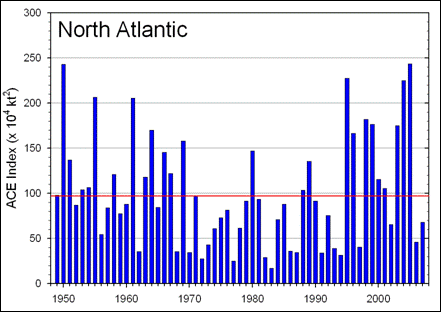
The following figures show North Atlantic hurricanes in terms of Accumulated Cyclone Energy (ACE) for 1949-2007 [http://www.ncdc.noaa.gov/oa/climate/research/2007/ann/us-summary.html]
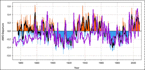
The following figure compares the Atlantic Basin ACE (magenta line) with the Atlantic Multidecadal Oscillation (AMO).
See http://www.appinsys.com/GlobalWarming/GW_4CE_Hurricanes.htm for more details on hurricanes.
|
|
Precipitation
There are no distinct trends in precipitation when long-term data are available. There is considerable annual and decadal variability.
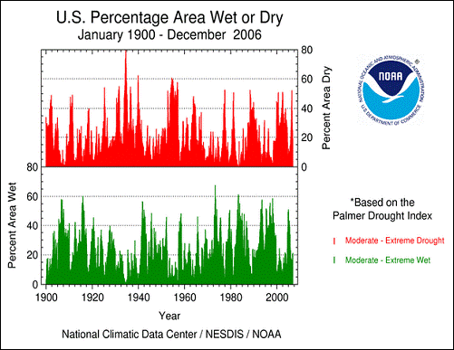
The following figure compares the occurrences of moderate to extreme drought and moderate to extreme wet conditions in the US Feb 1990 to 2006. [http://www.ncdc.noaa.gov/oa/climate/research/2006/ann/us-summary.html]
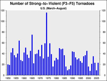
The following figure shows the annual number of strong tornadoes for the period of 1950 to 2006. The number of strong tornadoes has been decreasing since the 1960’s. [http://www.ncdc.noaa.gov/oa/climate/research/2006/ann/us-summary.html]
See http://www.appinsys.com/GlobalWarming/GW_4CE_Precipitation.htm for more details on precipitation and tornadoes.
|
|
Polar Ice Caps
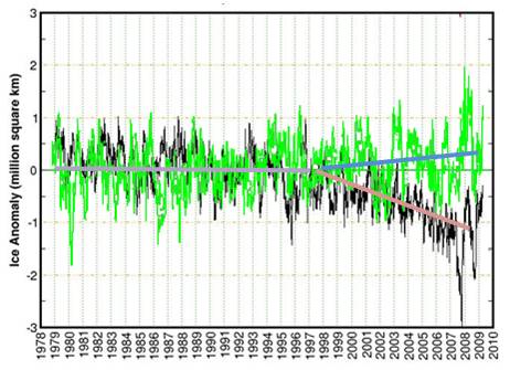
The melting polar ice caps are used in alarmist portrayals (Obama said “the polar ice caps have melted”). The ice extent in the Polar Regions has been measured since 1979 – the start of the satellite era for earth measurements. The following figures show sea ice extent anomalies for the Arctic (left) and Antarctic (right) to March 2009 [http://arctic.atmos.uiuc.edu/cryosphere/] The following figure overlays the Antarctic ice anomalies (green), on the Arctic ice anomalies (black). A divergence began around 1998 (when the major El Nino of 1997-98 occurred). The divergence is due to divergence in sea surface temperature trends.
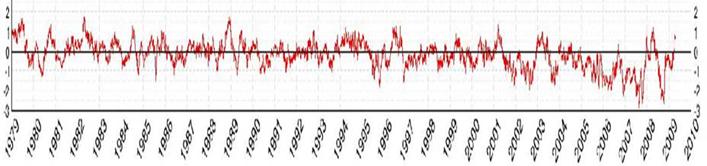
The following figure shows the global sea ice extent anomalies to March 2009 [http://arctic.atmos.uiuc.edu/cryosphere/]. Arctic sea ice losses were balanced by Antarctic ice gains until around 2001-2 when Arctic losses started to exceed Antarctic gains (although as of March 2009, the global ice anomaly is positive – more ice than the 1979-2000 mean).
See http://www.appinsys.com/GlobalWarming/GW_4CE_PolarIceCaps.htm for more details on the polar ice caps.
|
|
Glaciers
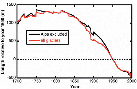
The following figures are from a study of 169 receding glaciers worldwide (Johannes Oerlemans, “Extracting a Climate Signal from 169 Glacier Records”, published in Science, 2005). This shows the composite average of up to 169 glaciers (the number varies in different time periods). These indicate the pattern that is consistent for most glaciers worldwide – the recession of the glaciers started at the end of the little ice age in the 1700s.
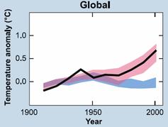
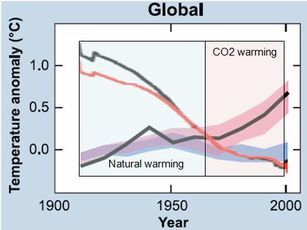
The following figure shows the IPCC graph of model outputs (left) (from IPCC 2007 AR4 Figure SPM-4 [http://www.ipcc.ch/pdf/assessment-report/ar4/syr/ar4_syr_spm.pdf]) In this figure, the blue shaded bands show the result of climate model simulations using only the natural forcings, while red shaded bands show the result of climate model simulations including anthropogenic CO2. This clearly shows that prior to about 1970, the global warming is fully explained by climate models using only natural forcings (i.e. no human CO2). The figure on the right superimposes the receding glacier trend from above on the SPM-4 figure. Glaciers have been receding since the Little Ice Age and cannot be attributed to CO2. If anything the rate of global glacier recession since 1970 has declined.
See http://www.appinsys.com/GlobalWarming/GW_4CE_Glaciers.htm for more details on glaciers.
|
|
Sea Level
The IPCC stated in the Third Assessment Report (2001) [http://www.grida.no/climate/ipcc_tar/wg1/425.htm]: “There is no evidence for any acceleration of sea level rise in data from the 20th century data”.
The report “Decadal Rates of Sea Level Change During the Twentieth Century” (Simon Holgate, Proudman Oceanographic Laboratory, Liverpool, UK) states: “The first half of the century (1904-1953) had a slightly higher rate (1.91±0.14 mm/yr) in comparison with the second half of the century (1.42±0.14 mm/yr 1954-2003).” [http://meteo.lcd.lu/globalwarming/Holgate/sealevel_change_poster_holgate.pdf]
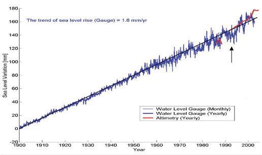
The following figure shows cumulative sea level change for 1900 to 2002. The trend shows no increase in rate since measurements began [http://www.wamis.org/agm/meetings/rsama08/S304-Shum_Global_Sea_Level_Rise.pdf]. Since according to the IPCC, CO2-based warming is only evident since the 1970s, all of this sea level rise since prior to 1970 cannot be caused by anthropogenic CO2, and yet the trend has not increased. Thus sea level rise cannot be attributed to CO2.
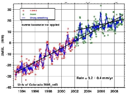
Alarmists say everything is accelerating and it’s worse than expected. But they carefully select start and end dates to create exaggeration. The following figure shows sea level from 1993 to 2009 [http://sealevel.colorado.edu/]. This figure shows a rate of 3.2 mm/year since it starts at a low point in the fluctuating data (the 1993 start indicated by the arrow in the above figure). But the last 6 years exhibit a much lower rate of increase.
Although Al Gore and other alarmists make statements about scary unrealistic increases in sea level, the IPCC AR4 (2007) report predicts that sea level rise will be 0.6 – 1.9 feet by the year 2100. The larger value is reduced from the IPCC TAR (2001) report which predicted 0.3 to 2.9 feet by 2100. The historic rate of 1.6 mm/yr over the last 100 years translates into a sea level rise of about 6 inches by the year 2100.
See http://www.appinsys.com/GlobalWarming/GW_4CE_SeaLevel.htm for more details on sea level change.
|
|
Animals
Many claims are made regarding animals affected by global warming. When the details are examined, the causes are usually found to be due to local deforestation or other localized conditions. In other cases the trends started long before CO2 could have had an effect on the temperature.
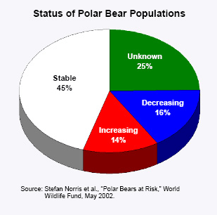
Polar bears have become a poster-child for the global warming scare movement. The reality is that a) some polar bear populations are increasing, some are declining, some are stable and b) similar temperatures and conditions existed in both the 1930’s and during the Medieval Warm Period.
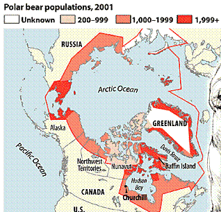
The following figure is from the World Wildlife Fund (whose position is that global warming will cause the polar bears to become extinct). According to the World Wildlife Fund (WWF), there are about 20 distinct polar bear populations accounting for approximately 22,000 polar bears worldwide. Population patterns, according to the WWF data, do not show a temperature-linked decline:
Polar Bear Population Status 2002 (left), Polar Bear Distribution (right)
A recent article in the Christian Science Monitor http://www.csmonitor.com/2007/0503/p13s01-wogi.html discusses the results of a study of polar bears in Canada by biologist Mitchell Taylor (Canada hosts about two-thirds of the world’s estimated 25,000 polar bears): “the number of polar bears in the Davis Strait area of Canada's eastern Arctic – one of 19 polar bear populations worldwide – has grown to 2,100, up from 850 in the mid-1980s. Dr. Taylor explained his conviction that threats to polar bears from global warming are exaggerated and that their numbers are increasing.”
The US Department of the Interior Secretary Kempthorne bases her assessment on computer modeling. In her speech [http://www.doi.gov/secretary/speeches/081405_speech.html] she : “Although the population of bears has grown from a low of about 12,000 in the late 1960’s to approximately 25,000 today, our scientists advise me that computer modeling projects a significant population decline by the year 2050. This, in my judgment, makes the polar bear a threatened species – one likely to become in danger of extinction in the foreseeable future.”
See http://www.appinsys.com/GlobalWarming/GW_4CE_Animals.htm for more details on animals.
|
|
Human Disease / Death
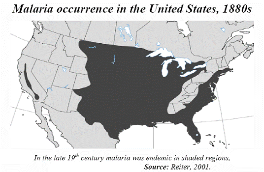
The alarmists say global warming is causing expanded disease such as malaria and increased human deaths due to heat waves. In fact winter-based deaths greatly exceed heat-related deaths.
Malaria was common in the United States during the late 1800s. “In 1878, 100,000 Americans were infected with malaria, and some 25,000 died. Malaria was eradicated from the United States in the 1950s not because of climate change (it was warmer in the 1950s than in the 1880s), but because of technological advances. Air conditioning, the use of screen doors and windows, and the elimination of urban overpopulation brought about by the development of suburbs and automobile commuting were largely responsible for the decline in malaria (Reiter, 1996).” [http://scienceandpublicpolicy.org/images/stories/papers/originals/wyoming_climate_change_2008.pdf]
See http://www.appinsys.com/GlobalWarming/GW_4CE_HumanDeath.htm for more details on disease and extreme weather causing deaths.
|
|
North Atlantic Thermohaline Circulation
Some global warming alarmists suggest that the North Atlantic Thermohaline Circulation (NATC) or (Atlantic Meridional Overturning Circulation) will be disrupted by the melting of the Arctic ice cap, causing an ice age. This has mainly come about due to a general misunderstanding of the NATC and the Gulf Stream. Scientific studies show the alarm to be bogus.
Science: “False Alarm: Atlantic Conveyor Belt Hasn't Slowed Down After All” [http://www.sciencemag.org/cgi/content/summary/314/5802/1064a]: “A closer look at the Atlantic Ocean's currents has confirmed what many oceanographers suspected all along: There's no sign that the ocean's heat-laden "conveyor" is slowing”
Scientific American: “The Source of Europe's Mild Climate” [http://www.americanscientist.org/issues/pub/2006/4/the-source-of-europes-mild-climate/1]: “the still-tentative connections investigators have made between thermohaline circulation and abrupt climate change during glacial times have combined with the popular perception that it is the Gulf Stream that keeps European climate mild to create a doomsday scenario: Global warming might shut down the Gulf Stream, which could "plunge western Europe into a mini ice age," making winters "as harsh as those in Newfoundland," or so claims, for example, a recent article in New Scientist. This general idea been rehashed in hundreds of sensational news stories. … But at root, it is the ignorance of how regional climates are determined that allows this misinformation to gain such traction. ... The blame lies with modern-day climate scientists who either continue to promulgate the Gulf Stream-climate myth or who decline to clarify the relative roles of atmosphere and ocean in determining European climate. This abdication of responsibility leaves decades of folk wisdom unchallenged, still dominating the front pages, airwaves and Internet, ensuring that a well-worn piece of climatological nonsense will be passed down to yet another generation.”
See http://www.appinsys.com/GlobalWarming/GW_4CE_NATCGulfStream.htm for more details on the NATC and Gulf Stream.
|