Global Warming Science: www.appinsys.com/GlobalWarming
The El Nino / Southern Oscillation (ENSO)
[last update: 2010/07/04]
|
It is only in recent years that scientists are starting to recognize the influence of atmospheric and oceanic cycles in influencing climate.
A 2008 study – “Oceanic Influences on Recent Continental Warming”, by Compo, G.P., and P.D. Sardeshmukh, (Climate Diagnostics Center, Cooperative Institute for Research in Environmental Sciences, University of Colorado, and Physical Sciences Division, Earth System Research Laboratory, National Oceanic and Atmospheric Administration), Climate Dynamics, 2008) [http://www.cdc.noaa.gov/people/gilbert.p.compo/CompoSardeshmukh2007a.pdf] states: “Evidence is presented that the recent worldwide land warming has occurred largely in response to a worldwide warming of the oceans rather than as a direct response to increasing greenhouse gases (GHGs) over land. Atmospheric model simulations of the last half-century with prescribed observed ocean temperature changes, but without prescribed GHG changes, account for most of the land warming. … Several recent studies suggest that the observed SST variability may be misrepresented in the coupled models used in preparing the IPCC's Fourth Assessment Report, with substantial errors on interannual and decadal scales. There is a hint of an underestimation of simulated decadal SST variability even in the published IPCC Report.”
This document describes the El Nino / Southern Oscillation (ENSO).
|
|
Environmentalists confuse El Nino with global warming: See: http://www.appinsys.com/GlobalWarming/ElNino2010.htm
|
See also the additional oceanic oscillation documents:
- Pacific Decadal Oscillation (PDO)
- Atlantic Multidecadal Oscillation (AMO)
- PDO + AMO Influences
- Arctic Oscillation (AO) / North Atlantic Oscillation (NAO)
|
|
|
The El Nino / Southern Oscillation (ENSO)
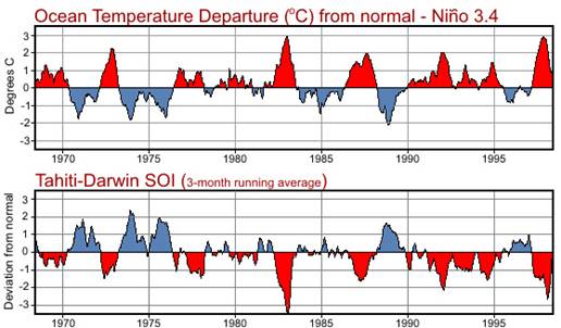
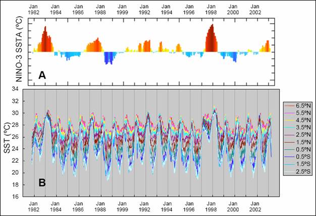
The El Nino / Southern Oscillation (ENSO) is an oceanic / atmospheric oscillation of the equatorial Pacific / southern Pacific. Various indexes have been derived from measurements in the area. The Southern Oscillation Index (SOI) is based on the difference between sea level pressures at Tahiti and Darwin, Australia. The Oceanic Nino Index (ONI) is based on sea surface temperatures in the eastern equatorial Pacific Ocean. The SOI and ONI have similar shapes but of opposite sign as shown in the figure below [http://www.srh.weather.gov/srh/jetstream/tropics/enso.htm].
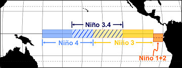
Various Nino regions have been defined across the equatorial Pacific as shown in the figure below [http://www.srh.weather.gov/srh/jetstream/tropics/enso.htm]
|
|
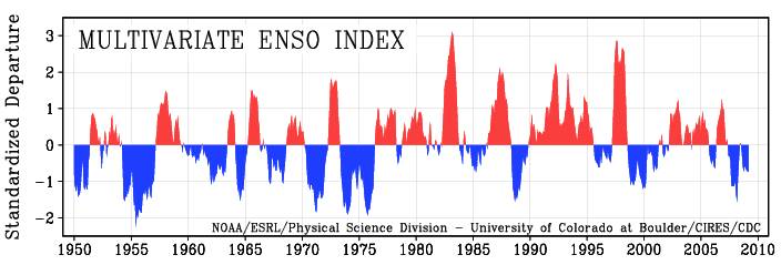
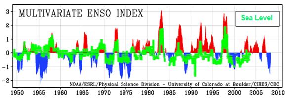
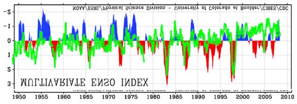
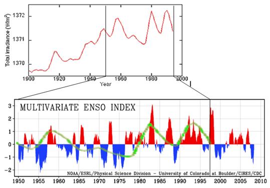
The multivariate ENSO Index (MEI) is based on the six main observed variables over the tropical Pacific. These six variables are: sea-level pressure, zonal and meridional components of the surface wind, sea surface temperature, surface air temperature, and total cloudiness fraction of the sky. The following figure shows the MEI since 1950. [http://www.cdc.noaa.gov/people/klaus.wolter/MEI/]
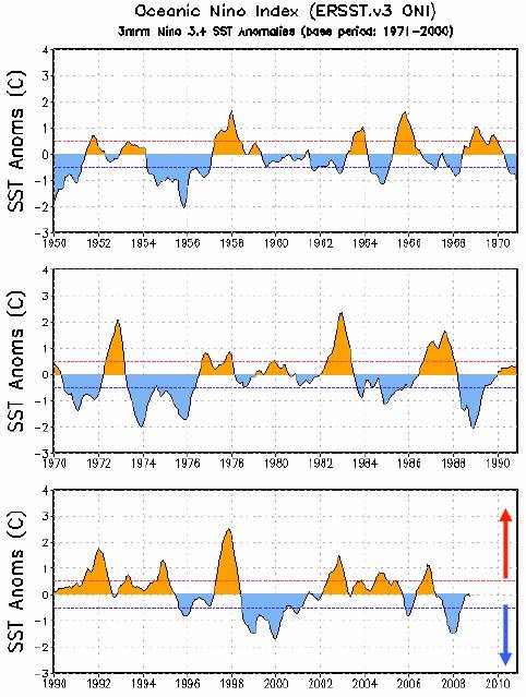
The Oceanic Nino Index (ONI) is based on sea surface temperature anomalies and is defined as the three-month running-mean SST departures in the Niño 3.4 region, based on the NOAA ERSST data. El Nino is characterized by ONI >= +0.5 C, while La Nina is based on ONI <= -0.5 C. An El Nino or La Nina episode is defined when the above thresholds are exceeded for a period of at least 5 consecutive overlapping 3-month seasons. The following figure shows the ONI since 1950. [http://www.cpc.ncep.noaa.gov/products/analysis_monitoring/lanina/enso_evolution-status-fcsts-web.pdf]
NOAA provides a list of all El Nino / La Nina episodes since 1950 based on the ONI: http://www.cpc.noaa.gov/products/analysis_monitoring/ensostuff/ensoyears.shtml
|
|
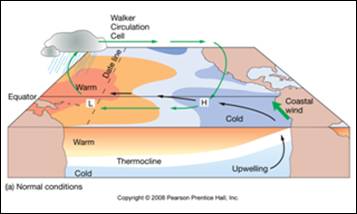
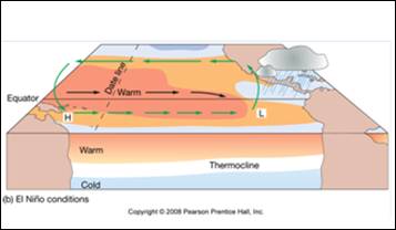
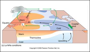
The following figure shows typical “normal” conditions (top), El Nino (middle) and La Nina (bottom) as a 3-dimensional view [www.miracosta.edu/home/kmeldahl/T&Toutlines/CH07_Outline.ppt]
NOAA provides an ENSO monitoring web page: http://www.pmel.noaa.gov/tao/elnino/1997.html
|
|
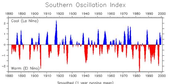
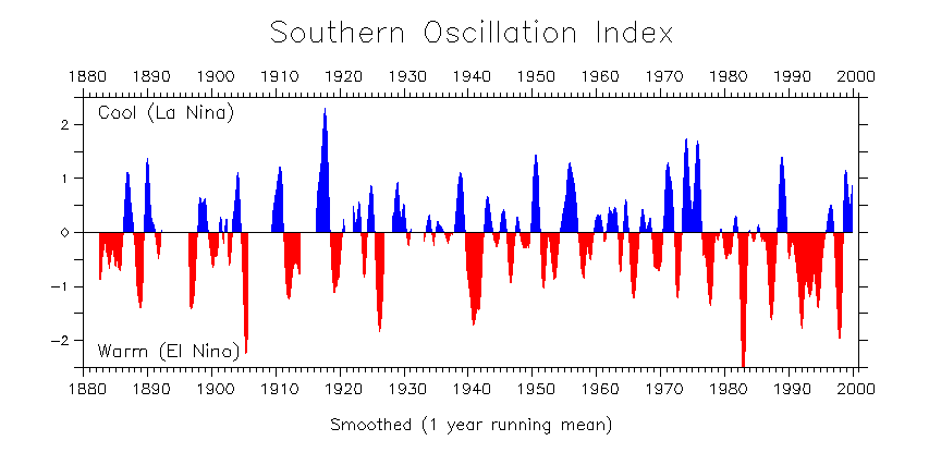
The following figure shows the SOI since 1880 [http://faculty.washington.edu/kessler/ENSO/soi-shade-ncep-b.gif]
The following figure compares Nino 3 SST anomalies (top) with the weekly SST gradient from 7N to 3S at 90W: “A weak gradient in the early part of the year occurs under the influence of the “doldrums” while the ITCZ [Inter-Tropical Convergence Zone] is positioned near the equator. Later in the year, as the ITCZ shifts north, the southeast trades across the equator strengthen and drive enhanced upwelling, hence a strong gradient develops. Prominent El Niño anomalies (e.g., 1982–83, 1987, 1997–98) are marked by unusually weak gradients and more southerly ITCZ, whereas La Niñas (e.g., 1988) are marked by an enhanced and longer-persisting SST gradient, and more northerly ITCZ.” [http://shadow.eas.gatech.edu/~jean/Koutavas2004.pdf]
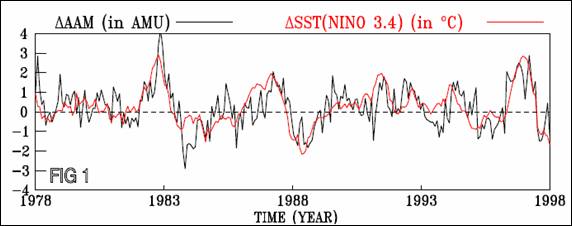
The following figure compares the change in atmospheric angular momentum (AAM) with the change in Nino 3.4 sea surface temperatures [http://www-pcmdi.llnl.gov/projects/cmip/cmip_subprojects/Huang/huang_proposal.pdf] The atmospheric angular momentum (AAM) results from the Earth’s atmosphere and the planet itself rotating at different speeds and causes fluctuation in the length of a day, as well as affecting the polar wobble.
More ENSO information is available at: http://iridl.ldeo.columbia.edu/maproom/.ENSO/
|
|
Trade Winds / Western Pacific Warm Pool
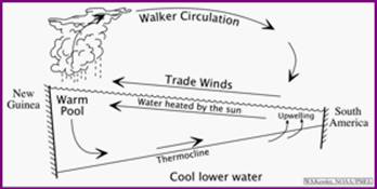
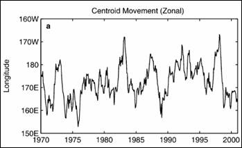
The ENSO phenomenon is related to the Pacific trade winds. The western Pacific is warmer than the eastern Pacific (the warm pool), as shown below (left) [http://faculty.washington.edu/kessler/occasionally-asked-questions.html#q1]. During El Nino the trade winds are weaker than “normal” allowing stronger ocean currents to flow eastward, while during La Nina the winds are stronger pushing stronger westward currents. The centroid of the western Pacific warm pool (WPWP) moves longitudinally as shown below (right) [http://www.shao.ac.cn/yhzhou/ZhouYH_2004JG_PM_Warmpool.pdf]. The major El Nino events of 1983 and 1998 caused the WPWP centroid to move as far east as 170W.
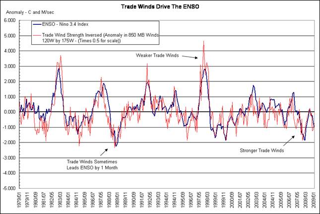
The following figure compares the Nino 3.4 Index with the inverted trade wind strength, showing the strong correlation between the two. [http://wattsupwiththat.com/2009/02/17/the-trade-winds-drive-the-enso/#more-5702]
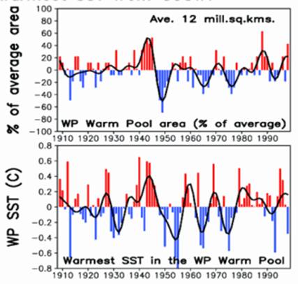
The following figure shows the percent of average area (top) and the sea surface temperature anomalies for the western pacific warm pool (from “Natural decadal-multidecadal variability of the Indo-Pacific Warm Pool and its impacts on global climate” [http://www.crces.org/presentations/dmv_ipwp/]).
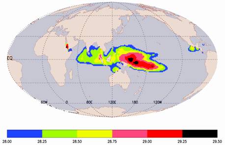
The following figure shows the location of the warm pool, showing the sea surface temperatures (degrees C) (from same reference as above, which states: “THE major source of heat for the global atmosphere”).
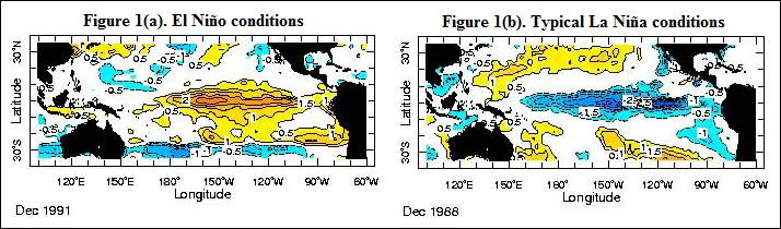
The following figure shows typical El Nino and La Nina conditions in terms of SST anomalies [http://iri.columbia.edu/climate/ENSO/background/basics.html]. During El Nino the weakened winds allow the piled up warm pool to spread eastward, while during La Nina the increased winds draw more upwelling cold water from near South America in a westward direction.
|
|
Effect on Ocean Currents
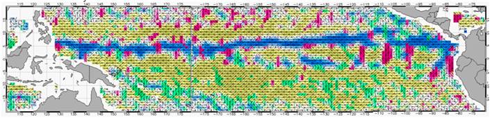
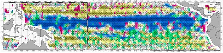
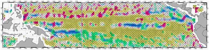
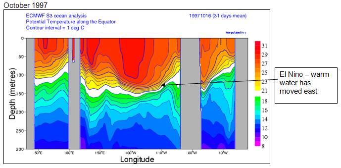
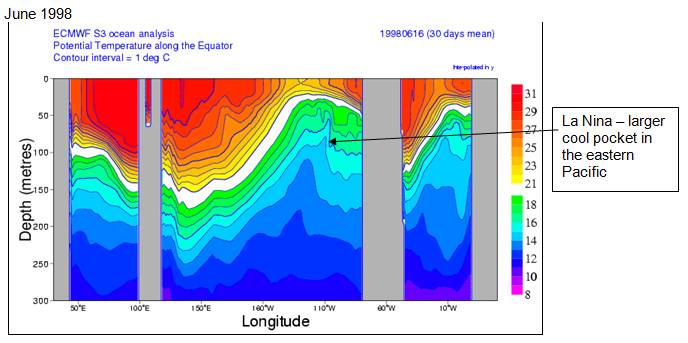
The NASA Ocean Motion and Surface Currents web site provides visualizations of ocean current parameters including speed and direction [http://oceanmotion.org/html/resources/oscar.htm#visstart]. The following figures from that web site show the direction of ocean currents for three times around the 1997/1998 El Nino. The first shows July 1996 prior to the El Nino – the blue shows the equatorial eastward current (called the Equatorial Countercurrent) with yellow westward currents to the north and south (the North and South Equatorial Currents). The second figure shows the peak of the El Nino (October 1997) with a very strong easterly equatorial countercurrent and greatly reduced westward equatorial currents. The third figure shows the reversal into La Nina (June 1998) with the large rebound of the westward equatorial currents and an almost non-existent easterly countercurrent.
Current direction color-code:
Prior to El Nino – July 1996
El Nino -- October 1997
El Nino reversed into La Nina – June 1998
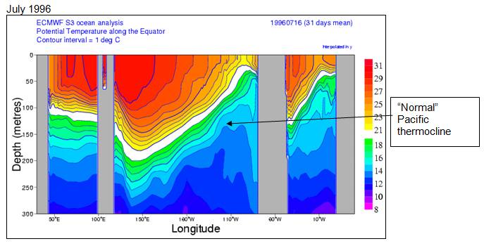
The following figures show the ocean temperature along the equator (with ocean depth as the y-axis) for the three months shown above [http://www.ecmwf.int/products/forecasts/d/charts/ocean/reanalysis/xzmaps/Monthly/]. In these figures, the left ocean panel is the Indian Ocean, the center is the Pacific Ocean and the right panel is the Atlantic Ocean. Notice that the El Nino also corresponds to a reduced thermocline across the Atlantic Ocean, and that the El Nina corresponds with increased temperatures in the Indian Ocean.
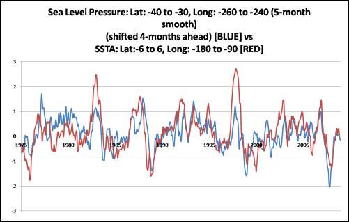
The following figure compares the sea level pressure (SLP - blue) to sea surface temperatures (SST - red). The SST lags the SLP by four months (data shifted in the graph). [http://climatechange1.wordpress.com/2009/01/08/more-evidence-that-el-ninos-are-sparked-from-above/]
|
|
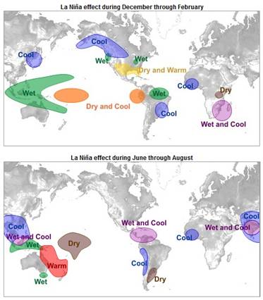
Effect on Weather
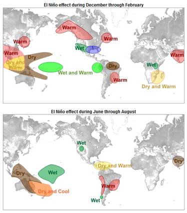
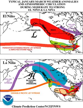
NOAA provides a good description of the weather impacts of ENSO: http://www.srh.weather.gov/srh/jetstream/tropics/enso_impacts.htm The following figure is from that web page.
This web page also provides a description of the effects on North America: http://faculty.washington.edu/kessler/ENSO/nawinter.html including the following figure.
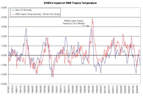
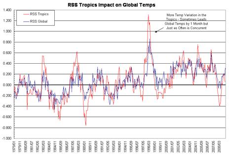
The ENSO greatly affects temperatures around the world starting with the tropics. The following two figures show temperature data from the RSS satellite data [http://wattsupwiththat.com/2009/02/17/the-trade-winds-drive-the-enso/#more-5702]. The left figure compares the Nino 3.4 anomaly (blue) with the RSS satellite temperature anomalies for the tropics (red). The right figure compares the RSS satellite data for the tropics (red) with global RSS satellite temperature anomaly data (blue).
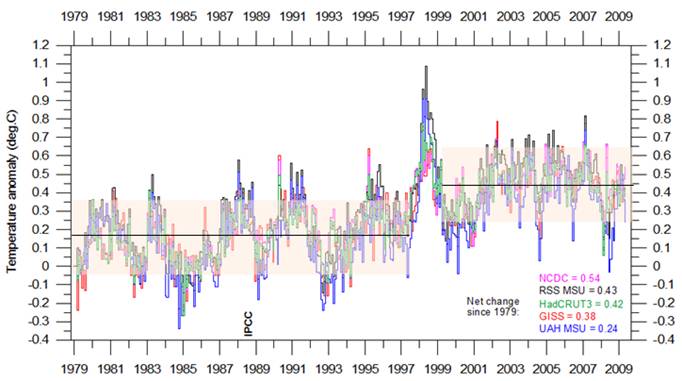
The following figure shows the general trends before and after the unusual 1997/98 El Nino. The figure shows global average temperature from five data sets since the start of the satellite temperature data era in 1979 (RSS MSU and UAH MSU are satellite data, HadCRUT3, NCDC and GISS are surface station data sets – graph from http://climate4you.com/GlobalTemperatures.htm). From 1979 to 1997 there was no warming trend. The major El Nino then resulted in a residual warming of about 0.3 degrees. Since the 1998 end of the El Nino there has also been no warming trend – all of the warming in the last 30 years occurred in a single year – the 1997-98 El Nino.
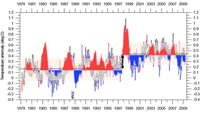
The following figure shows the above figure with MEI shown near the start of this document superimposed (with a step change split in the MEI in 1997). This shows how the El Nino governs global temperatures. The global temperature cycles match the El Nino cycles, except for a couple of places: the step change associated with the 1997-98 El Nino and the out-of-sync portion in 1992-93. (The out-of-sync portion in 1992-93 is due to the atmospheric cooling resulting from the Mount Pinatubo volcano explosion overcoming the El Nino warming [http://www.nasa.gov/centers/goddard/news/topstory/2007/aerosol_dimming.html]). The 1998 step change is an unexplained phenomenon.
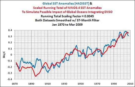
The following figure compares the integral (running sum) of Nino 3.4 SST anomlaies with global SST anomalies, (37-month smoothing filter) [http://bobtisdale.blogspot.com/2009/06/reemergence-mechanism.html].
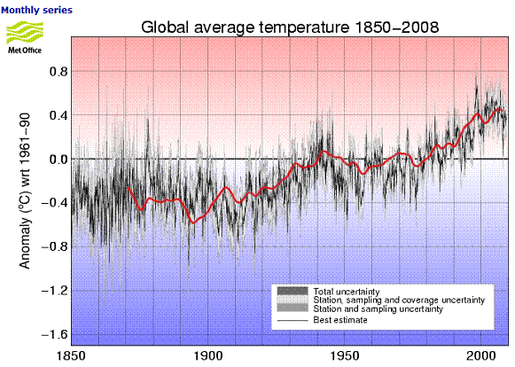
The following figure overlays the integral of Nino 3.4 SST anomalies from above on the Hadley global average temperature anomalies (from [http://hadobs.metoffice.com/hadcrut3/diagnostics/global/nh+sh/]).
See also the study of tropical SSTs / global temperature / cloud cover: www.appinsys.com/GlobalWarming/TropicalSST.htm
The El Nino heat propagates to other areas of the ocean through the “reemergence” phenomenon. Bob Tisdale provides an overview of the reemergence mechanism [http://bobtisdale.blogspot.com/2009/06/reemergence-mechanism.html] He also shows the following figure from the paper “Reemergence Areas of Winter Sea Surface Temperature Anomalies in the World’s Oceans” – Hanawa & Sugimoto, Geophysical Research Letters, 2004. The following figure shows reemergence areas detected by lag correlation analyses for five SST data sets – contours denote areas where lag correlations exceed the 99% significance level.
The above figure shows that the main reemergence areas are in the northern hemisphere.
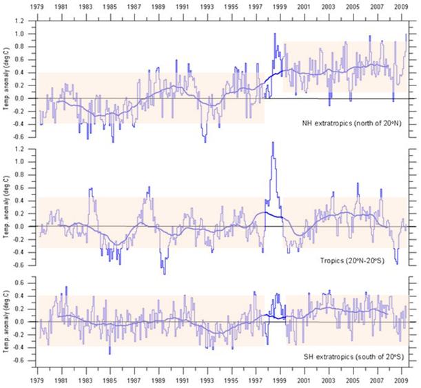
The following figure shows the global average temperature near the Earth’s surface from satellite data, for the northern hemisphere (north of 20N), the tropics (20N – 20S) and the southern hemisphere (south of 20S) (figure from http://climate4you.com/). The Northern Hemisphere exhibits the step change in temperature resulting from the 1997-98 El Nino similar to the global average, whereas there is no increase in the tropics and only a very small increase of shorter duration in the southern hemisphere. This matches the pattern of the reemergence areas by hemisphere.
|
|
Effect on Lower Troposphere Temperatures
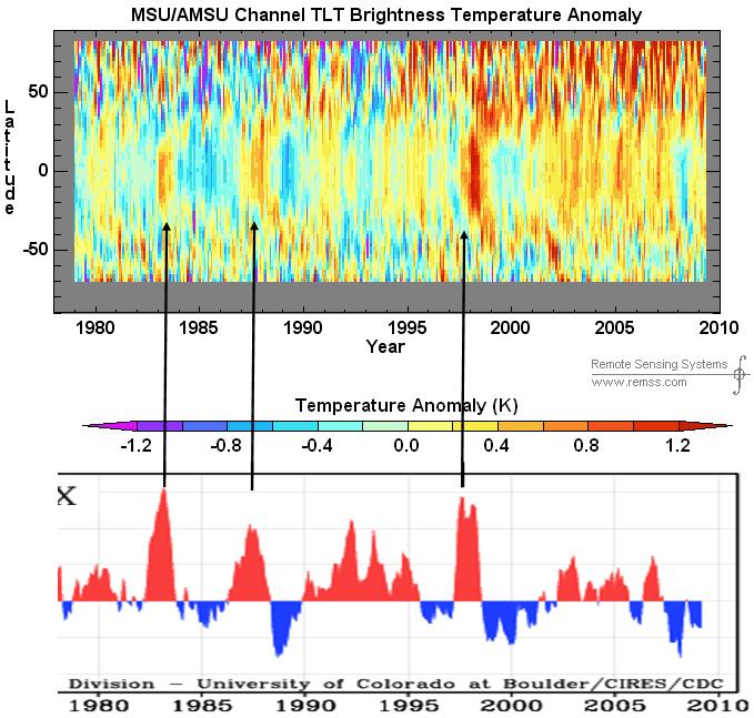
The following figure shows the global temperature anomalies by latitude for 1979 – 2009 from the RSS satellite data for the lower troposphere near the earth’s surface [http://www.ssmi.com/msu/msu_data_description.html] – latitude on the y-axis.
|
|
Interaction With AMO
Why did the 1997-98 El Nino result in a persistent step change in global temperatures whereas the 1983 El Nino did not? It appears that the combination of phase correspondence with the Atlantic Multidecadal Oscillation (AMO) is the influencing factor, along with the influence of volcanic aerosols causing simultaneous cooling.
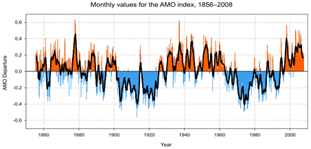
The following figure shows the AMO since 1850 (see www.appinsys.com/GlobalWarming/AMO.htm for more information on the AMO).
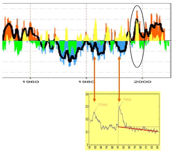
The next figure shows the ENSO-MEI, changed to yellow / green, superimposed on the AMO. The 1997-98 El Nino corresponded to an in-phase event in the AMO whereas the 1983 El Nino was out of phase with the AMO. This figure also shows the volcanic aerosols from 1981 – 2006 (graph with yellow background, from [http://www.nasa.gov/centers/goddard/news/topstory/2007/aerosol_dimming.html]). The El Chichon volcano eruption created atmospheric aerosols that influenced the AMO and counteracted the 1982-83 El Nino.
|
|
Effect on Sea Levels
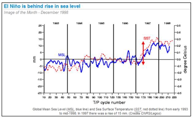
Sea levels are greatly affected by the ENSO. The 1997-98 El Nino affected global sea level rise, as shown below [http://www.aviso.oceanobs.com/en/news/idm/1998/dec-1998-el-nino-is-behind-rise-in-sea-level/index.html].
The Southern Oscillation is calculated based on sea level pressure differences across the pacific, as described previously. The following figures compare the effects on seal level on opposite sides of the Pacific Ocean.
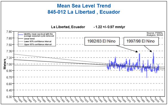
The following figure shows the sea level data for La Libertad, Ecuador from the NOAA database [http://tidesandcurrents.noaa.gov/sltrends/index.shtml]
The following figure superimposes the sea level data for La Libertad from the figure above (changed to green) on the multivariate ENSO Index plot shown previously. This shows a strong correlation between the ENSO and sea level variation.
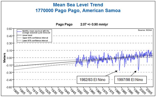
The following figure shows the sea level data for Pago Pago, American Samoa from the NOAA database.
The following figure superimposes the sea level data for Pago Pago from the figure above (changed to green) on the inverted multivariate ENSO Index plot shown previously. This shows a strong correlation between the ENSO and sea level variation
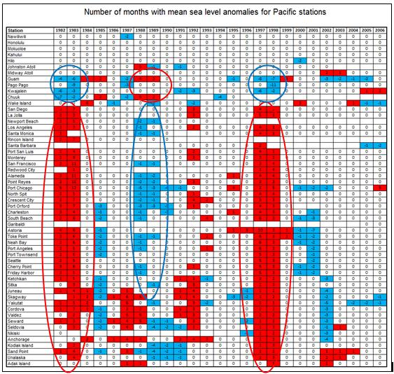
The effects of the ENSO on sea levels around the Pacific is evident from the following table [http://tidesandcurrents.noaa.gov/sltrends/pacific19822006.htm] The 1982/83 and 1997/98 El Nino events are clearly seen as causing positive sea level anomalies in North America through Alaska and negative sea level anomalies in the Oceania area. The 1988/89 La Nina is also highlighted although this was not as large as the El Nino events and was delayed reaching Alaska.
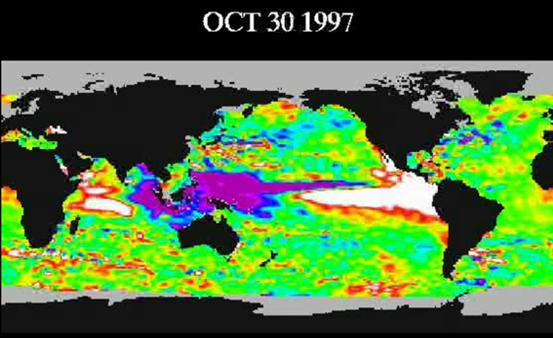
The following figure is from an animation showing the progression of sea surface height anomalies through the 1997/98 El Nino [http://sealevel.jpl.nasa.gov/gallery/videos-ssh-movies.html]. The white area represents sea surface height increase in the range of 6-12 inches, while the purple area represents sea surface height decrease in the range of 6-12 inches. This web site has a sequence of images with descriptions: http://sealevel.jpl.nasa.gov/science/enso97/el_nino_1997.html
|
|
Effect on the Arctic
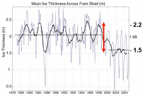
The following figure shows the mean sea ice thickness across Fram Strait – where Arctic sea ice exits the Arctic Ocean into the Atlantic Ocean [http://www.ees.hokudai.ac.jp/coe21/dc2008/DC/report/Maslowski.pdf]. There are large annual fluctuations, which changed to a new level after the 1998 El Nino.
|
|
Effect on the Antarctic
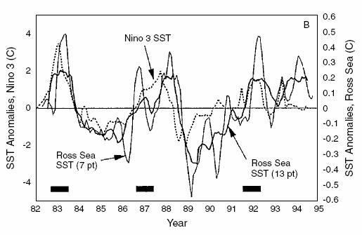
The following figure shows monthly mean smoothed Ross Sea SST anomalies (13-point smoothed, thick solid line; seven-point smoothed, thin solid line) and Nino 3 region anomalies (dashed line) from the 13 year monthly means. The horizontal bars are each 1 year long and indicate the approximate times of ENSO events [http://www.scar.org/information/elnino/El_Nino.pdf].
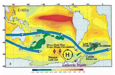
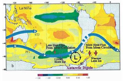
The following figures show the SST anomaly composites (°C) for (top) the El Niño condition, and (bottom) La Niña condition. The composites average the SST from May before ENSO events matured to the following April, and over five El Niño events and five La Niña events, respectively. Schematic jet stream (STJ and PFJ), persistent anomalous high and low pressure centers, and anomalous heat fluxes due to mean meridional circulations are marked. Antarctic ice conditions are also indicated on the figures. [http://journals.cambridge.org/download.php?file=%2FANS%2FANS16_04%2FS0954102004002238a.pdf&code=e398b02f2adb5e5379829c68c457666d]
|
|
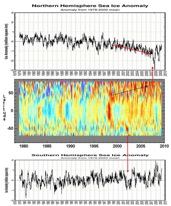
Effect on Global Sea Ice
The following figures show sea ice extent anomalies for the Arctic (top) and Antarctic (bottom) to March 2009 [http://arctic.atmos.uiuc.edu/cryosphere/] along with the global tropospheric temperature map shown previously (middle). The El Nino propagated more quickly to the Arctic and shows persistent reemergence in the Arctic region affecting sea ice levels there.
|
|
Relationship to Solar Activity and Cosmic Rays
The Nino 3.4 Index has a very strong correlation to solar irradiance and cloud cover.
The following figure shows the estimated solar output reaching the earth (upper figure) [http://www.giss.nasa.gov/research/briefs/shindell_03/] as well as the same plot (changed to green) superimposed on the ENSO graph shown previously. The declining solar irradiance from 1958 to 1975 corresponds to a general decreasing trend in the ENSO, followed by a shift to mainly positive values following the Pacific climate shift of 1976/77
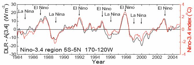
The following figure shows “Time-series of downward longwave radiation (DLR-A[3.4]), and net downwelling longwave radiation at the surface (NSL-A[3.4]) anomaly (defined with respect to the average monthly DLR for the whole study period 1984–2004) in the Ni˜no-3.4 region (black line). Overlaid is the time-series of the Ni˜no-3.4 index (red line)” (from Pavlakis et al, “ENSO surface longwave radiation forcing over the tropical Pacific” Atmospheric Chemistry and Physics 7, April 2007 [http://www.atmos-chem-phys.net/7/2013/2007/acp-7-2013-2007.pdf]).
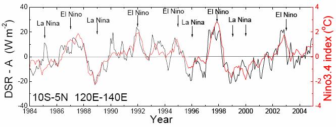
The following figure shows “Time-series of downward shortwave radiation anomaly (DSR-A) at the surface (defined with respect to the average monthly DSR for the whole study period 1984–2004) in the north subtropical region (7–15_ N 150–170_ E). Overlaid is the time-series of the Nino-3.4 index (red line).” from the study “ENSO surface shortwave radiation forcing over the tropical Pacific” (Pavlakis et al, Atmospheric Chemistry and Physics Discussions, 2008 [http://www.atmos-chem-phys-discuss.net/8/6697/2008/acpd-8-6697-2008-print.pdf])
The above figures show an extremely strong correlation between downward solar radiation and the Nino 3.4 Index.
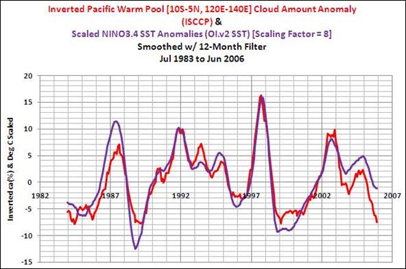
Downward radiation at the Earth’s surface is greatly affected by the amount of cloud cover. The following figure (from [http://bobtisdale.blogspot.com/2009/02/recharging-pacific-warm-pool-part-2.html]) shows the cloud amount (inverted, in red) from the International Satellite Cloud Climatology Program (ISCCP) dataset, along with the Nino 3.4 SST anomalies.
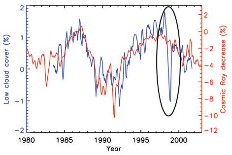
The following figure is from Marsh and Svensmark “Galactic cosmic ray and El Niño–Southern Oscillation trends in International Satellite Cloud Climatology Project D2 low-cloud properties” [http://www.agu.org/pubs/crossref/2003/2001JD001264.shtml] and shows the low altitude cloud cover (blue) as well as the cosmic ray flux (red). A sudden decrease in low cloud cover accompanied the 1997-98 El Nino.
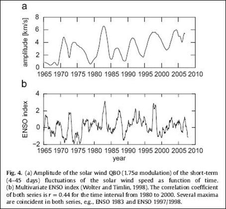
Further solar evidence is provided by a study of the solar wind quasi-biennial oscillation (Hocke, “QBO in Solar Wind Speed and its Relation to ENSO”, Journal of Atmospheric and Solar-Terrestrial Physics [http://www.sciencedirect.com/science?_ob=ArticleURL&_udi=B6VHB-4V74XTR-1&_user=10&_coverDate=02%2F28%2F2009&_rdoc=4&_fmt=high &_orig=browse&_srch=doc-info(%23toc%236062%232009%23999289997%23895122%23FLA%23display%23Volume)&_cdi=6062&_sort=d&_docanchor=&_ct=11&_acct=C000050221&_version=1 &_urlVersion=0&_userid=10&md5=e1e9610326693e88e937e49e06da3c35] )
The following figure is from that paper showing a correspondence between peaks in solar wind amplitude and ENSO index.
A 1988 study (R. Pérez-Enríquez, B. Mendoza1 and M. Alvarez-Madrigal, “Solar activity and El Niño: the auroral connection” [http://www.springerlink.com/content/844527g47556312x/]) found “A significant correlation is found between the distribution of the data around that maximum, suggesting a connection between the phenomenon of El Niño and the solar activity which gives rise to aurorae. We interpret the results in terms of a possible change of the global circulation pattern of the ocean induced by temperature increases of a few degrees at the auroral zone, as proposed by some authors, which may trigger El Niño.”
A 2007 study (Vovk, V.; Egorova, L., “Role of solar activity in formation of the anomalous El Nin'o current”, Geomagnetism and Aeronomy, Volume 47, Number 1, February 2007 [http://www.ingentaconnect.com/content/maik/11478/2007/00000047/00000001/00001014]) found “a sharp decrease in the SOI indices, which corresponds to the beginning of El Nin'o (ENSO), is preceded one or two months before by a 20% increase in the monthly average Wolf numbers. In warm years of Southern Atmospheric Oscillation a linear relationship is observed between the SOI indices and the number of geoeffective solar flares with correlation coefficients p < −0.5. It is shown that in warm years a change in the general direction of the surface wind to anomalous at the above stations is preceded one or two days before by an increase in the daily average values of IMF Bz. An increase in the SOI indices is preceded one or two months before by a considerable increase in the monthly average values of the magnetic AE indices.”
A study published in 2006 (Nyenzi and Lefale, World Meteorological Association, “El Nino Southern Oscillation (ENSO) and global warming”, Advances in Geosciences 6, 95-101, 2006 [http://hal.archives-ouvertes.fr/docs/00/29/69/12/PDF/adgeo-6-95-2006.pdf]) states: “Although ENSO simulations in AOGCM have improved in recent years, further model enhancements are required to simulate a more realistic Pacific climatology and seasonal cycle as well as more realistic ENSO variability. … In terms of the connection between ENSO and global warming, the scientific literature provides insufficient evidence to date to suggest any direct link between the recent observed increase in ENSO episodes and global warming. … We conclude there is insufficient evidence to date to suggest any changes in the intensity or frequency of ENSO as a consequence of global warming.”
A study published in 2008 (Robert Baker, “Exploratory Analysis of Similarities in Solar Cycle Magnetic Phases with Southern Oscillation Index Fluctuations in Eastern Australia” Geophysical Research Papers, Vol. 46, 2008) [http://www3.interscience.wiley.com/journal/121542494/abstract?CRETRY=1&SRETRY=0] states: “There is growing interest in the role that the Sun's magnetic field has on weather and climatic parameters, particularly the ~11 year sunspot (Schwab) cycle, the ~22 yr magnetic field (Hale) cycle and the ~88 yr (Gleissberg) cycle. These cycles and the derivative harmonics are part of the peculiar periodic behaviour of the solar magnetic field. Using data from 1876 to the present, the exploratory analysis suggests that when the Sun's South Pole is positive in the Hale Cycle, the likelihood of strongly positive and negative Southern Oscillation Index (SOI) values increase after certain phases in the cyclic ~22 yr solar magnetic field. The SOI is also shown to track the pairing of sunspot cycles in ~88 yr periods. This coupling of odd cycles, 23–15, 21–13 and 19–11, produces an apparently close charting in positive and negative SOI fluctuations for each grouping. This Gleissberg effect is also apparent for the southern hemisphere rainfall anomaly. Over the last decade, the SOI and rainfall fluctuations have been tracking similar values to that recorded in Cycle 15 (1914–1924). This discovery has important implications for future drought predictions in Australia and in countries in the northern and southern hemispheres which have been shown to be influenced by the sunspot cycle. Further, it provides a benchmark for long-term SOI behaviour.”
A study of solar magnetic clouds during 1994 - 2002 by Wu, Lepping & Gopalswamy, “Solar Cycle Variations of Magnetic Clouds and CMEs” [http://www.scostep.ucar.edu/archives/scostep11_lectures/Pap.pdf] states: “The average occurrence rate is 9 magnetic clouds per year for the overall period (68 events/7.6 years). It is found that some of the frequency of occurrence anomalies were during the early part of Cycle 23: 1. Only 4 magnetic clouds were observed in 1999, and 2. An unusually large number of magnetic clouds (16 events) were observed in 1997 in which the Sun was beginning the rising of Cycle 23.” This “unusually large number of magnetic clouds” may have been the trigger of the significant 1997-98 El Nino.
A 1986 study (Salstein and Rosen: “Earth Rotation as a Proxy for Interannual Variability in Atmospheric Circulation, 1860-Present”, Journal of Climate and Applied Meteorology [http://ams.allenpress.com/archive/1520-0450/25/12/pdf/i1520-0450-25-12-1870.pdf]) states: “in the historical earth rotation series, … the day is typically longer during the year following an ENSO oceanic warming event than otherwise.”
|