Global Warming Science - www.appinsys.com/GlobalWarming
Huffington Post Apocalyptic Vision
[last update: 2010/05/17]
|
The Huffington Post says it is the End of Our Civilization (and there is no hope).
[http://www.huffingtonpost.com/ian-welsh/global-warming-a-localize_b_578065.html]
Welsh writes: “The majority of the American population now thinks that global warming probably doesn't exist. Part of that is the huge amount of money which has been spent on propaganda, but part of it is that the only continent which is not experiencing increased temperatures right now--is the continental USA. If you want to be a climate change denialist, America is a great place to live.”
It appears that the majority of the American population is more intelligent than Welsh. If the amount of money the “green” vested interests has spent on propaganda wasn’t so large the number of Americans believing in the global warming scare would be even smaller. (See: http://www.appinsys.com/GlobalWarming/DoubleStandard.htm And http://www.appinsys.com/globalwarming/WhiteHouseDeception.htm )
|
|
The United States
Welsh: “not experiencing increased temperatures right now--is the continental USA”
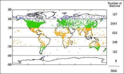
The US has 50% of the world’s temperature stations in the Global Historical Climate Network (GHCN). The following figure shows the global distribution of temperature stations.
Worldwide Distribution of Temperature Stations
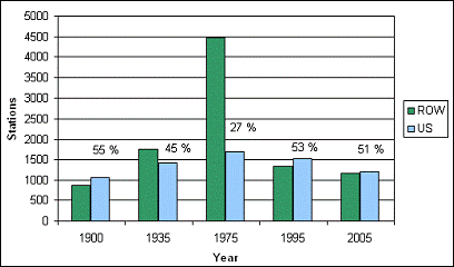
The following figure shows the number of stations in the GHCN database with data for selected years, showing the number of stations in the United States (blue) and in the rest of the world (ROW – green). The percents indicate the percent of the total number of stations that are in the U.S. The US is the country with the most reliable records in the world (and even then there are problems). But most of the world has a lack of long-term data.
Comparison of Number of GHCN Temperature Stations in the U.S. versus Rest of the World
(See: http://www.appinsys.com/GlobalWarming/GW_Part2_GlobalTempMeasure.htm for more info)
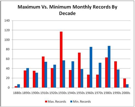
The following figure shows the distribution of US statewide maximum and minimum temperature records by decade [http://icecap.us/images/uploads/StateRecords.jpg]. More warm records were set in the first half of the 20th century than in the second half.
(Individual state records can be seen here: http://ggweather.com/climate/extremes_us.htm)
|
|
The World
The Climatic Research Unit (CRU) at the University of East Anglia provides data to the IPCC. They process temperature station data into adjusted averages for 5x5 degree grids covering the world. In November 2009, CRU had various emails hacked and released. A CRU email from Phil Jones to Michael Mann, Malcolm Hughes and others, Mar 11, 2003, stated: “Even with the instrumental record, the early and late 20th century warming periods are only significant locally at between 10-20% of grid boxes.” In other words, most of the world has no significant warming. [http://www.eastangliaemails.com/emails.php?eid=295&filename=1047388489.txt]
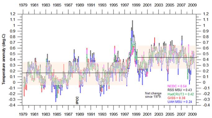
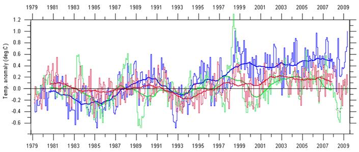
The following figure shows global average temperature from five data sets since the start of the satellite temperature data era in 1979 (RSS MSU and UAH MSU are satellite data, HadCRUT3, NCDC and GISS are surface station data sets – graph from http://climate4you.com/GlobalTemperatures.htm). From 1979 to 1997 there was no warming trend. The major El Nino then resulted in a residual warming of about 0.3 degrees. Since the 1998 end of the El Nino there has also been no warming trend – the only significant warming in the last 30 years occurred in a single year.
|
|
The Tropics
Welsh: “It is also entirely possible that large parts of the tropics will become effectively uninhabitable, the combination of humidity and temperature will be so high that it will literally be lethal to be outside air conditioning for any length of time for much of the year.” He ignores the actual data.
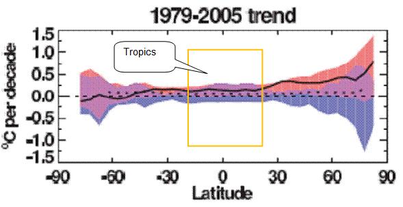
The following figure is from the IPCC Fourth Assessment Report (AR4) Figure 9.6 (2007). It shows the change in temperature (C per decade) by latitude. The black line shows the observed temperature, the blue band shows the output of the computer models including only natural factors, whereas the pink band shows the output of computer models including anthropogenic CO2. Notice that the models without CO2 (blue shaded area) can explain all of the warming for most of the world up to 30 degrees north latitude. This figure also shows cooling in Antarctica with warming increasing in the Arctic. The tropics have had very little warming and the models can explain that part without CO2.
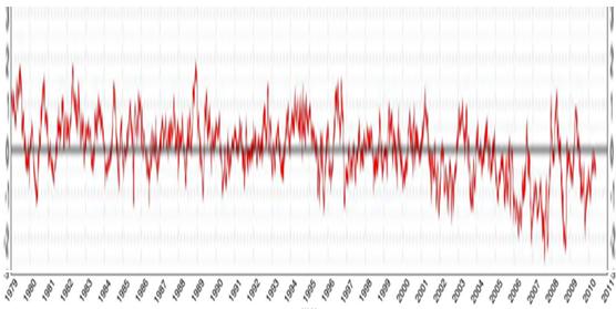
The following figure combines the three “hemispheric” graphs of satellite temperature data (from http://climate4you.com/), showing the northern hemisphere, tropics and southern hemisphere. The northern hemisphere has warmed about 0.5 degrees C, while the southern hemisphere has warmed about 0.1 C and the tropics show no net warming over the 30 years of available satellite data.
See: http://www.appinsys.com/GlobalWarming/GW_NotGlobal.htm for more info.
|
|
Ice Caps
Welsh: “With no glacial caps and with the methane released from Siberia, even radical decreases in human CO2 dumping will probably not be sufficient to stop the cycle.”
He ignores the fact that the Antarctic ice has been increasing while the Arctic has had decreasing ice.
The following figure shows the global total sea ice area – i.e. north pole plus south pole sea ice (from http://arctic.atmos.uiuc.edu/cryosphere/). As of April 2010 the total is about -0.4 million sq km – not significantly different from zero given the annual variation.
See: http://www.appinsys.com/GlobalWarming/GW_4CE_PolarIceCaps.htm for more info.
Welsh’s apocalyptic visions certainly do not represent the present state of the climate. These apocalyptic scenarios are always based on ignoring the actual data.
|
|
Huffington Post Ads
The ironic advertisement that was displayed when I viewed the HuffPo was “Stop The Energy Tax”:
This ad leads to the following web page [http://www.americansolutions.com/energytax/gastax.php]
A good ad for this HuffPo page: “Don’t be fooled by their spin” – the HuffPo is very spinny.
|
|
|


